EnterpriseGPT AI Platform
2023 • Lead Product Designer
EnterpriseGPT AI Platform
2023 • Lead Product Designer
EntepriseGPT is a SaaS platform for companies to create and manage LLMs, and the skills that execute tasks for users when chatting with an AI chatbot.
This meant having the capabilities to manage and fine-tune LLMs, and create the skills that stitched together the logic across many external applications.
Overview
With the explosion of AI in 2023, I was asked to be the main designer for an AI startup. Given that the exictement of the technology shift that is AI, I happily obliged.
The idea was to create a SaaS platform for enterprises to manage how the AI executed tasks in a chat experience, which involved how the AI executed tasks across systems.
My Role
I was the lead designer for this startup. I designed all the screens, and worked directly with engineering to get these implemented. I created the design system, and would iterate weekly on all my designs with the co-founders and lead engineers.
Problem
ChatGPT and Bard exploded on the scene, and showed the world the capabilities of AI. Now the problem is, what about every single company who wants an AI chatbot experience?
How can a private company customize their own fine-tuned private LLMs to their use cases?
Opportunity
The opportunity was to create an enterprise-grade SaaS platform where large-scale companies could manage the LLMs that affect their own end-user chat experiences. Additionally, this allows fine-tuning of open source & existing custom LLMs, and automates the tasks across multiple applications.
Research
Before designing, I needed to understand all things AI:
How does AI work?
How does fine-tuning an LLM model work?
How do agents work?
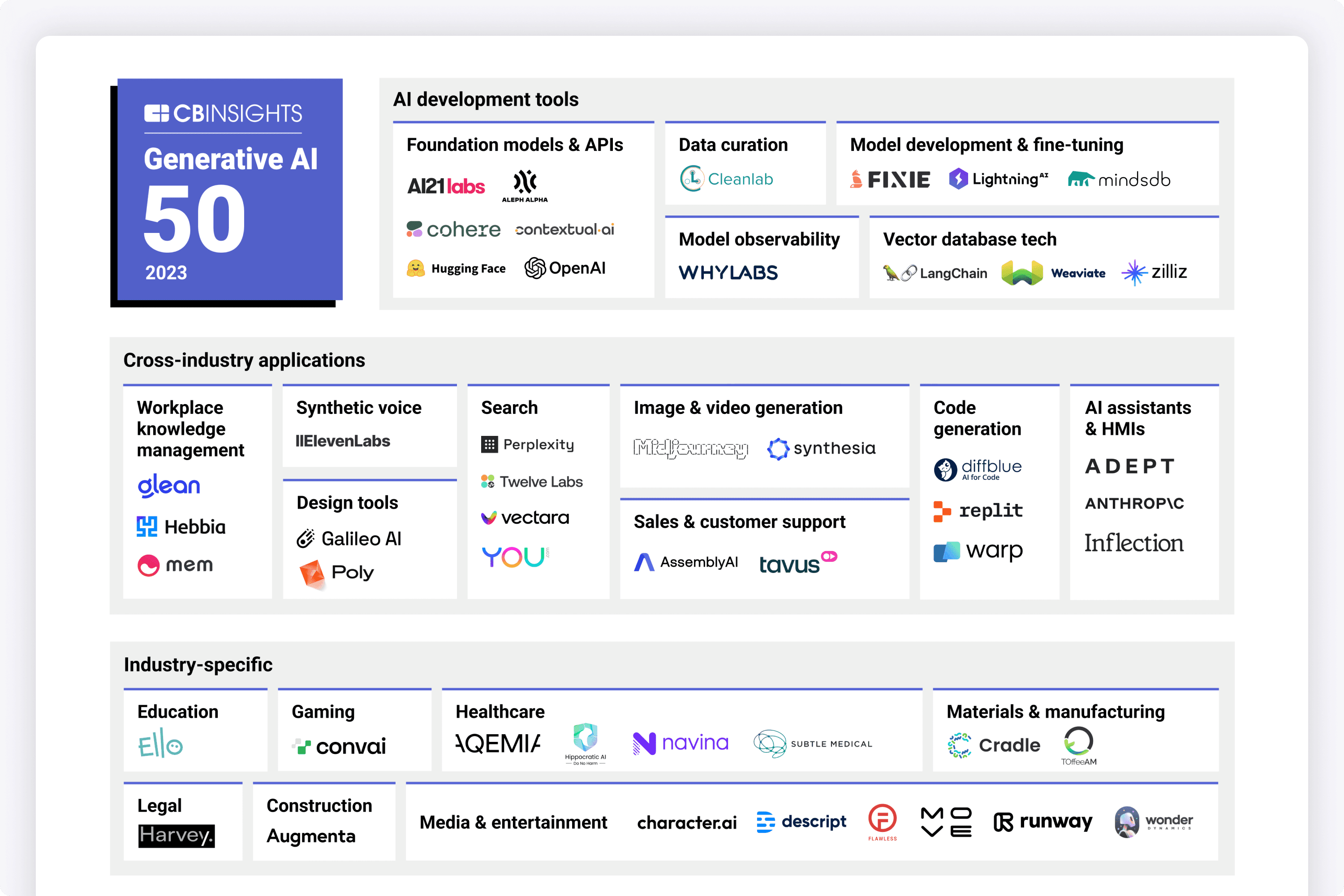
What are other AI platforms in the space doing?
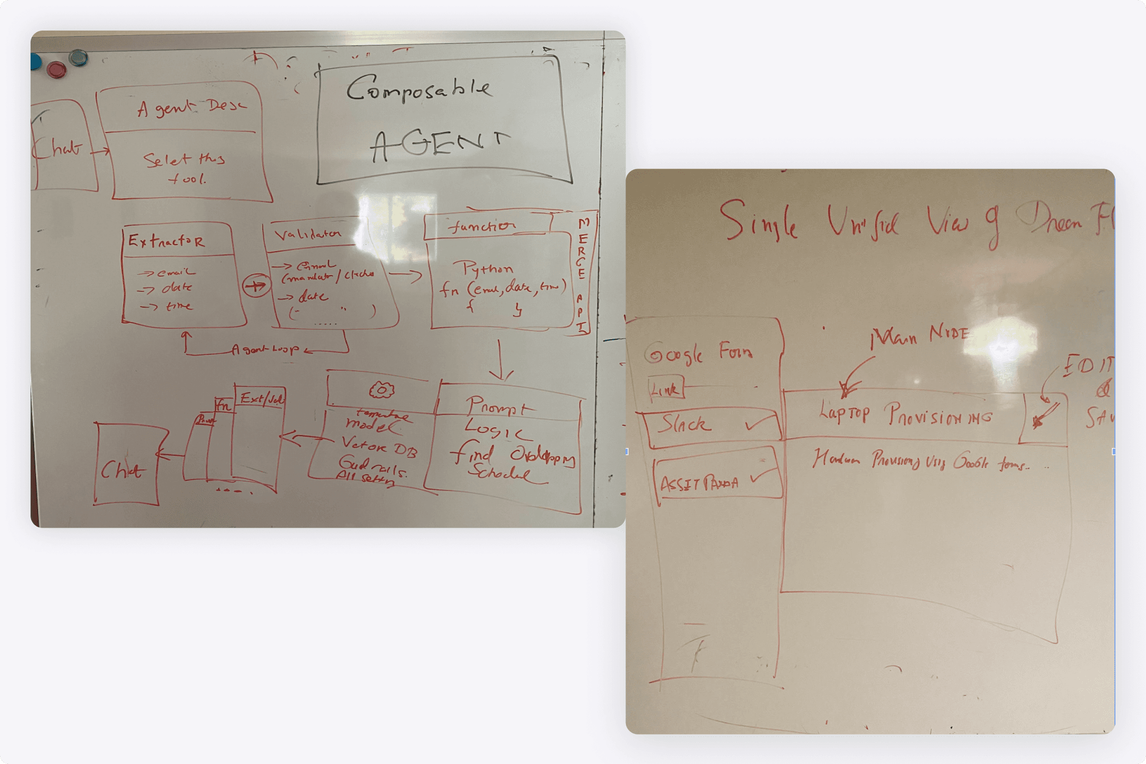
I did a lot of research and would regularly have brainstorm sessions with the CEO about how these systems would be connected together.
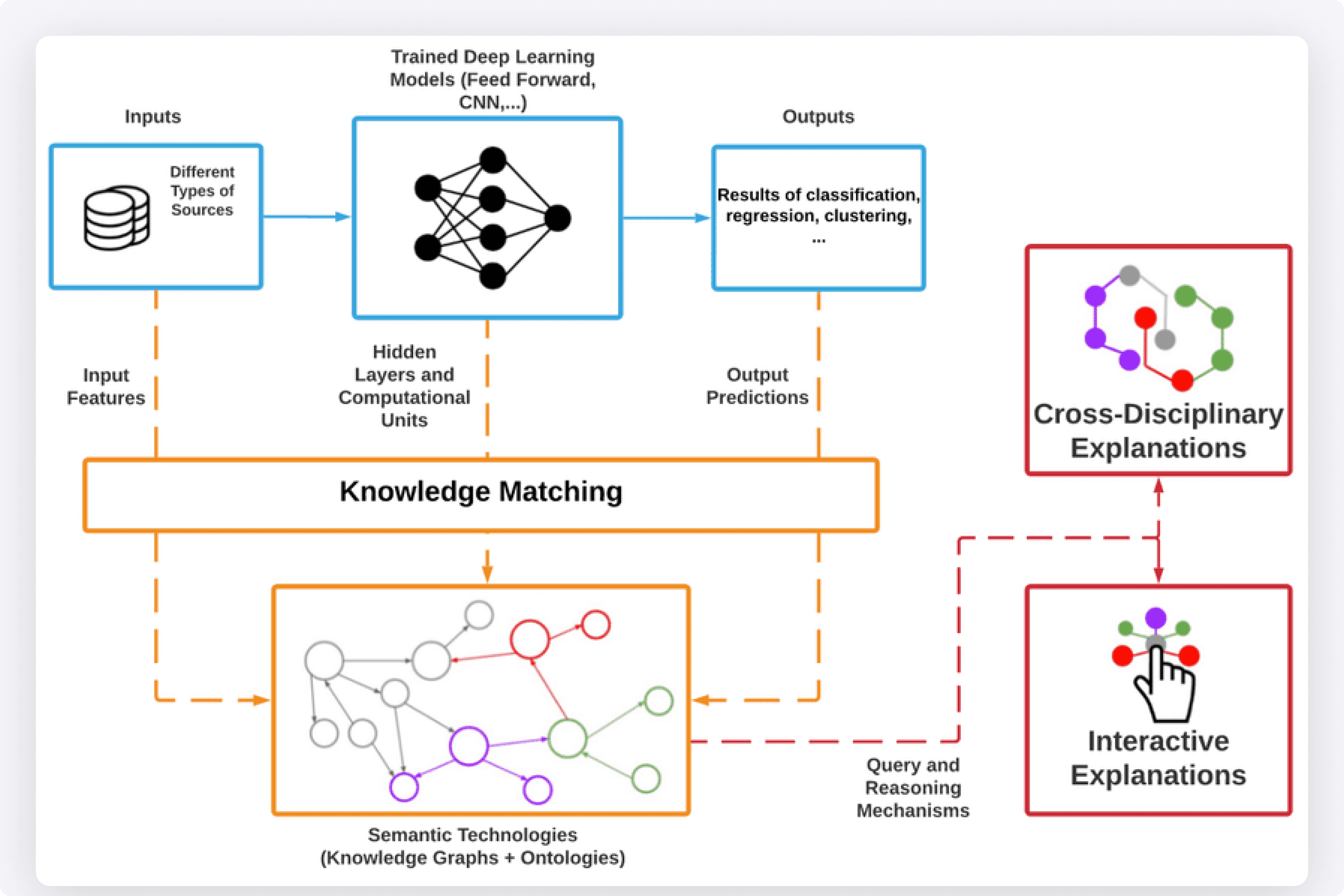
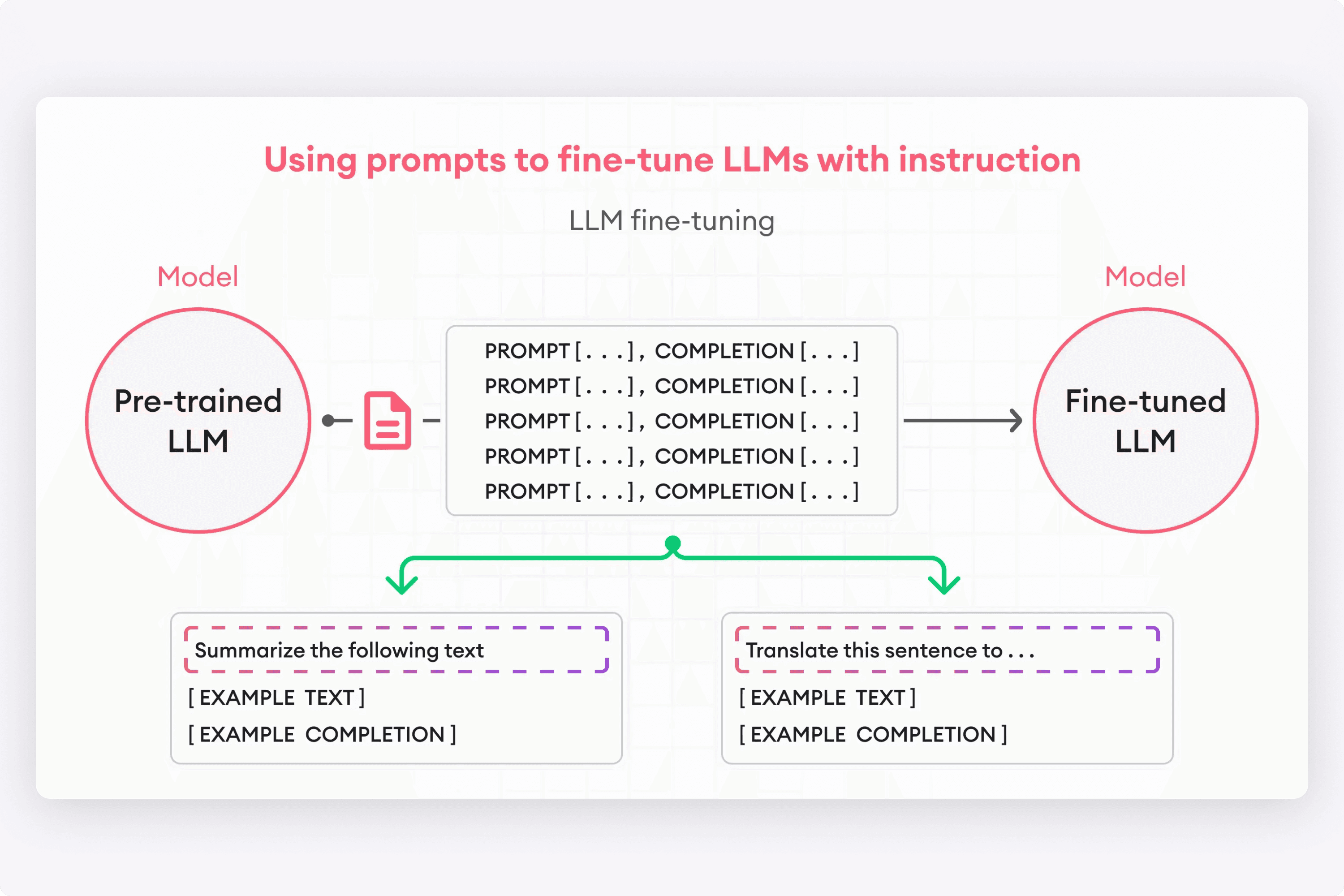
Since the idea was to create a platform where fine-tuning could be done on both open-source & private LLMs, it was important to understand how prompt engineering was done. This way, I could understand what knobs and parameters to expose in the UI.
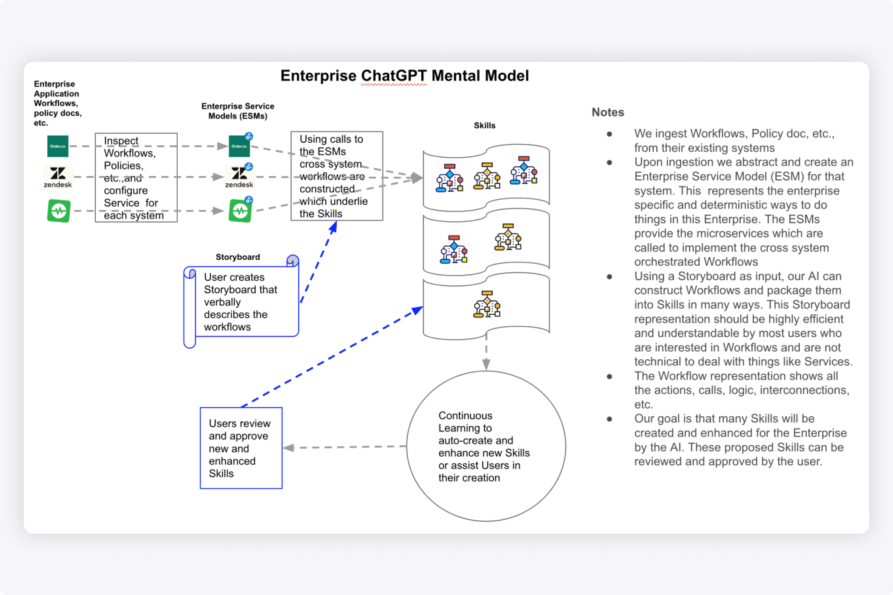
We created high-level architecture diagrams of the journey. This journey consisted of: policies from external systems -> data ingestion from 3rd party apps -> skills that are defined in the EnterpriseGPT system -> response in end user chat experience.
Design Thinking
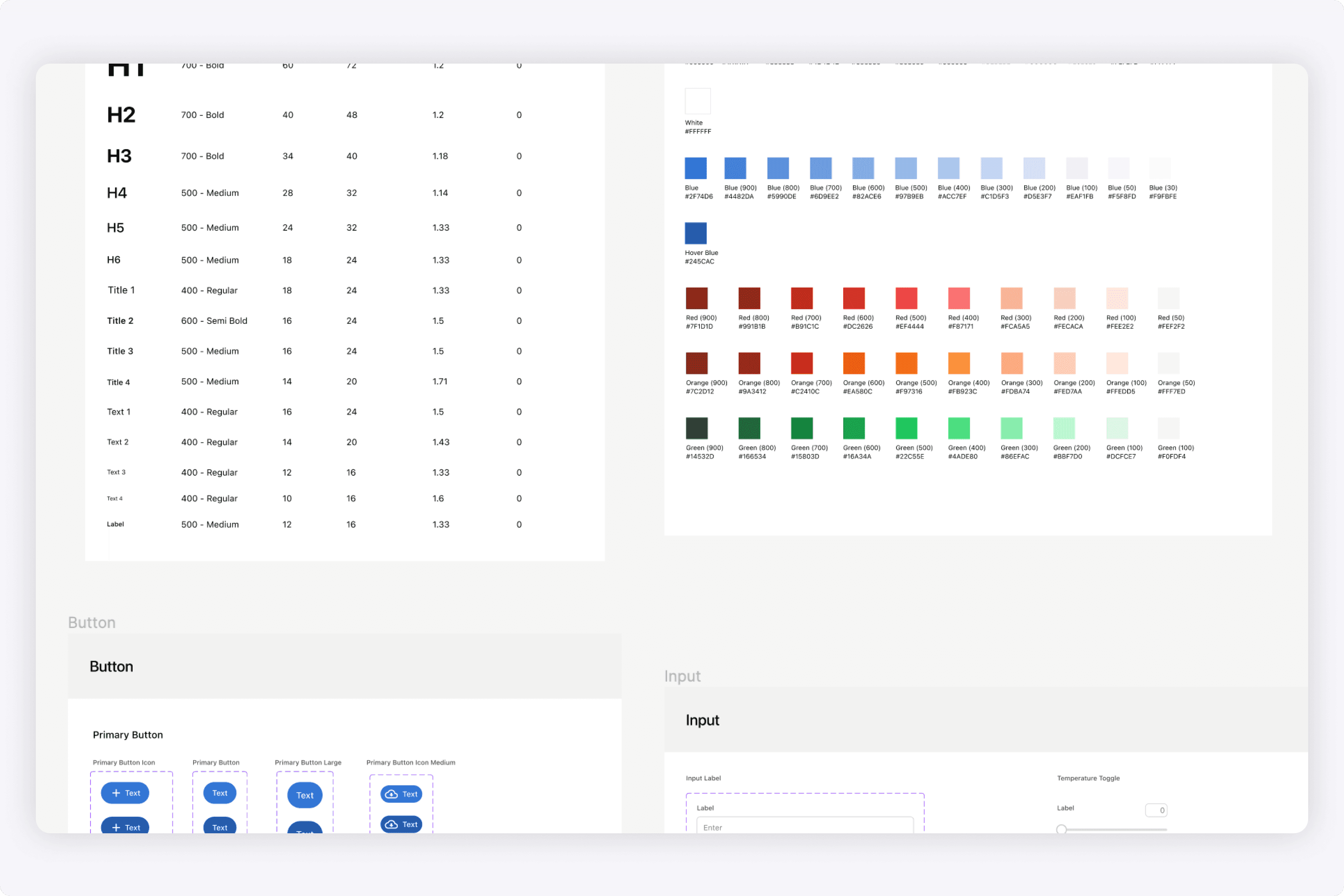
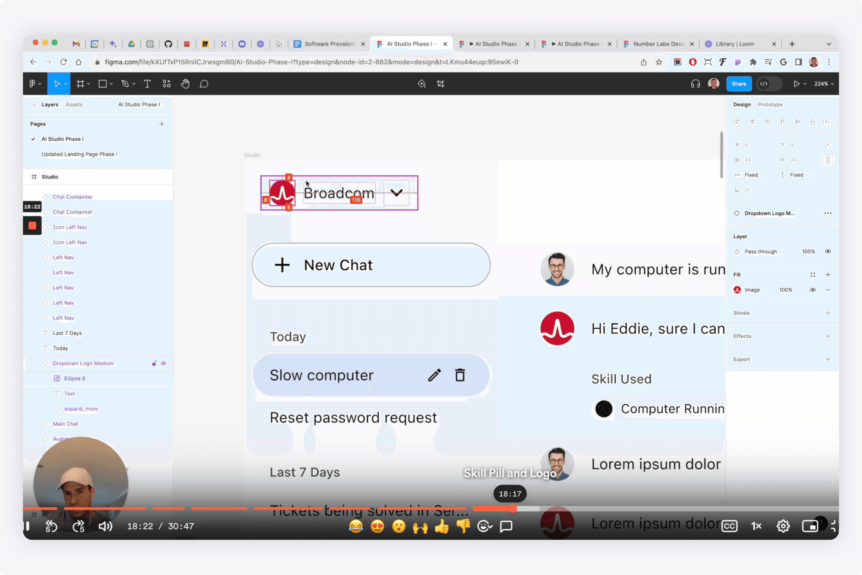
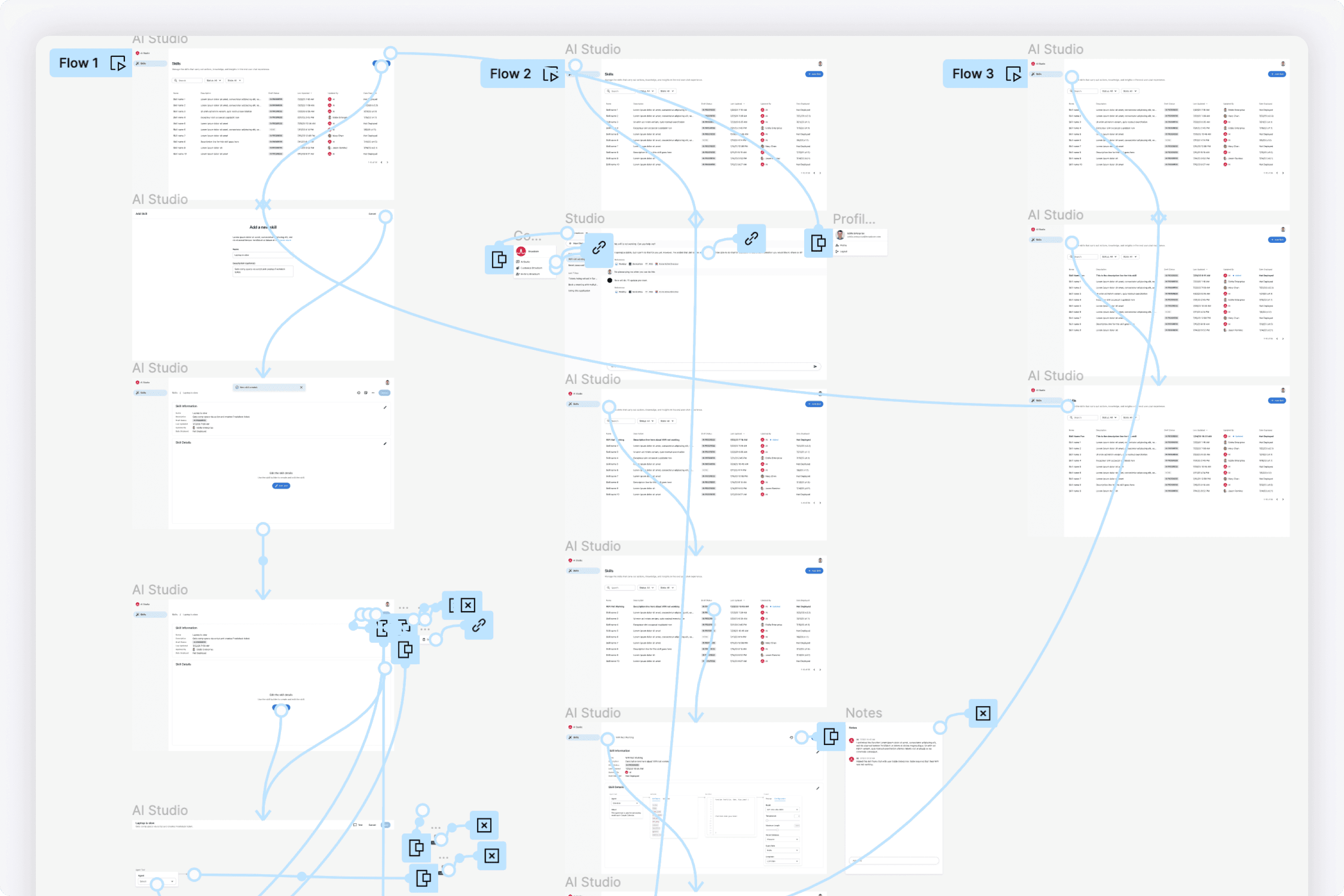
I created and maintained a design system for the project. Additionally, I would deliver many cycles of high fidelity prototypes weekly for different features.
When delivering spec to the engineering team, it was important to establish that the UI had to look pixel perfect. My goal was to establish a culture that UX is important, and the little UI details matter to create a clean polished product.
My Work
These are the sections of the platform I designed.
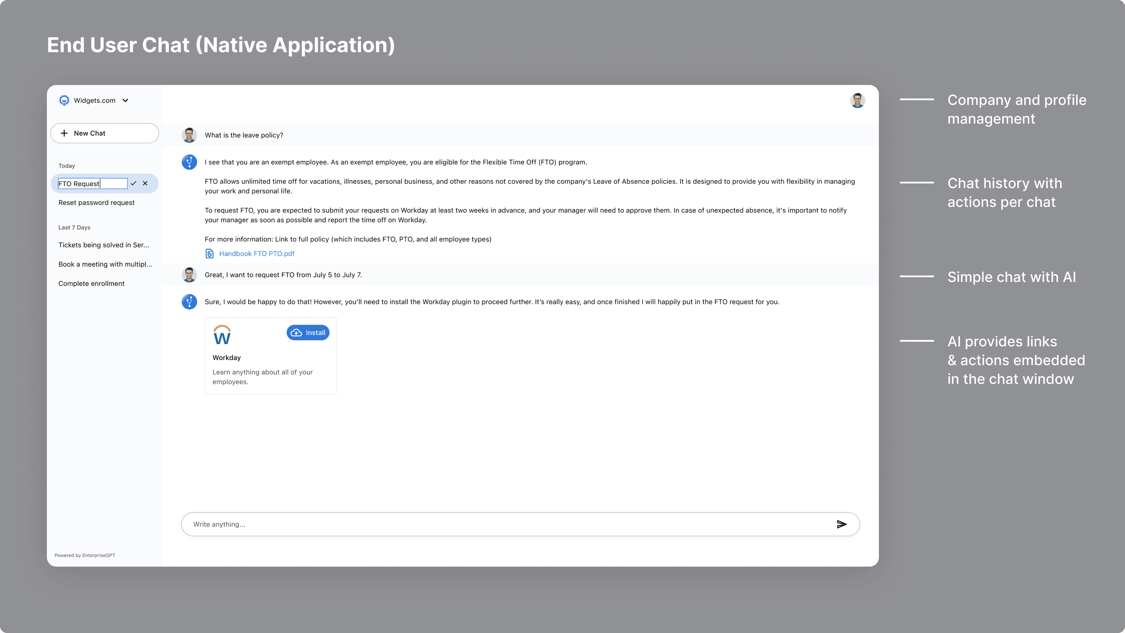
The user experience flow first started with the end user chat experience. ChatGPT was ubiquitous and Bard was just released. We focused on providing a similar experience in three channels:
The EnterpriseGPT native application
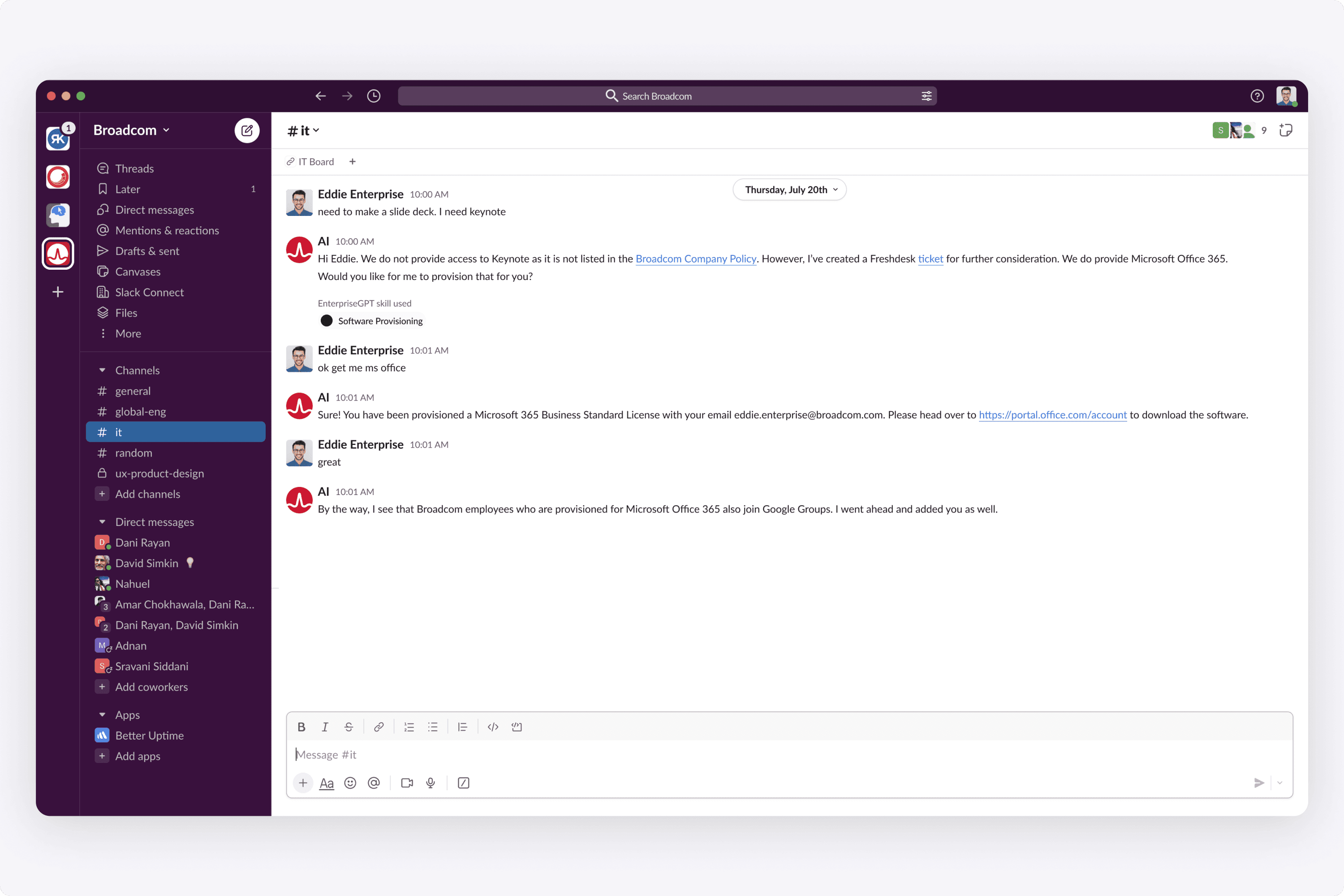
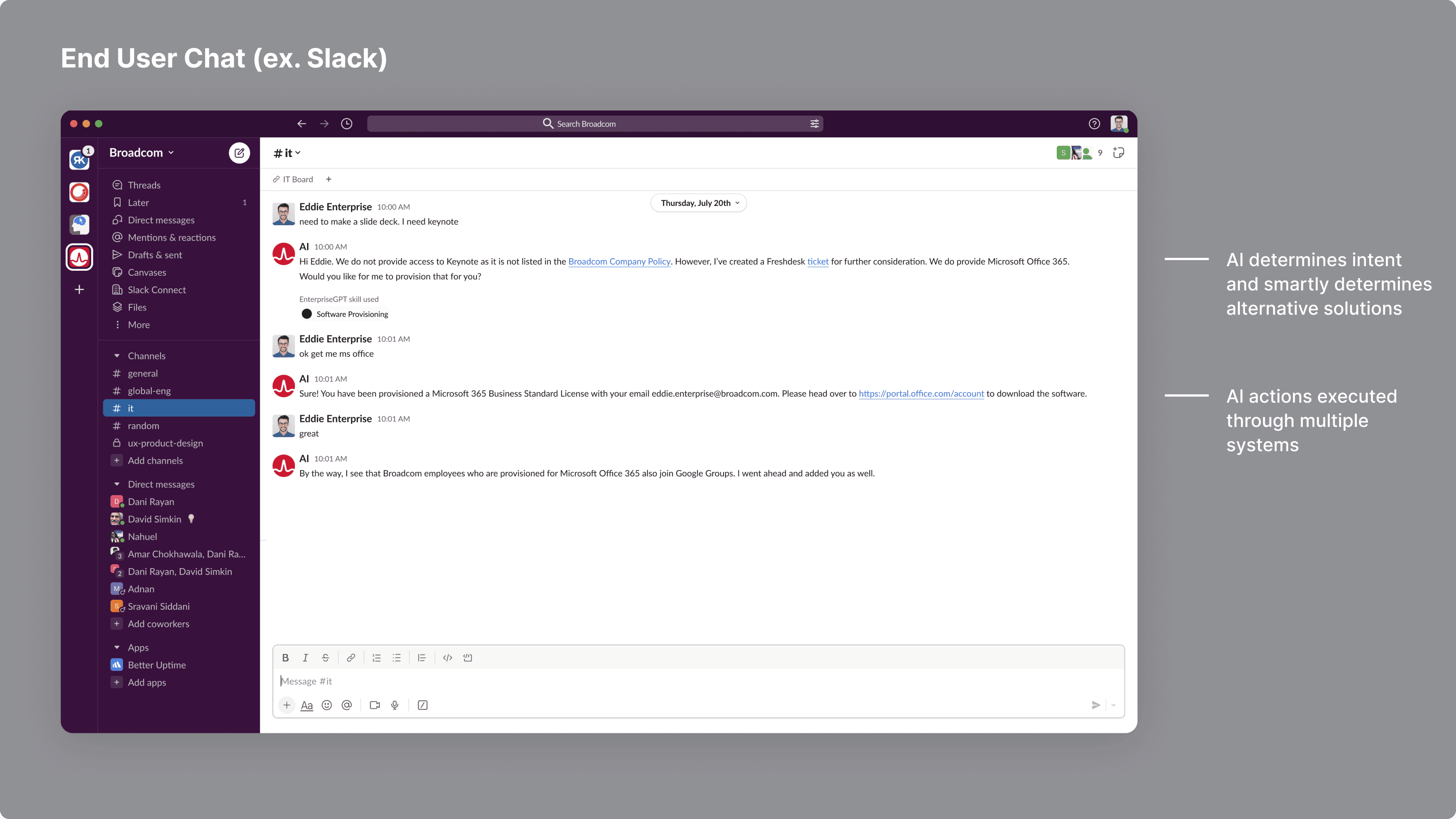
External channels (Slack, Teams, etc.)
A company's intranet
When we demo'ed this, we first wanted others to understand how the end user experience would be.
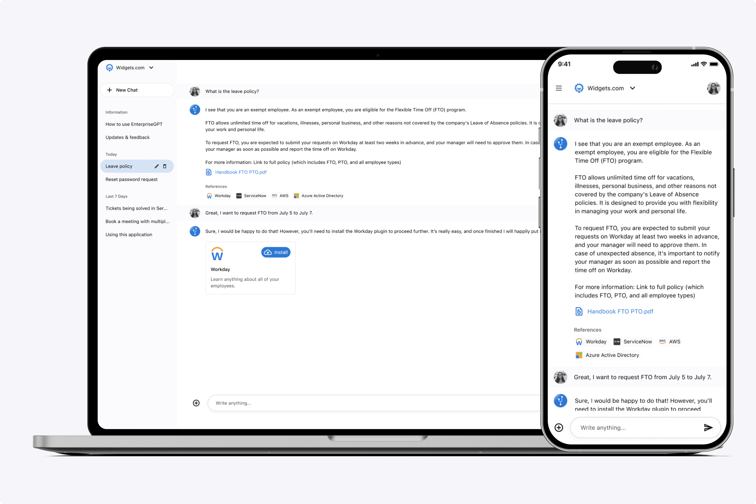
I would deliver spec in multiple screen sizes.
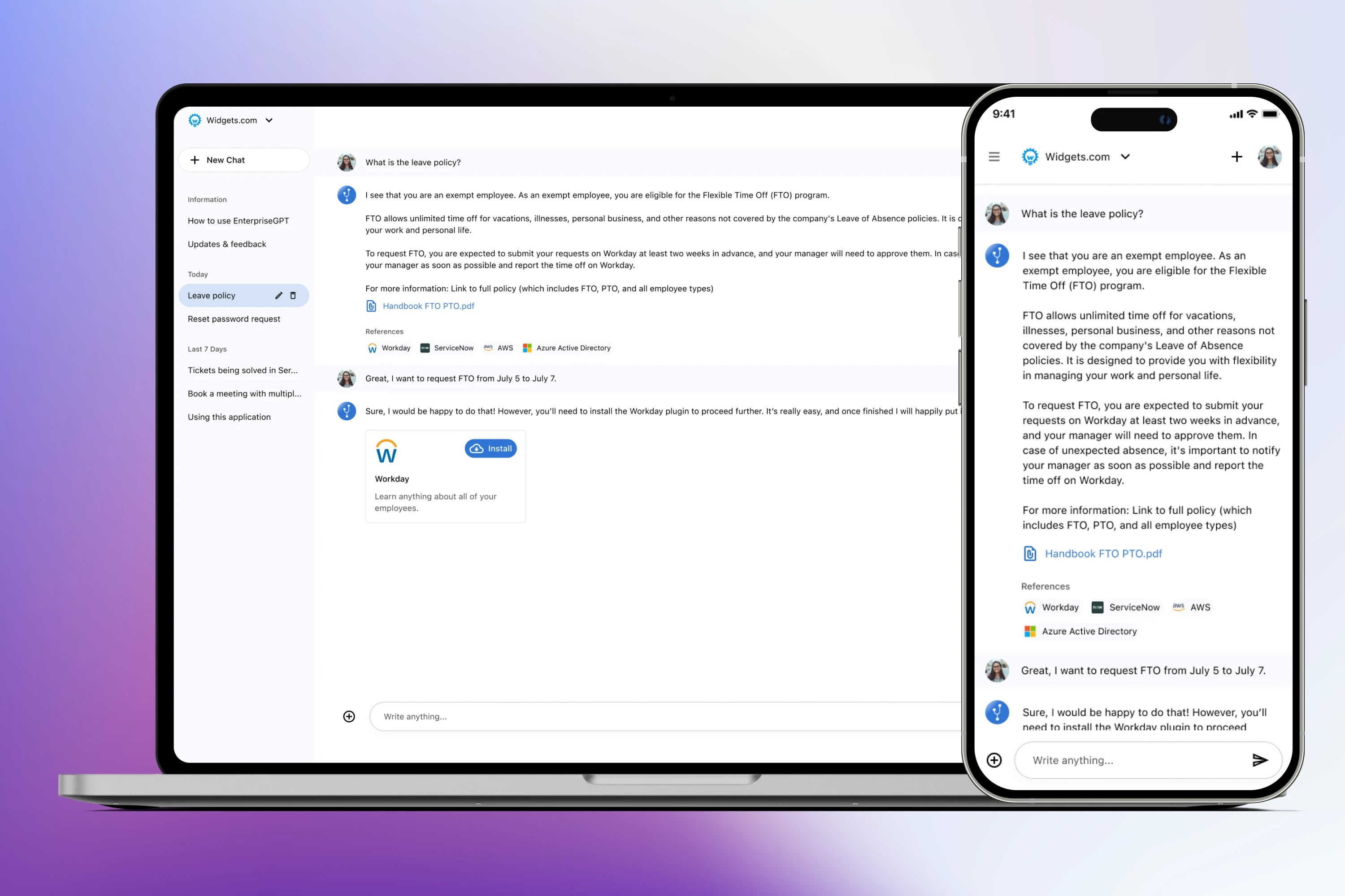
I designed the chat experience in the native application. The idea was to have a place where an employee in a company could chat with the app about anything company related. (Ex. How many days off do I have? How many Zendesk tickets are open?) All of their business related questions - all answered in one place.
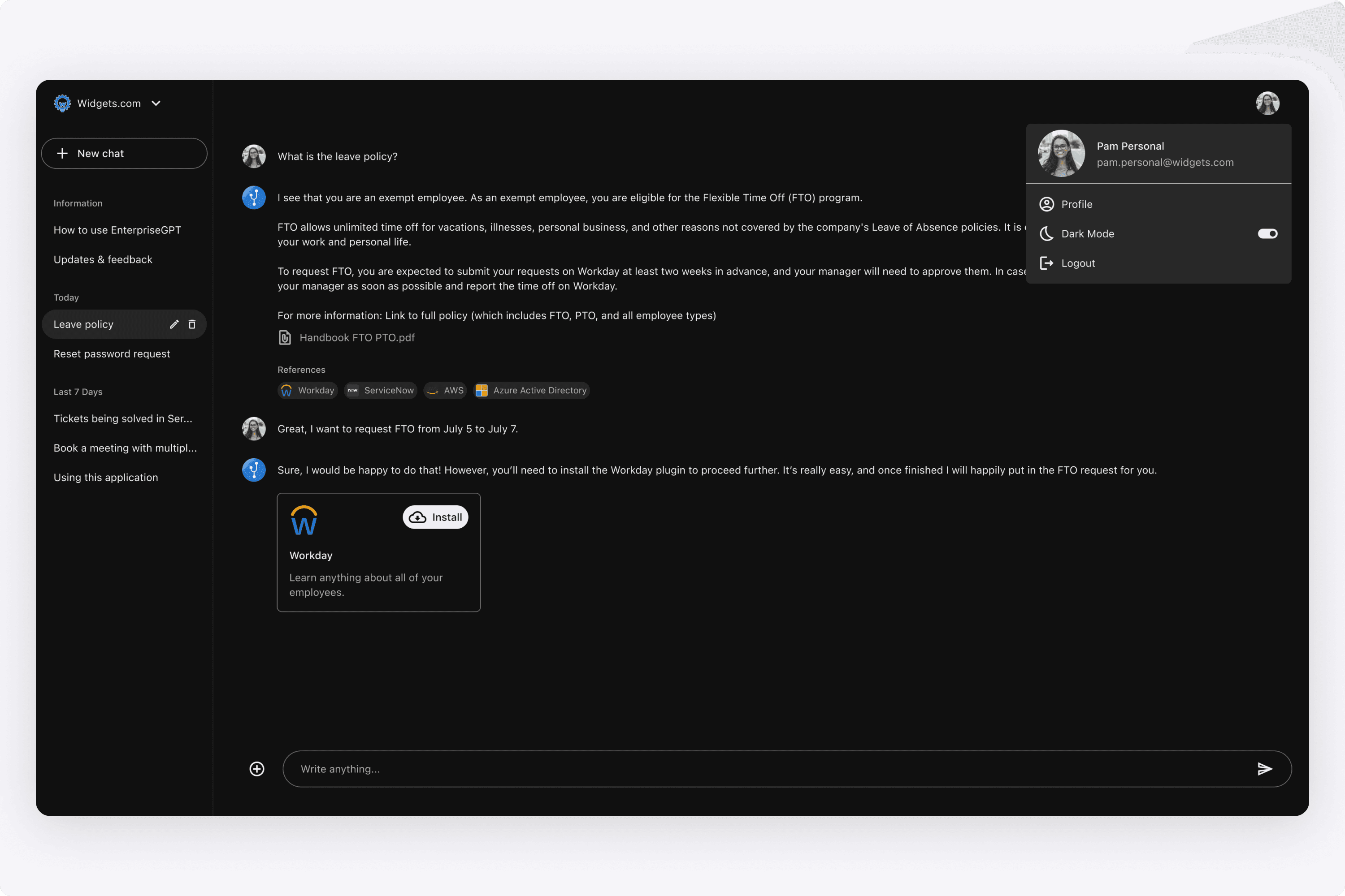
Additionally, we provided Dark Mode. Here is a Figma demo of how a user can switch the appearance. I also considered having it in the dropdown menu as a pullright (ex. YouTube has a menu item that says Appearance, and pulls-right to choose between Light or Dark), but opted to keep it as a toggle for now.
The idea was to support external channels as well. Here is a mockup I did of the AI chatbot in Slack. This helped others visualize what it could look like (especially to VC investors).
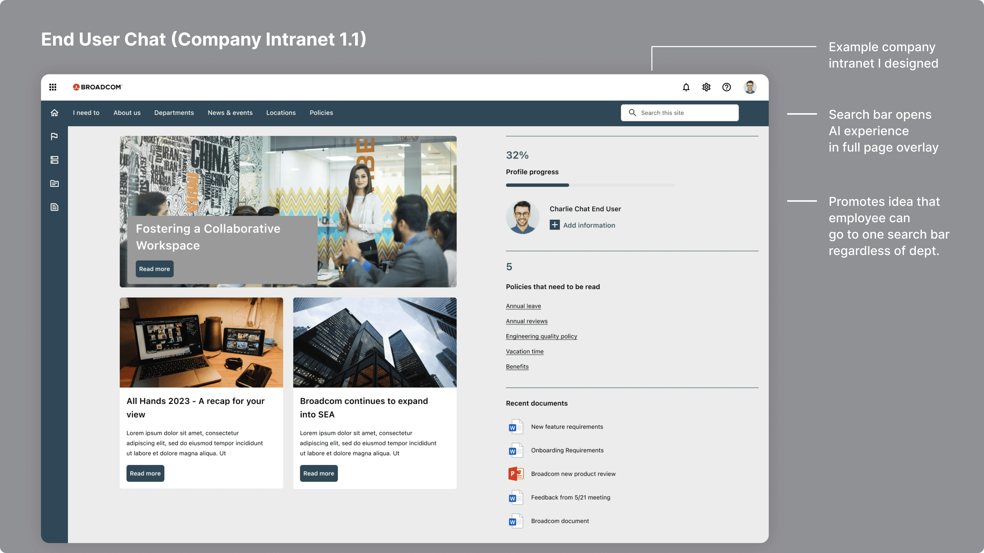
Additionally, I created this demo of how it could look like on a company's intranet. I designed this example intranet, and showed how clicking on the search bar triggered the AI experience. The goal was to eliminate the confusion employees have when they need to know something about the company. Just go to the search bar and ask the AI.
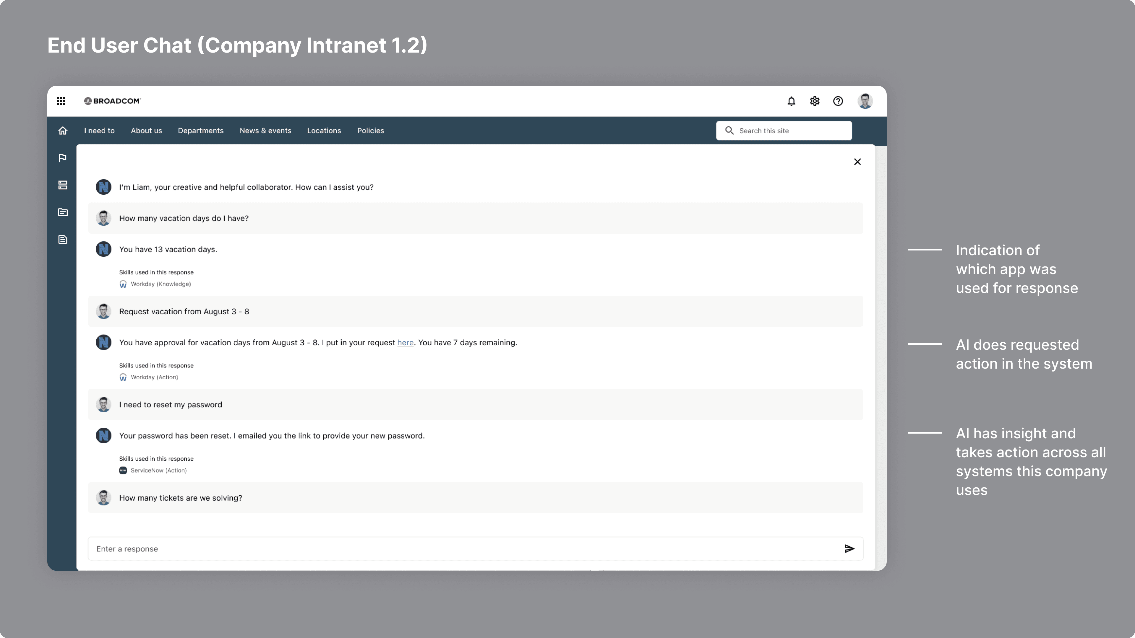
The AI has ingested data policies from all systems (Workday, ServiceNow, Jira, AWS, etc), so the idea was to eliminate this pain point for enterprises where employees waste time finding answers.
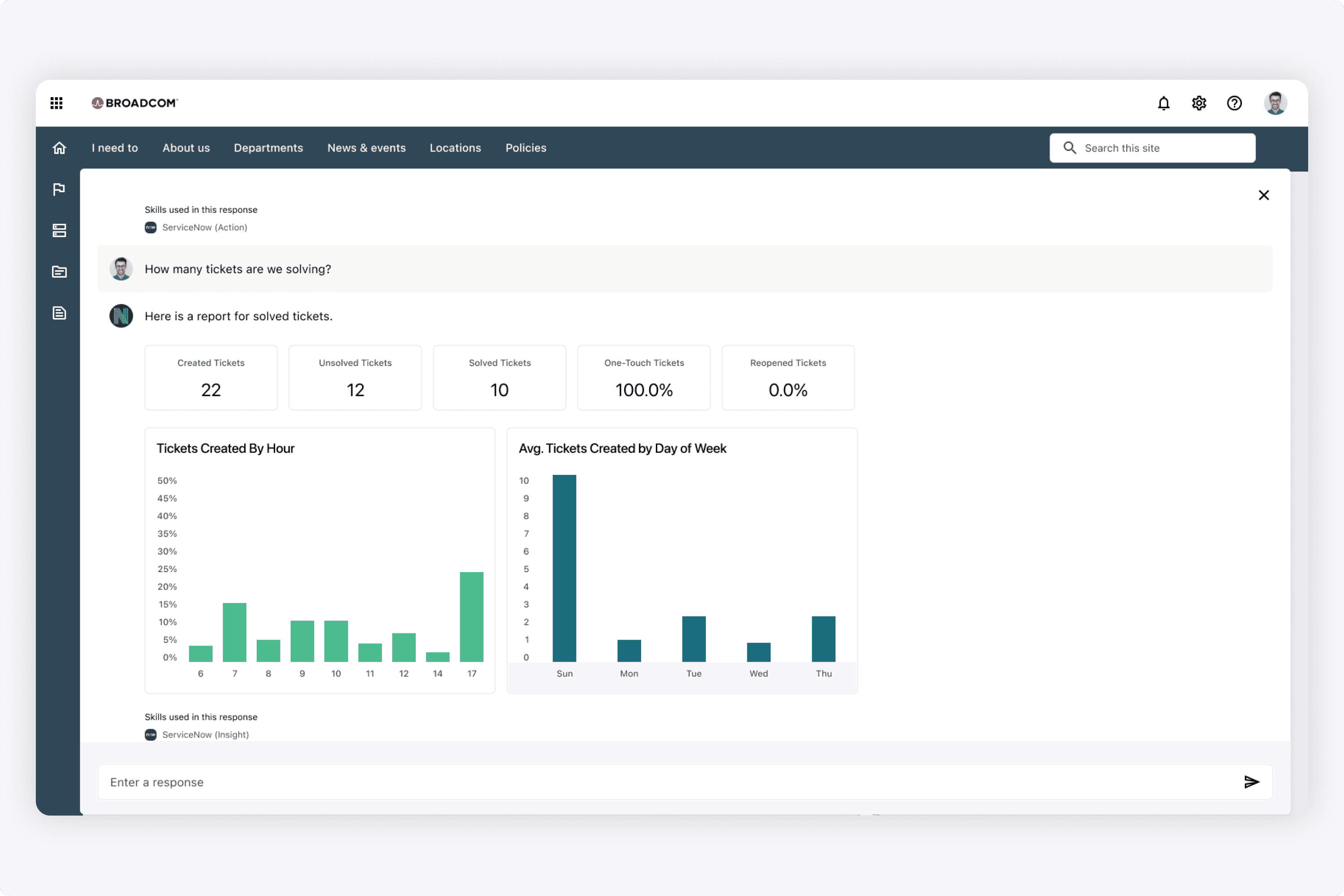
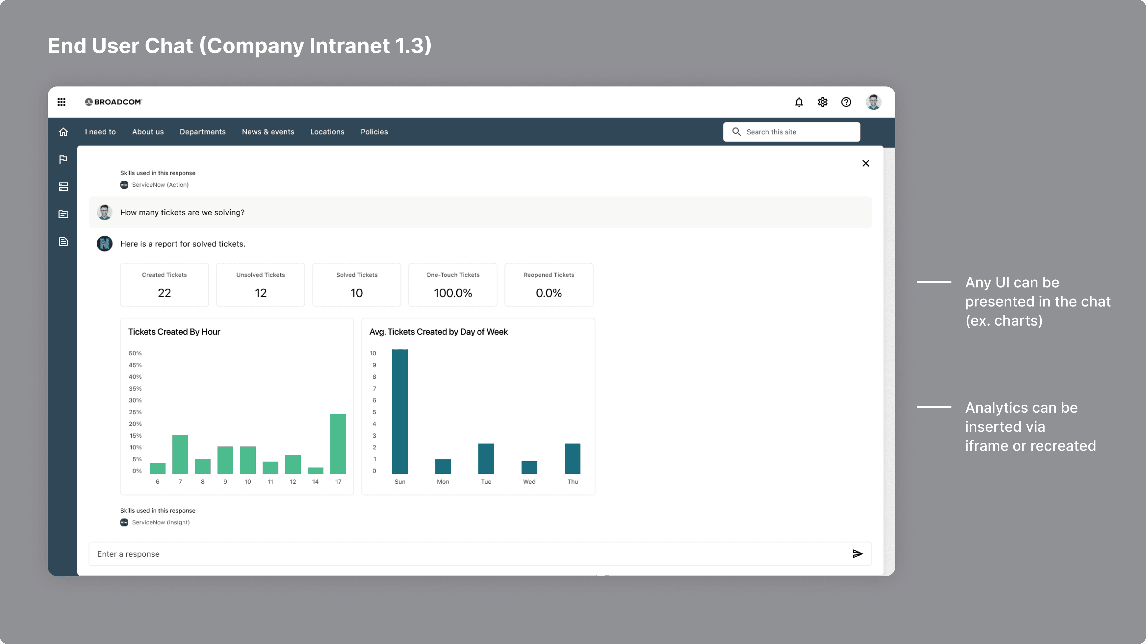
The goal of this demo was to show the full breadth of responses the AI could give. Responses were either insights or actions. An action could be to schedule time off for an employee, or give them insights into a ticket report in ServiceNow.
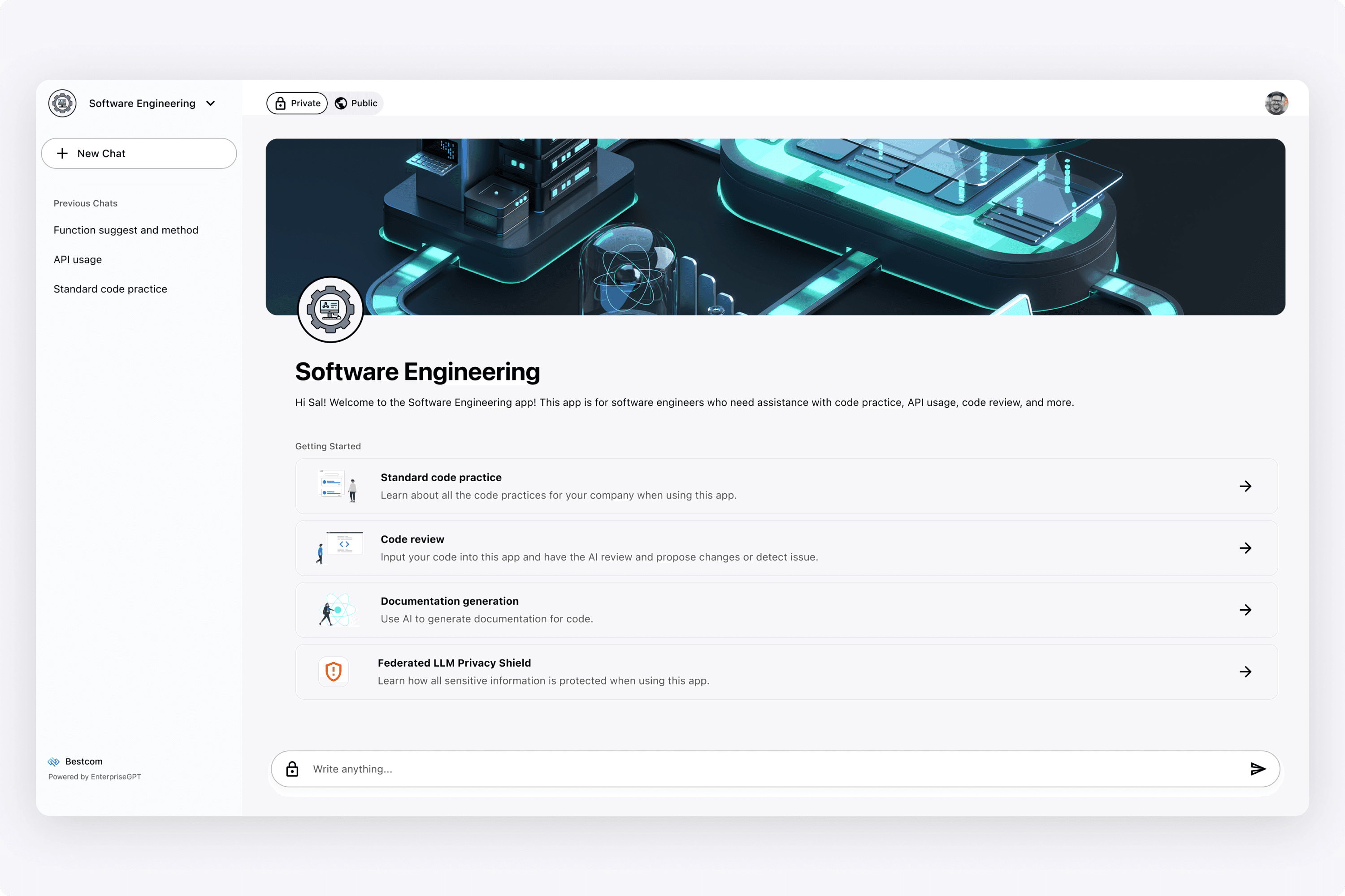
When designing each app, I wanted each app to have a classic app feel (banner + profile picture). Then users needed to know how they can use it, so I added the "Getting Started" section. However, we also introduced the idea of a private vs public switch, that determined which LLM's were called underneath the hood.
The reality is, many enterprises don't want their employees using ChatGPT as they are inputting sensitive information. Therefore, users had the option of using a public LLM (GPT 4 which was the most powerful), and getting blocked if their query contained sensitive information. Or they could use their private LLM, but it may not be as powerful as OpenAI's GPT.
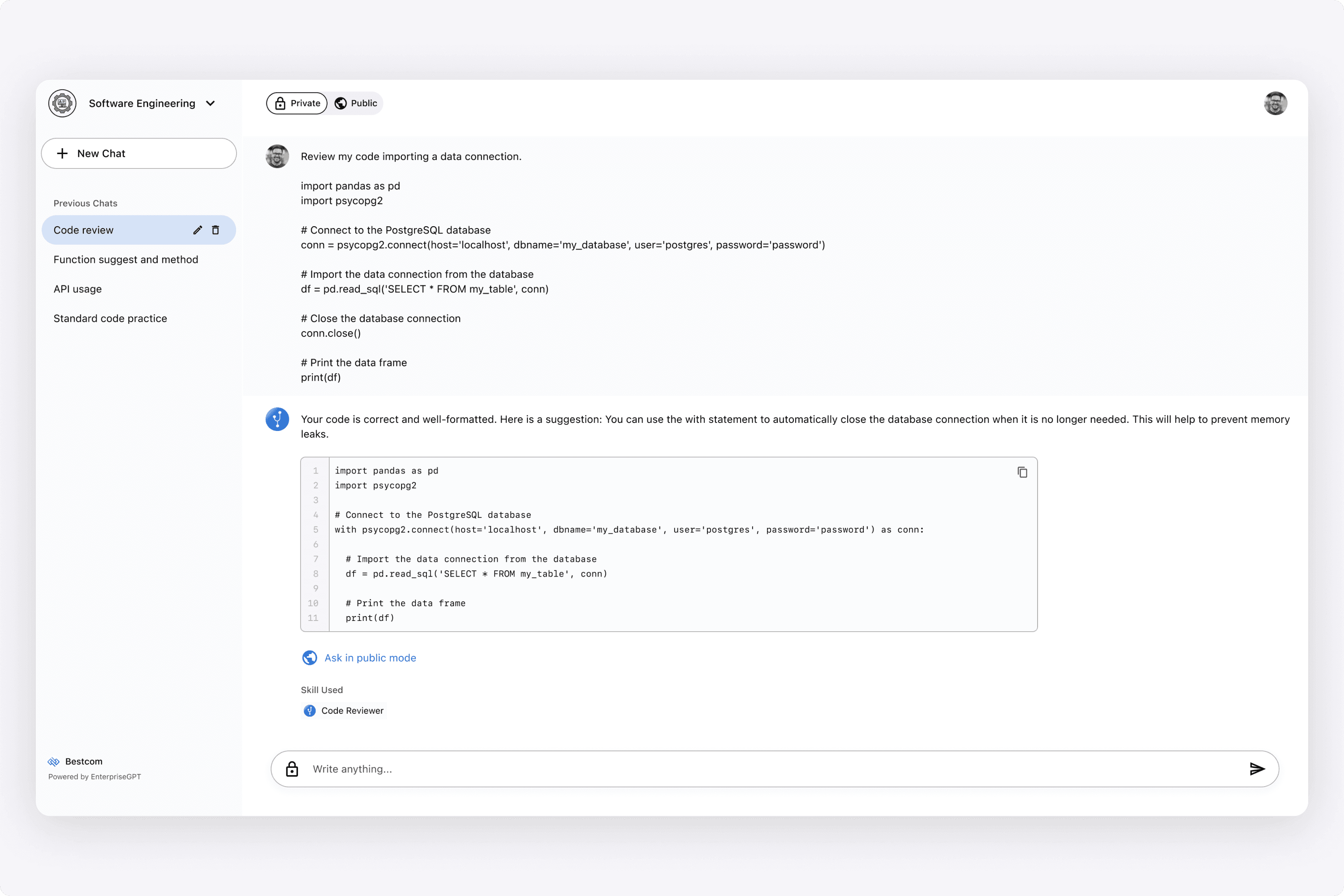
That distinction could have been done automatically underneath the hood, or in the UI. In this example, we opted to do in the UI first by giving the user the toggle to switch between having the AI response come from the public LLM (GPT 4) or the private one (their own customized one).
In this example, the AI also gave suggestions after its response. It's prompting the user to ask in public mode if the answer was unsatisfactory (or could be suggested vice versa).
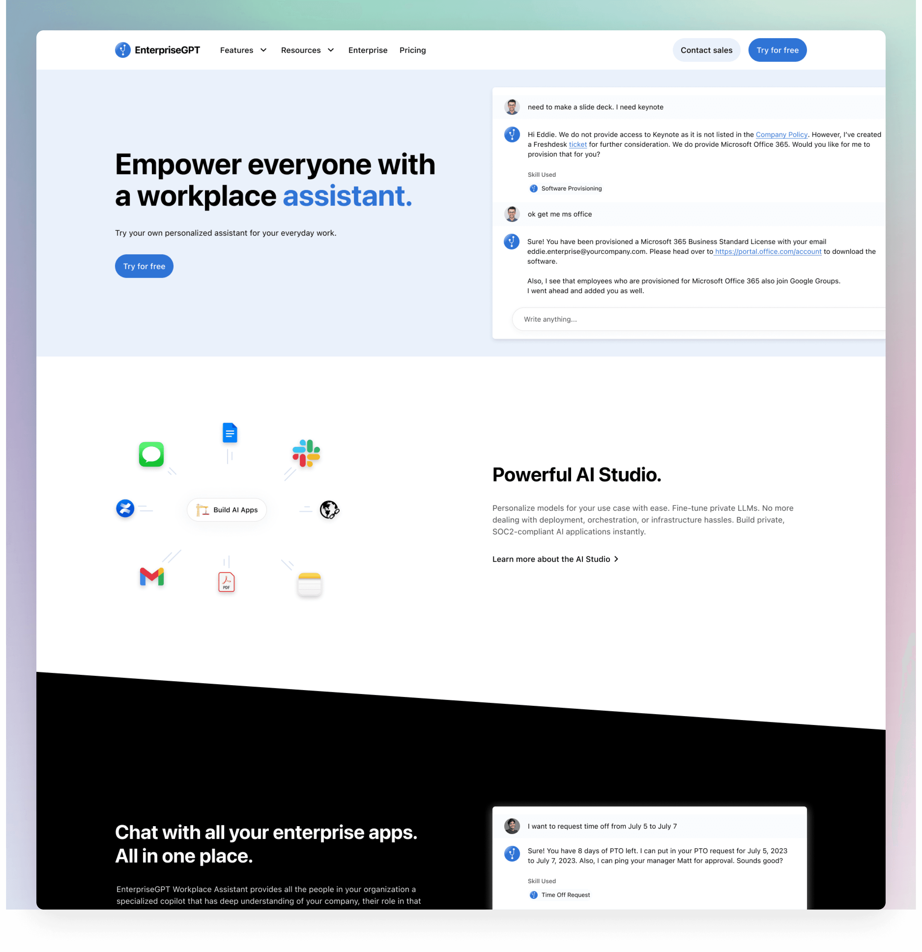
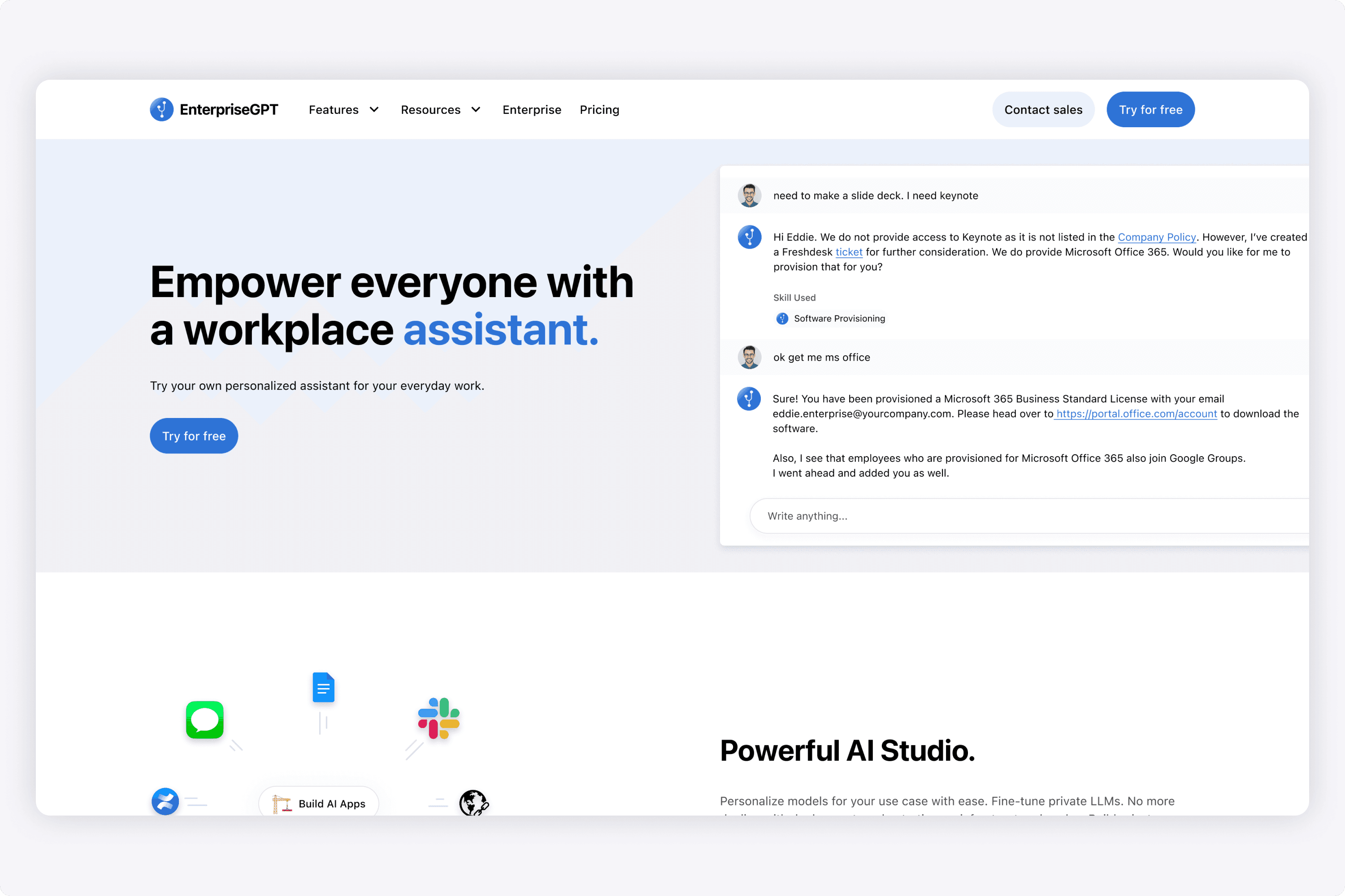
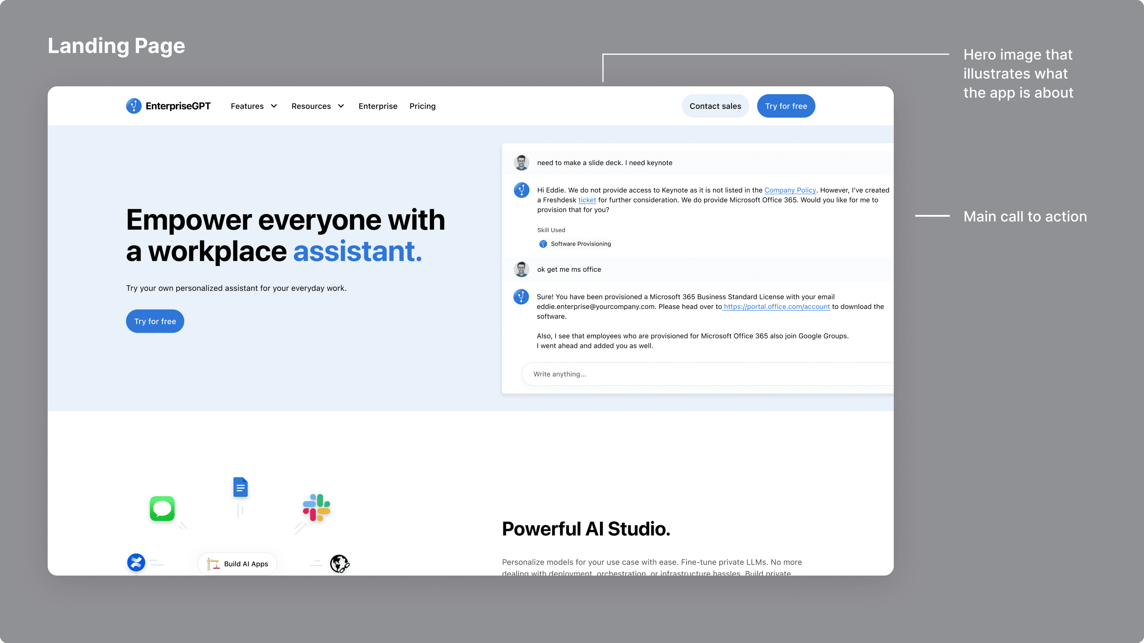
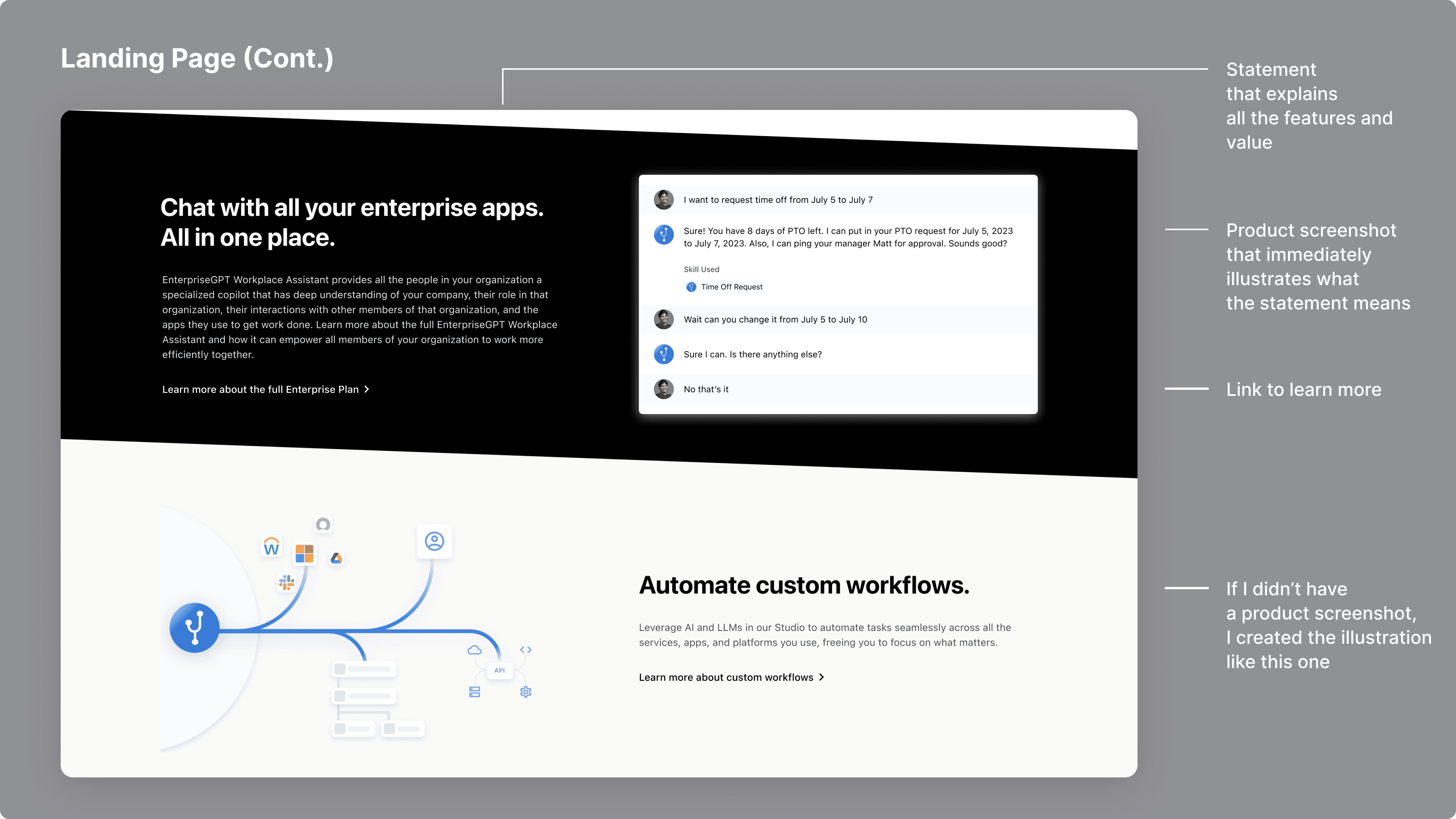
I designed a simple landing page for new users to learn about the platform and sign up. The idea was to keep it simple like the Slack or Discord landing page. I created all of the illustrations on the landing page so it could help communicate the main features of each section.
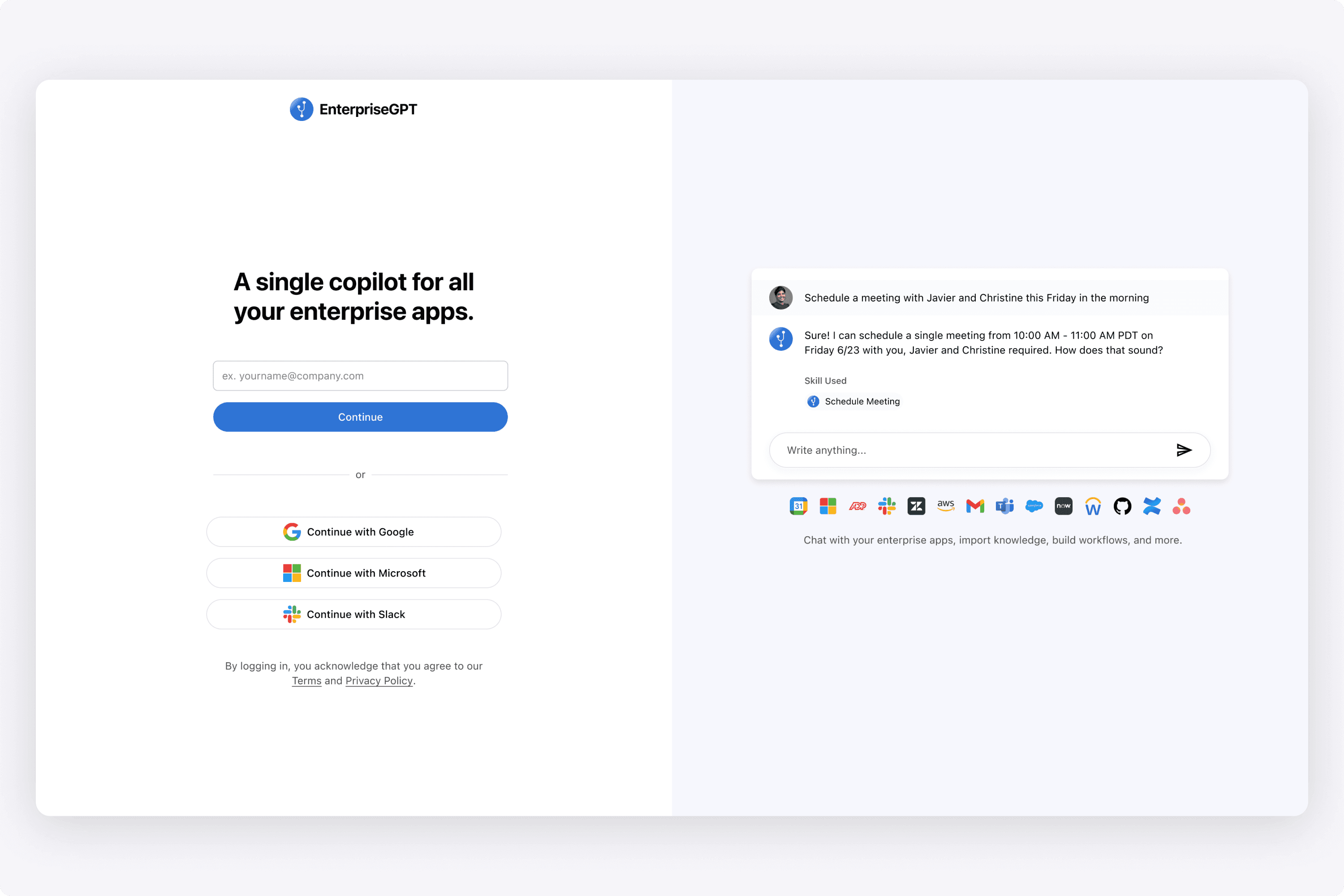
For this sign in page, I really wanted it to be clean. I researched sign in pages from many different popular SaaS apps, and the one that I gravitated towards was the split screen view. Inputs on the left side, delivering value on the right side.
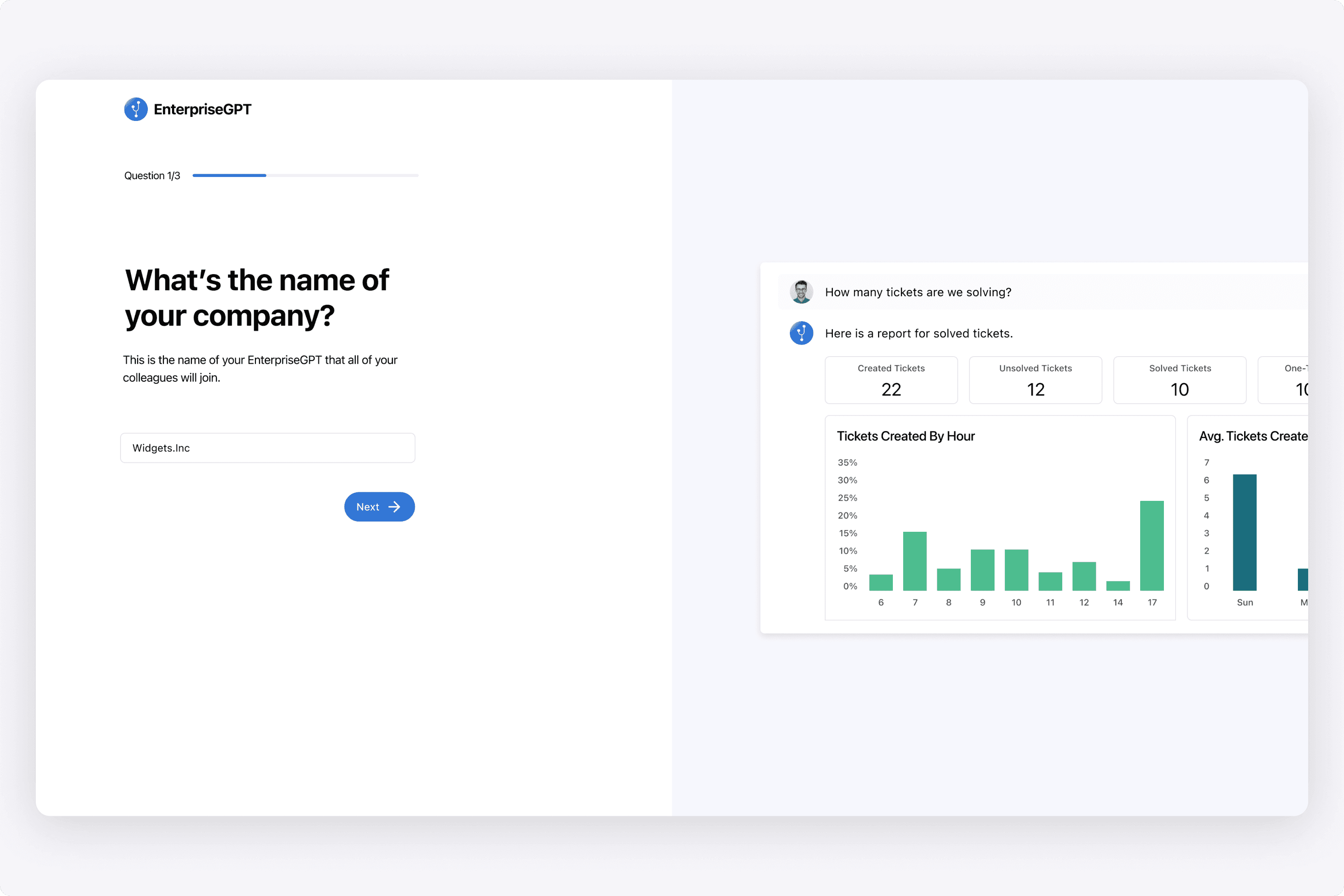
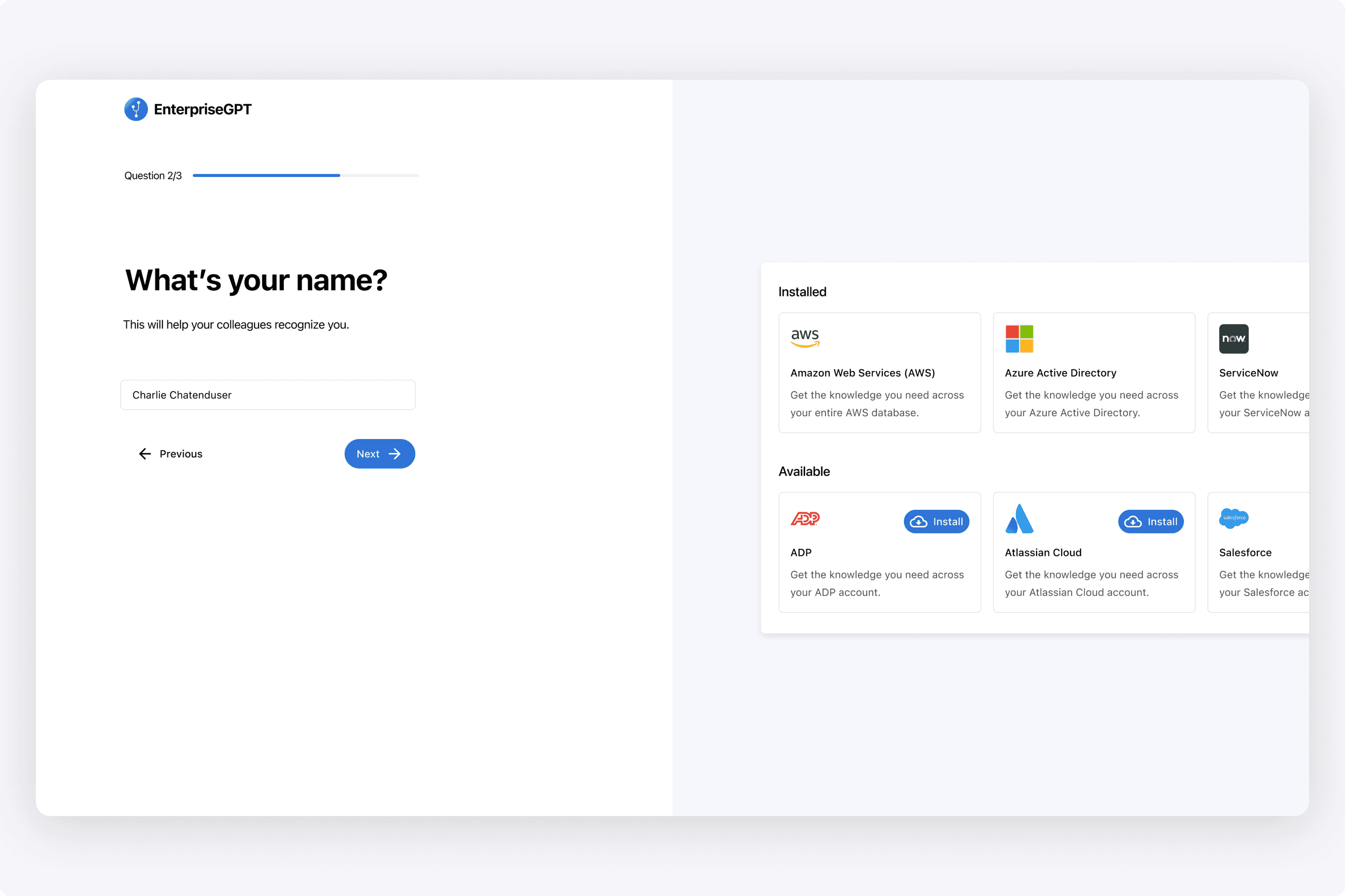
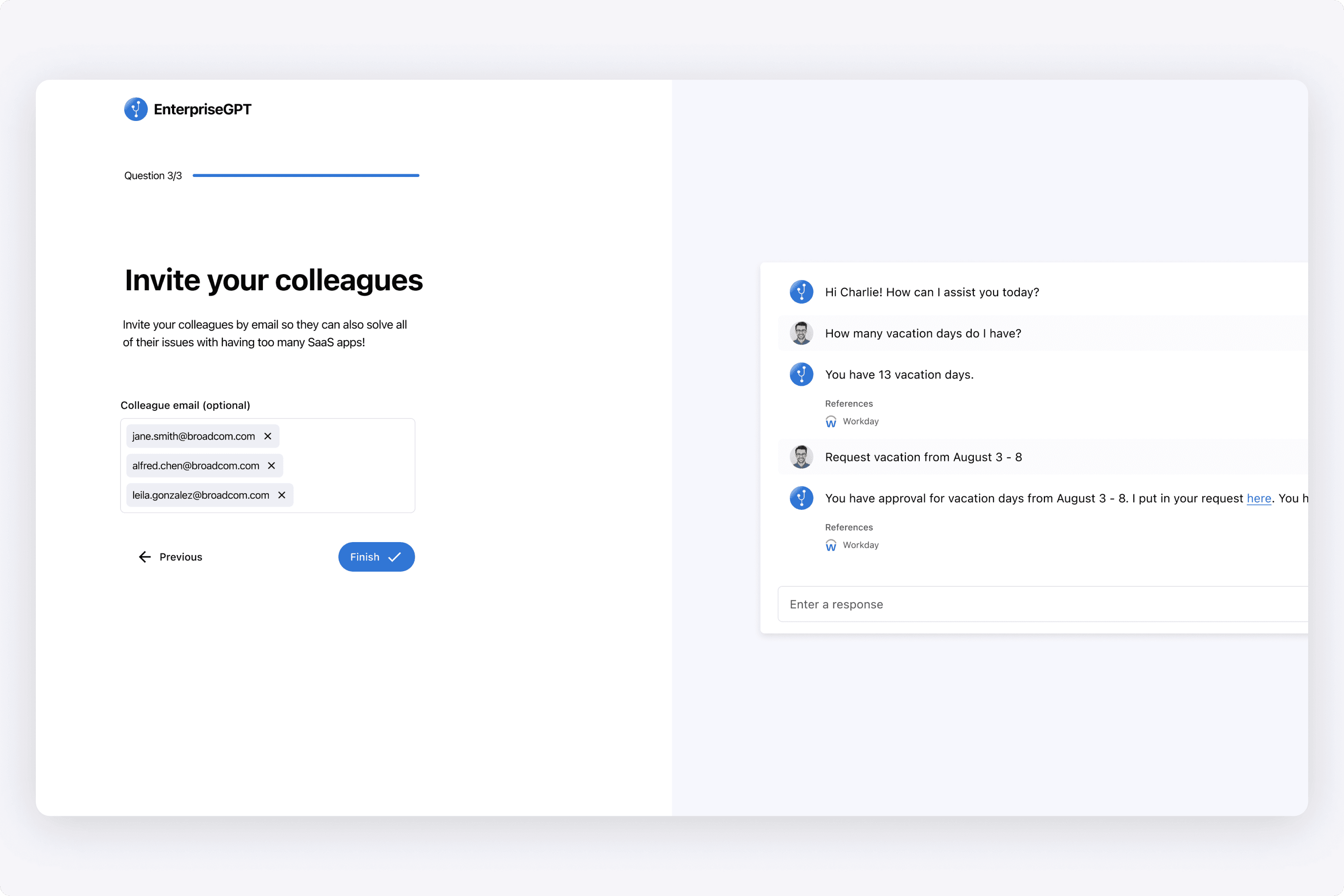
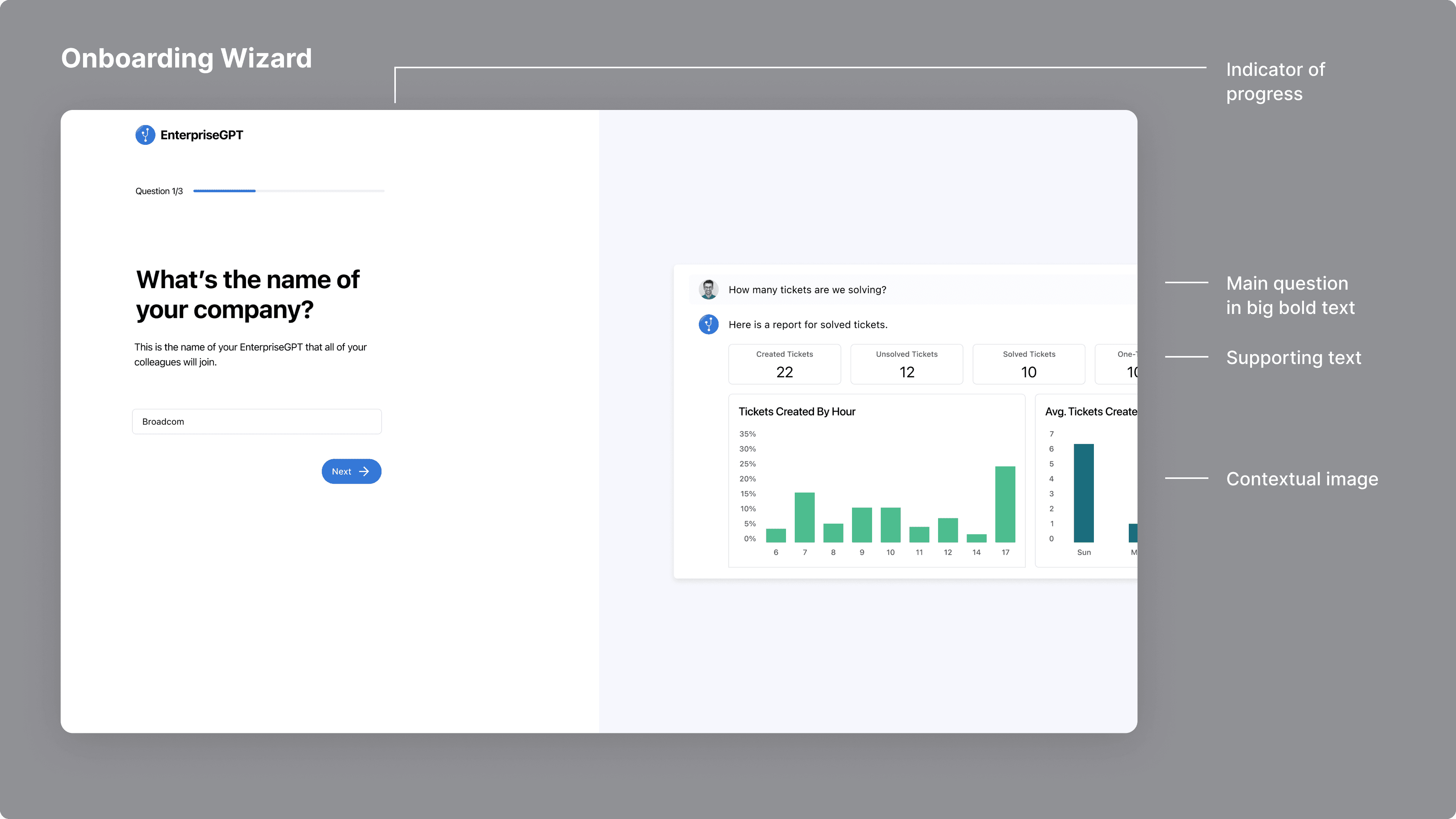
When designing this onboarding wizard, I wanted it to be simple and clean. I looked at a lot of major onboarding wizards from big SaaS companies to understand the best UX traits of a wizard before designing. Design-wise, I tried to keep it as simple and clean as possible.
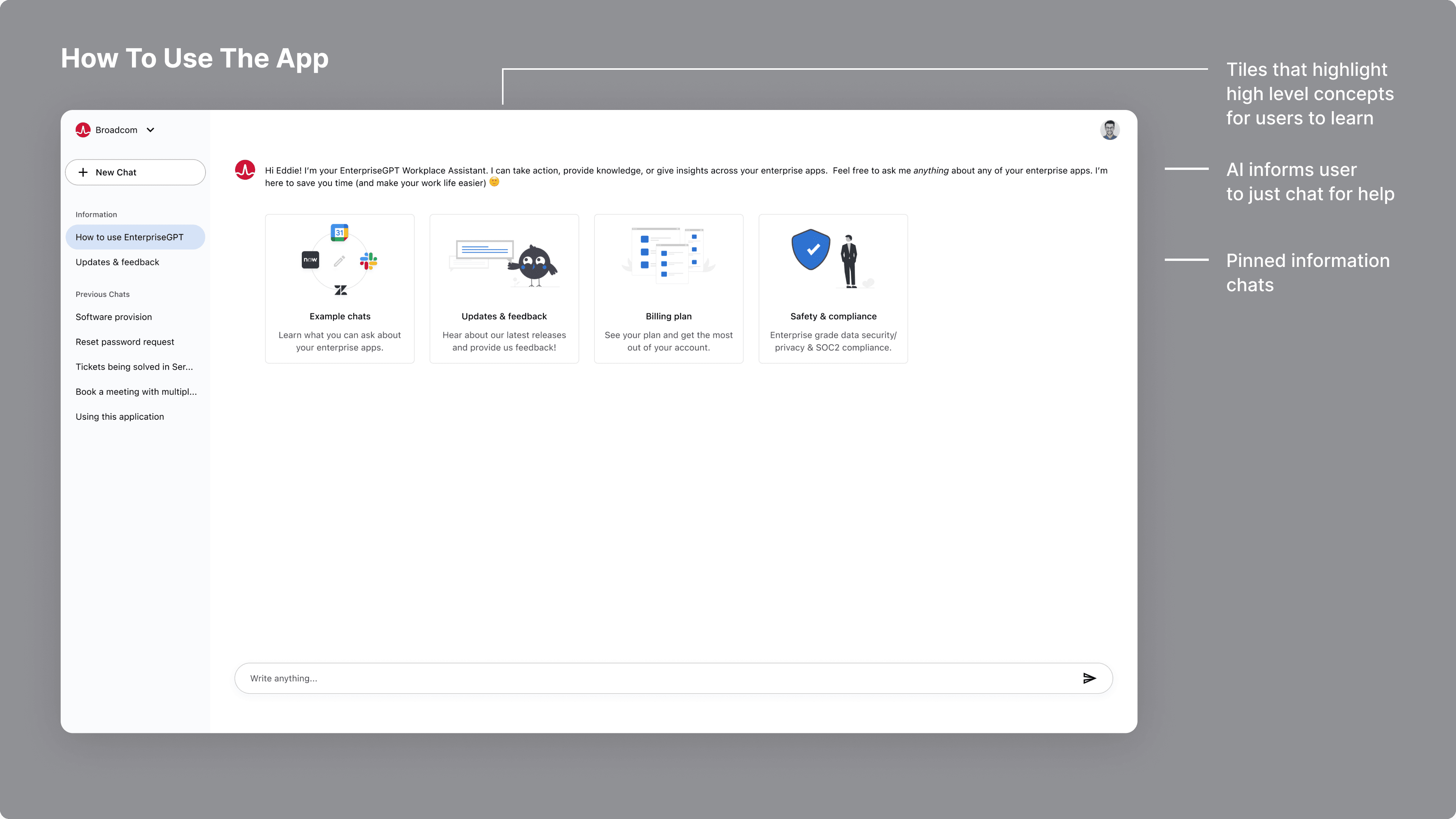
When a user landed in the application, I considered how we could instruct them on how to use the app. Personally, I like simple explanation videos as I think they are straight to the point, but that wasn't an option at the time. Rather than doing a tour, I liked the idea that Discord has when a user enters into a channel. They get these big tiles that a user can click on to learn more. I thought that was cool and was inspired by that.
We didn't have many tiles starting out, but from, a user would drill in and learn more. The main thing we wanted users to learn is: What are the example chats you can ask? When starting out, a new user may just not have an idea what the AI is used for. We wanted to inform them it can be any business related use case, whether it's HR, Engineering, and more.
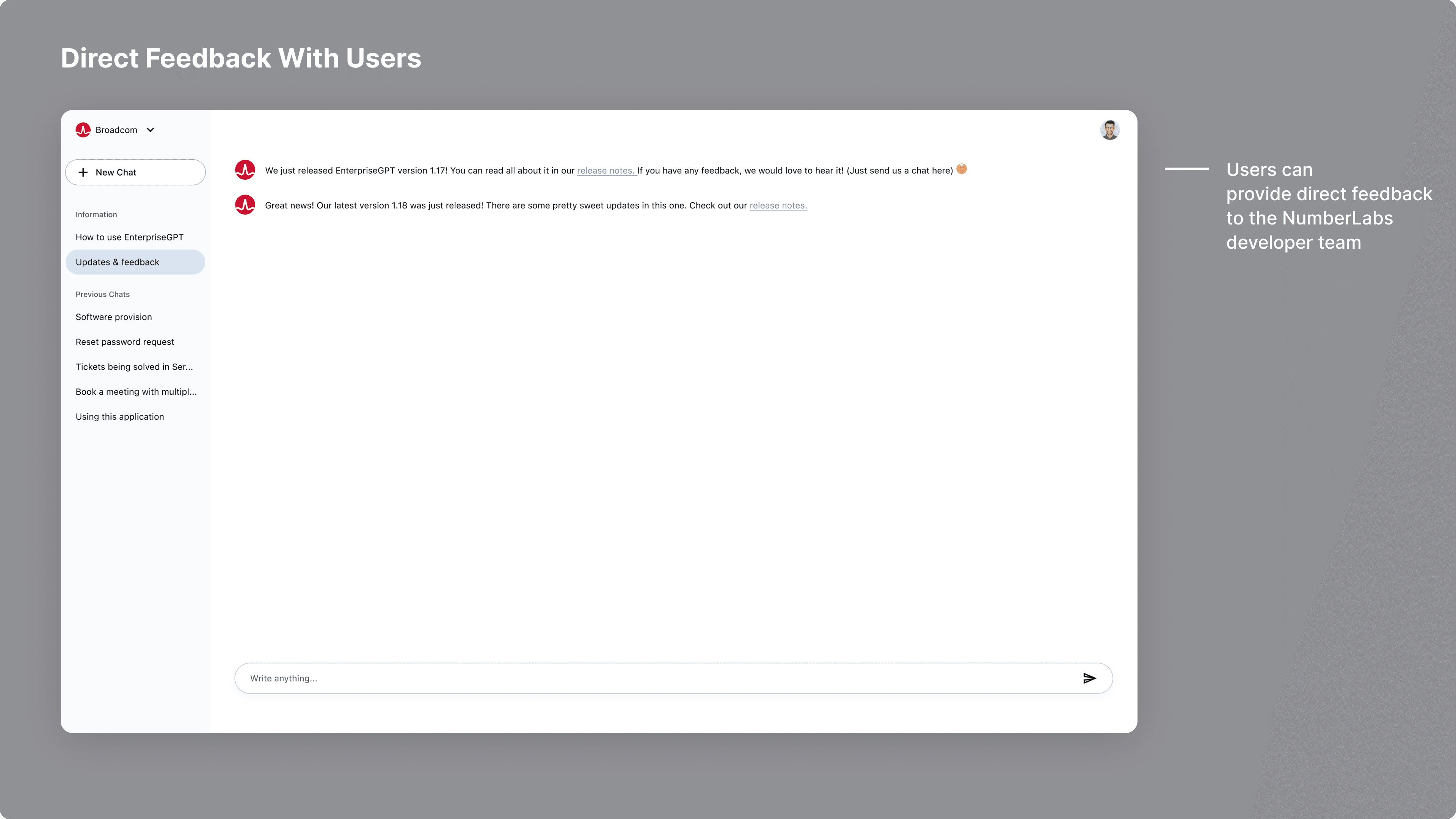
We had the idea of having an open channel with users to provide release notes, as well as let them directly chat with us to provide feedback. It was a novel way of removing friction to get as near to the customer as possible.
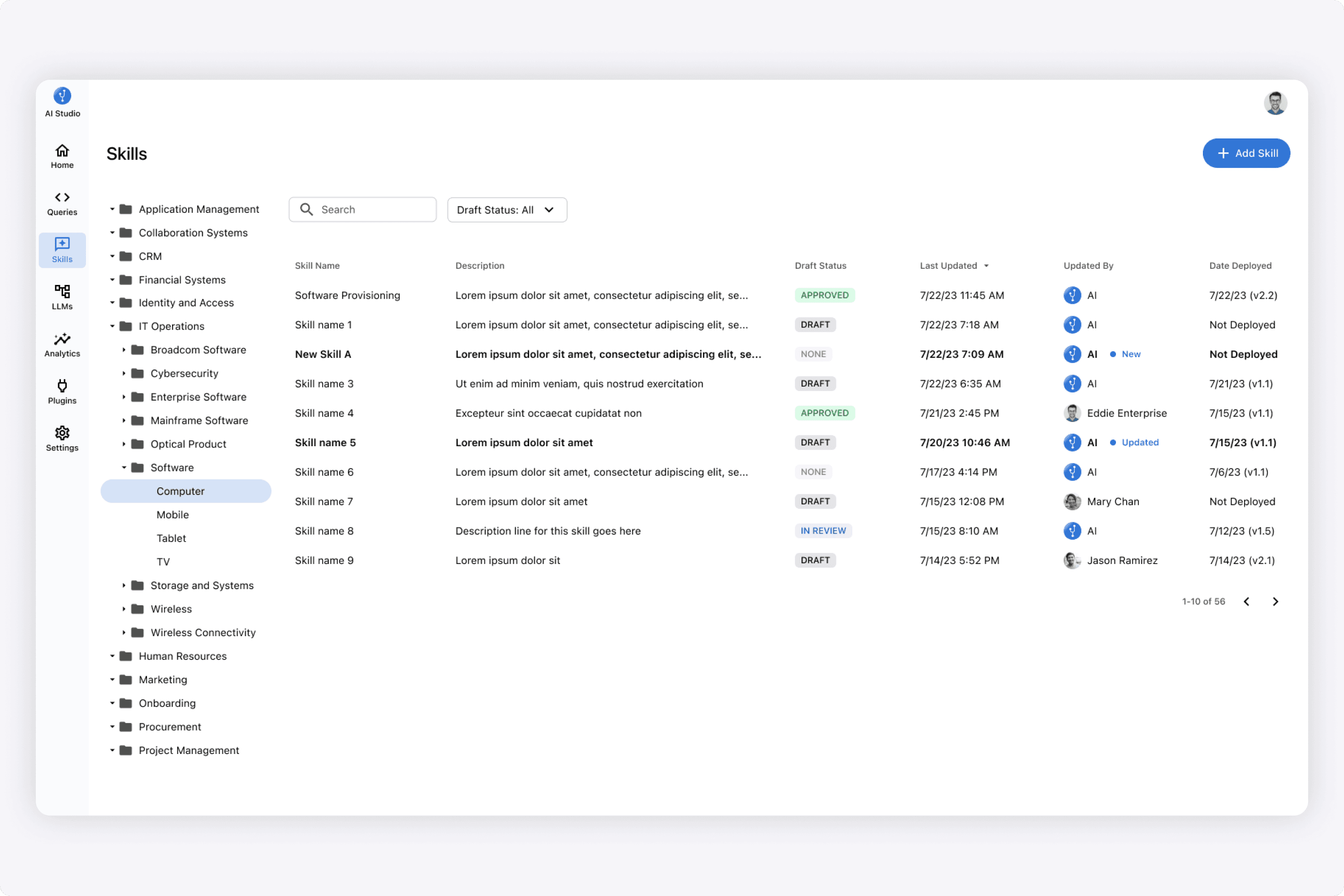
Here is the section where they managed all of the skills of an AI. These skills were the executable tasks on the end user chat experience. Example: If a user typed that they needed access to microsoft powerpoint, then the "Software Provisioning" skill would be executed. This skill executed automation logic across many systems to provide that provisioning. So in the shot above, that's the area of the platform where that skill was managed and defined.
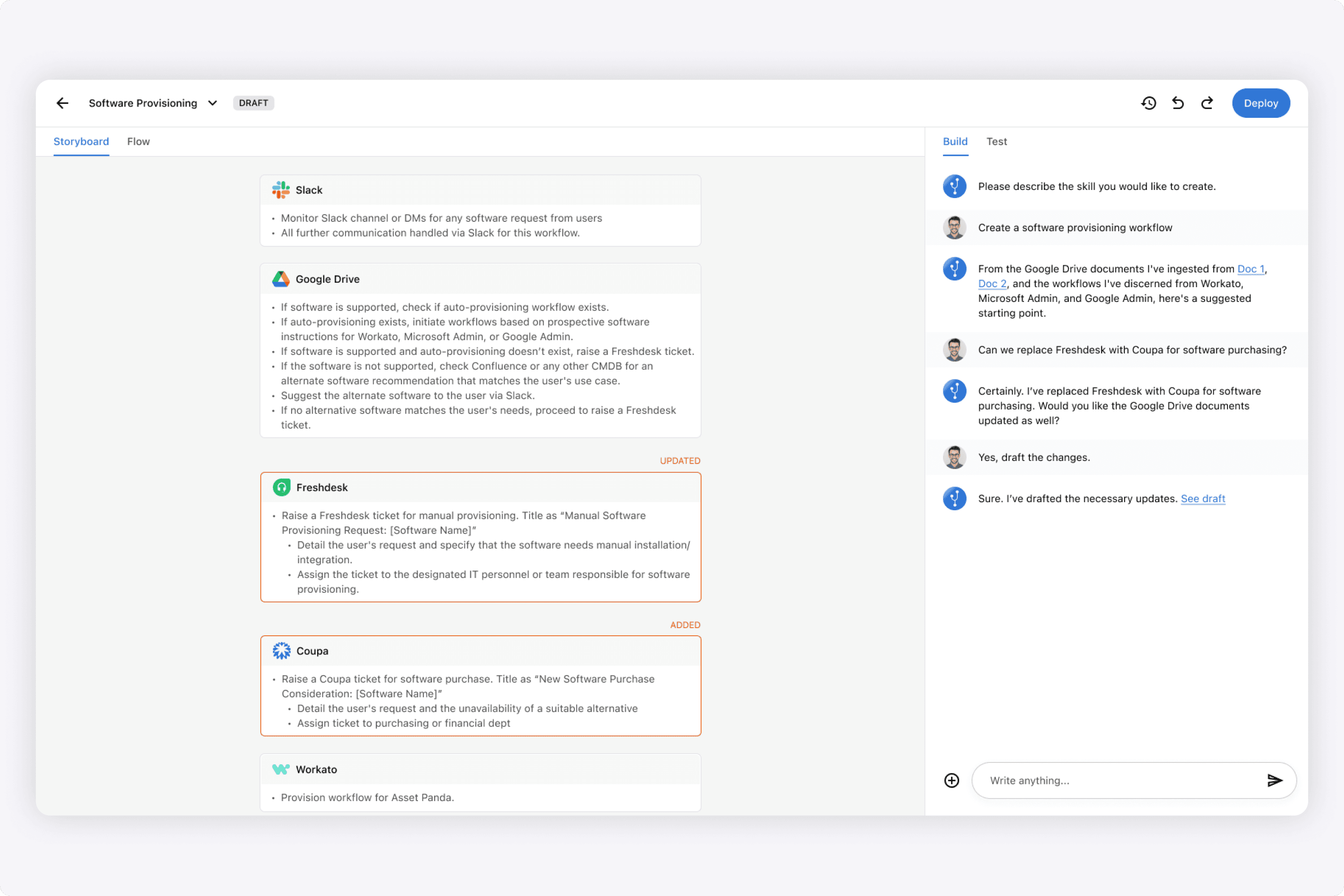
Here is an example of defining the "Software Provisining" skill that I designed. It is very much like an automation tool (ex. Workato), that stiches together logic across many applications. However, in the shot I designed above, our differentation was that the logic could simply be written in text, an the AI would interpret that circularly. It didn't require all of the IF/ELSE complicated branching that exists today.
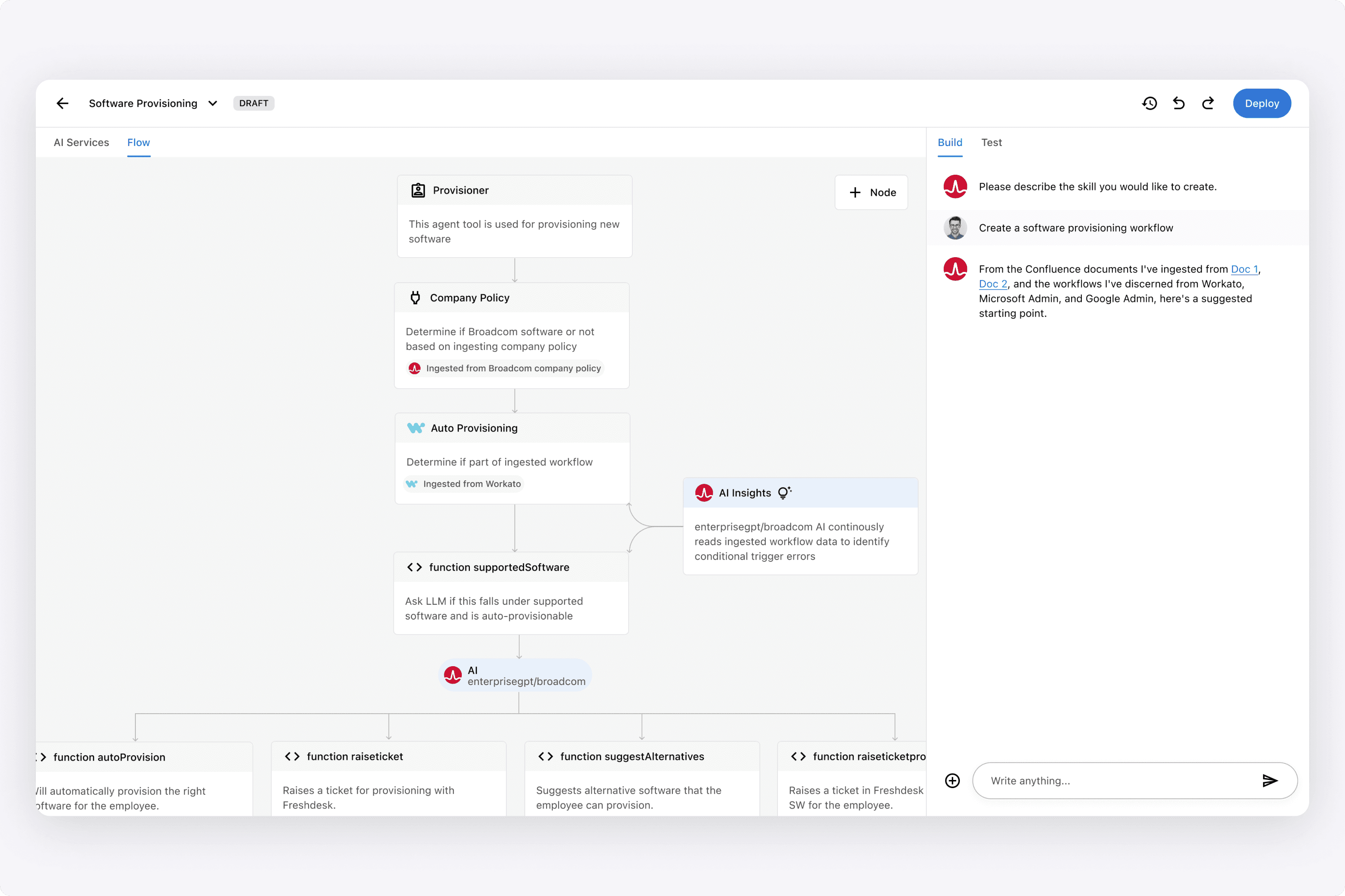
For users who wanted to see even more granularity, I designed this flow tab which showed each function throughout the process.
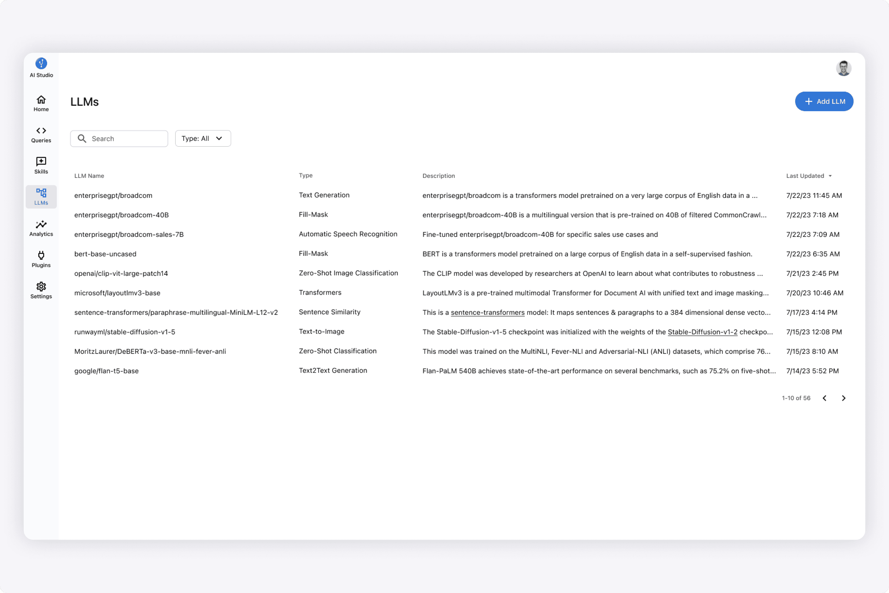
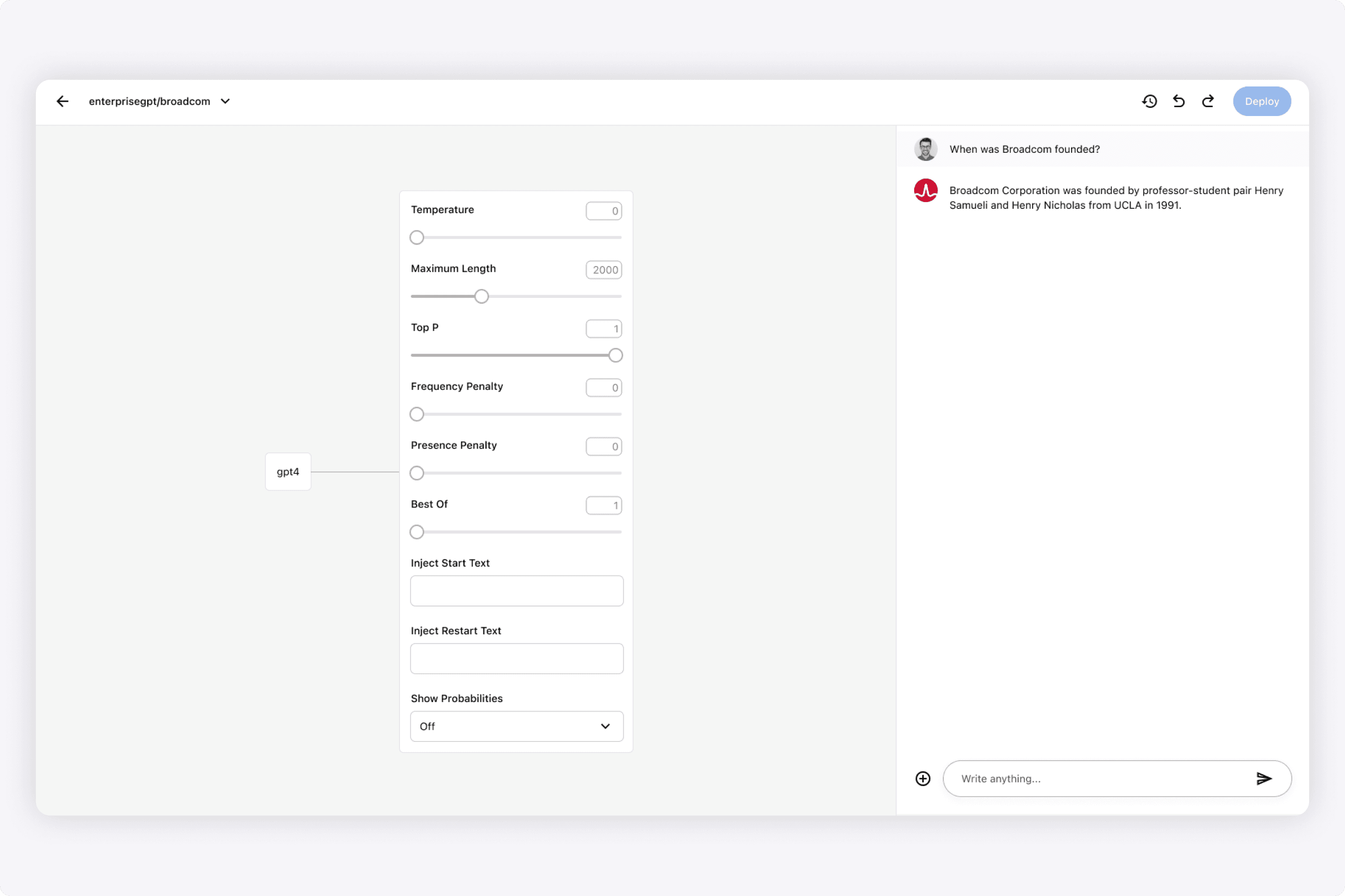
Since this was platform for enterprises, the idea was to have a place in the platform to customize both private LLMs and open source public ones. From a UX standpoint, the common UX pattern was inspired by OpenAI's playground, where users could inputs and sliders to affect the output.
From here, they could do basic prompt engineering and test results. When designing this, I was inspired by ChatGPT's playground (which many other platforms got inspired from as well). You can see the classic slider knobs that tweaked AI responses.
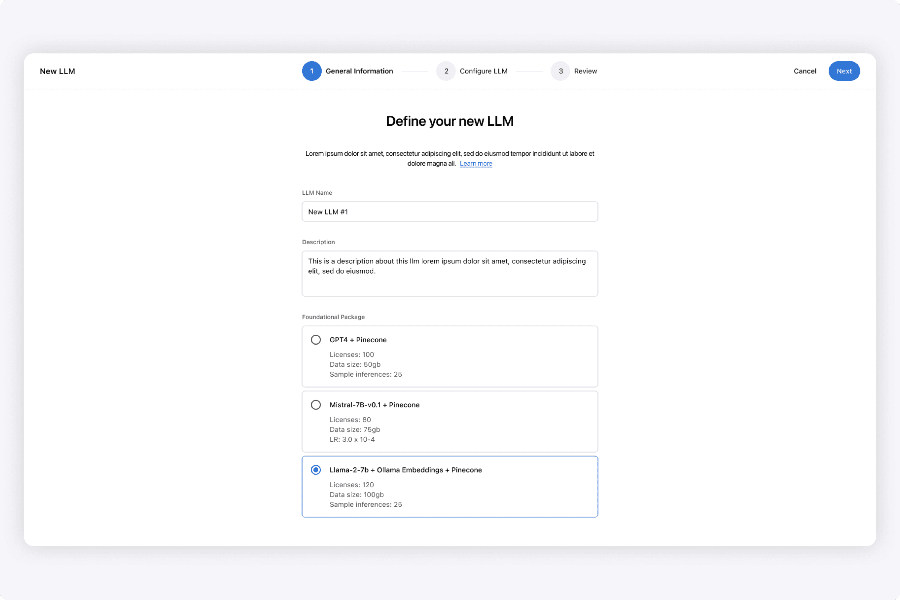
In the platform, users could create new LLMs that were based on a foundational package & vector DB. Here is the wizard I designed where users could create them, then be able to customize them afterwards. In essence, it was basically forking an existing LLM and then prompting it into something new.
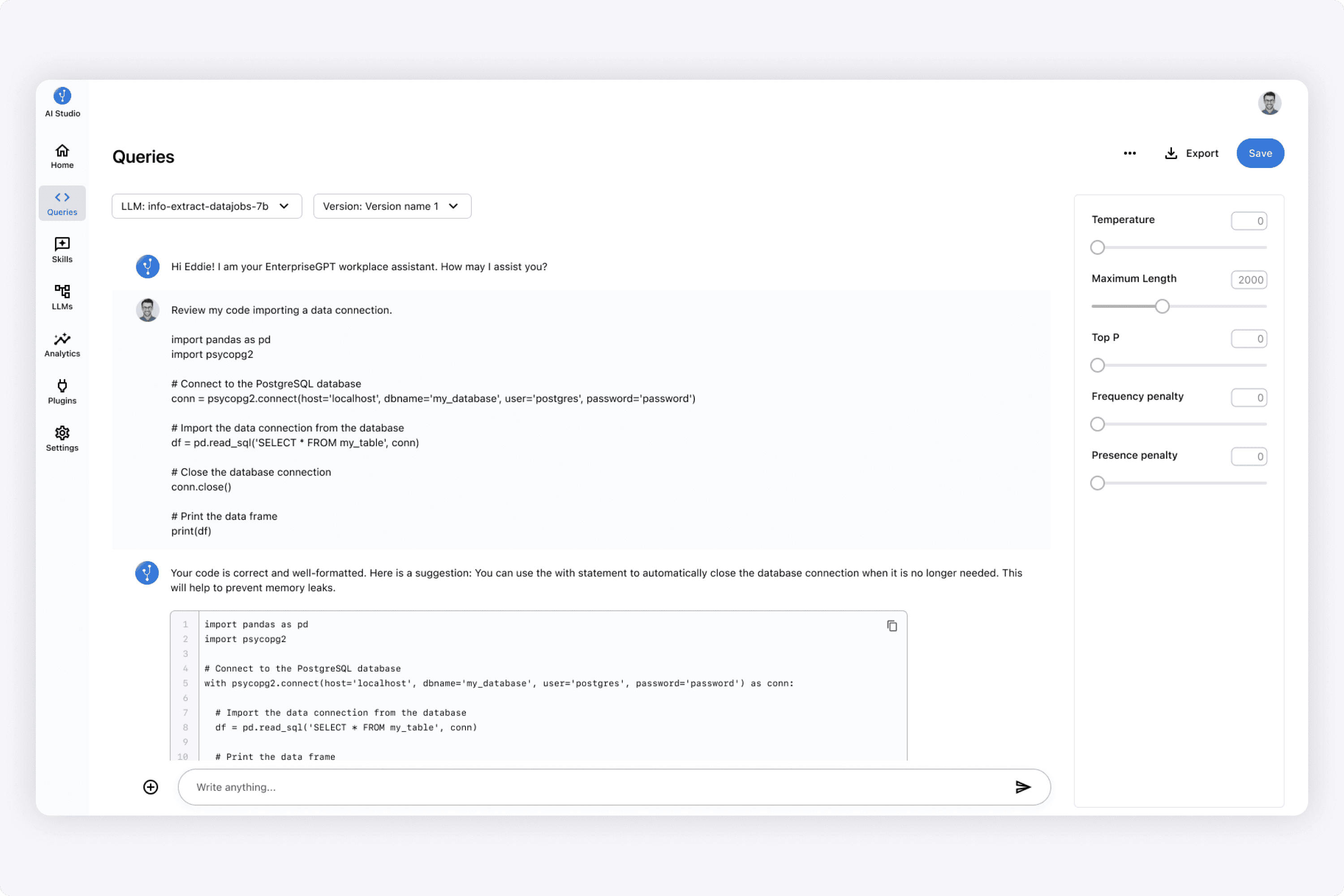
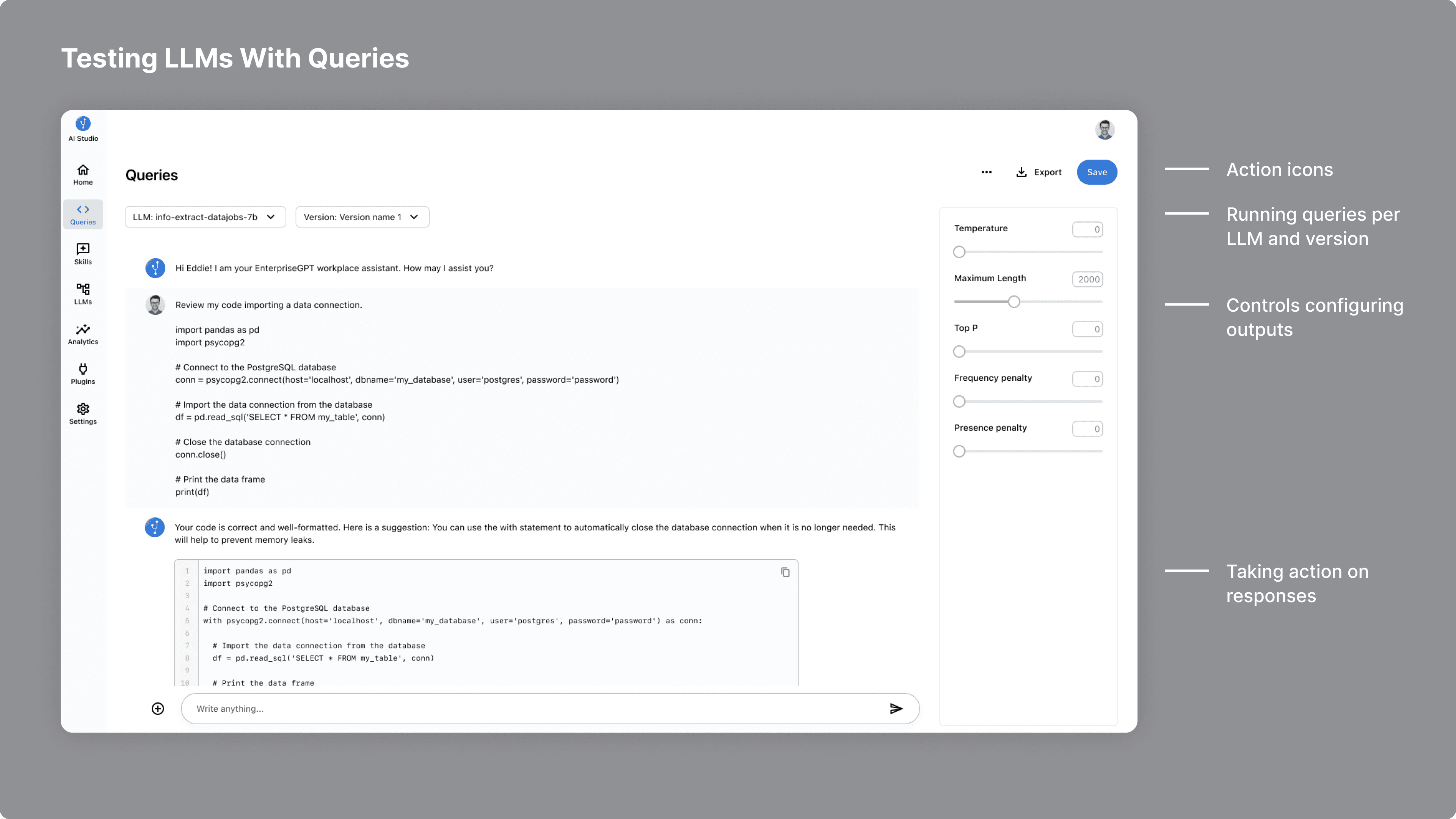
Here I designed the section where a user could test a version of an LLM through prompting it in the UI. The idea was to have a simple playground where a user could chat with the AI, and based on the returned responses, fine-tune them further.
We had the idea of versioning LLMs. This could be based on having different variations of prompt engineering, and then being able to test those out, before pushing a version to production to affect the end user chat experience.
This Queries area I designed would be able to support that use case. The idea was to have simple dropdowns to pick an LLM and version, and ask it questions.
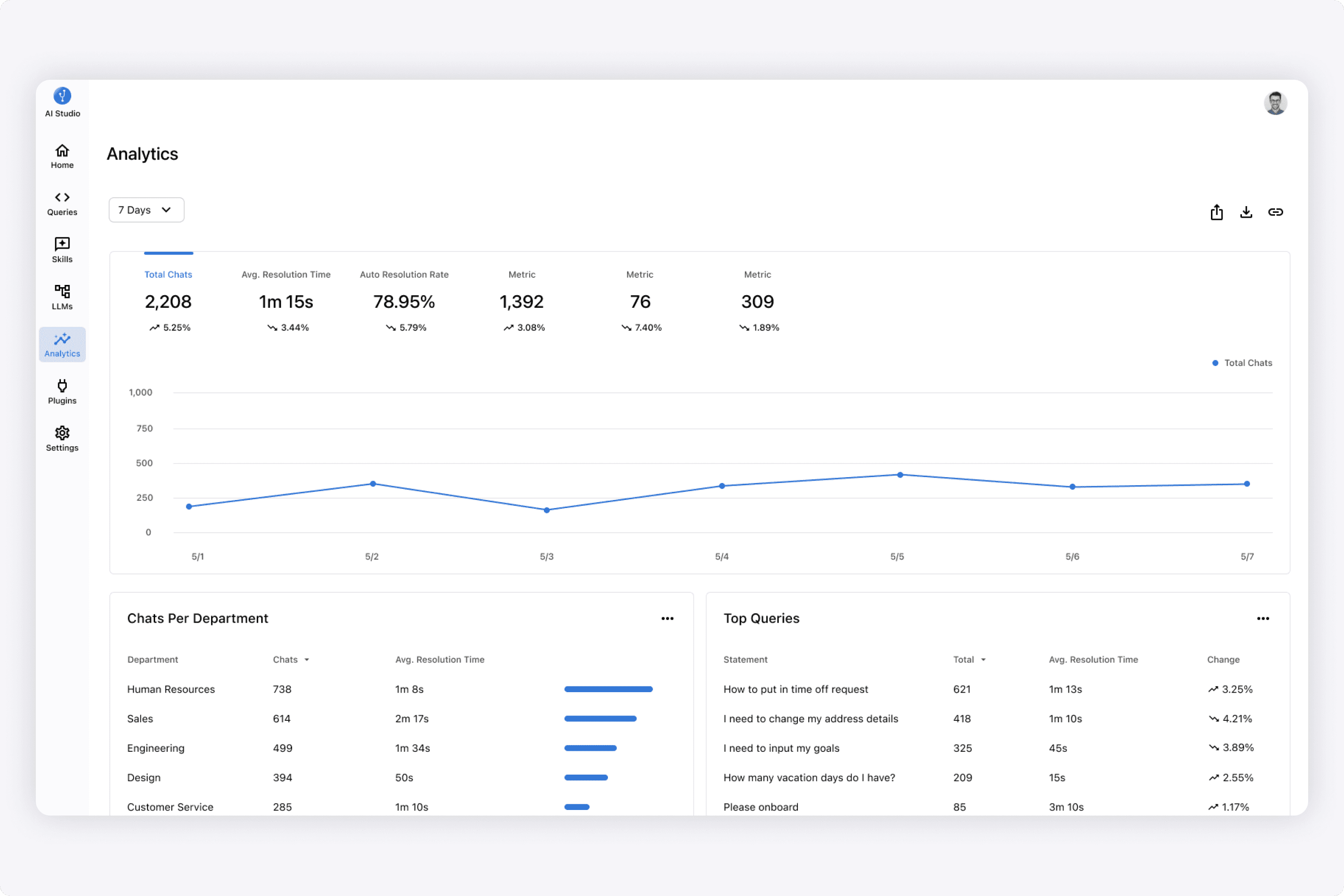
A user could see analytics of the LLM's deployed in end user chat experiences. This gave enterprises valuable insights into how their AI chat experiences were being utilized.
When designing this, I focused on what were the top metrics a user wanted to see, and specifically top chats/queries across each department in the enterprise.
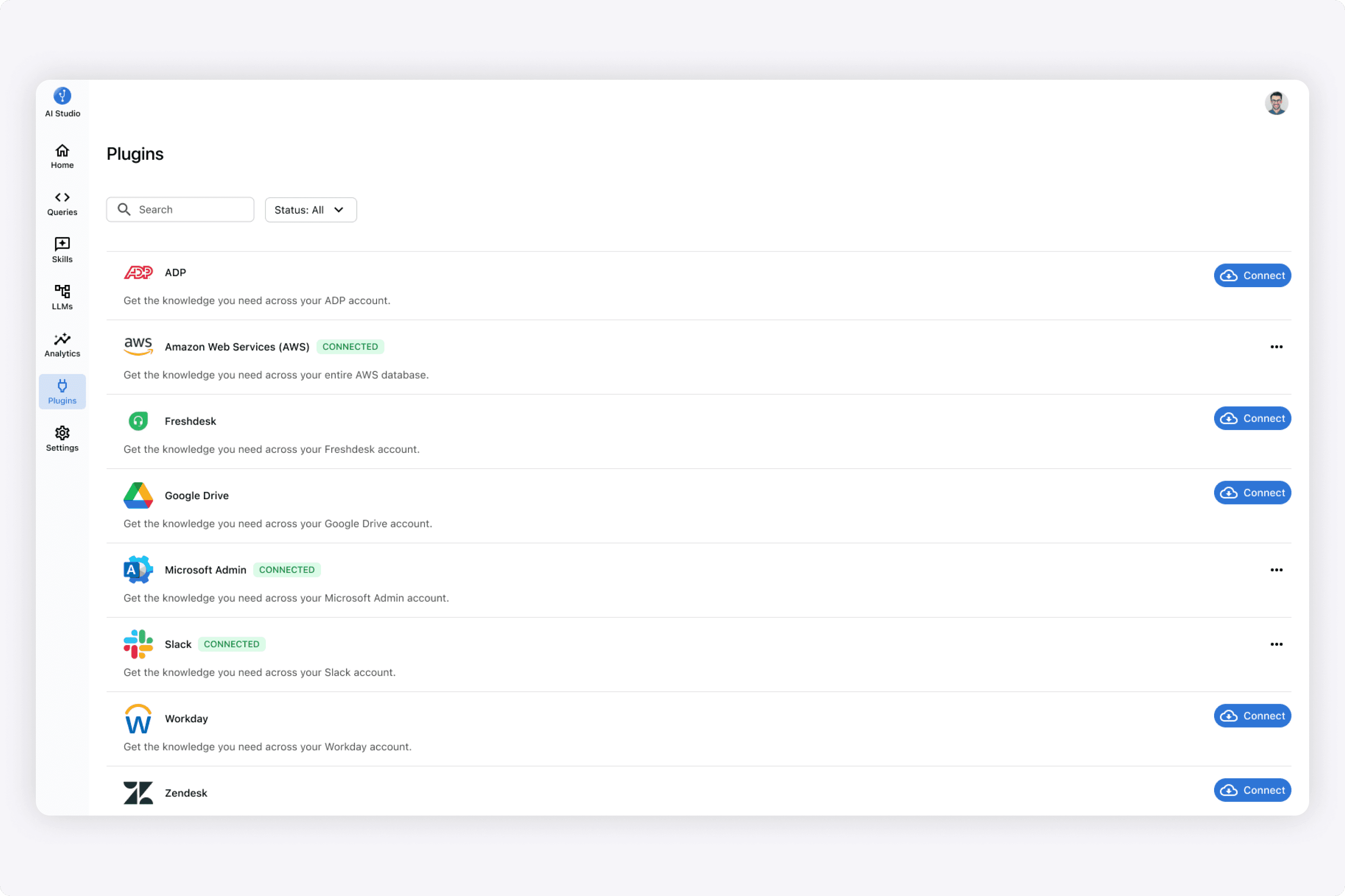
I designed the plugins area of the platform where the system connected to external systems, and the data and policies would be ingested. From here, a user could create a skill using this data that the AI would execute.
Results
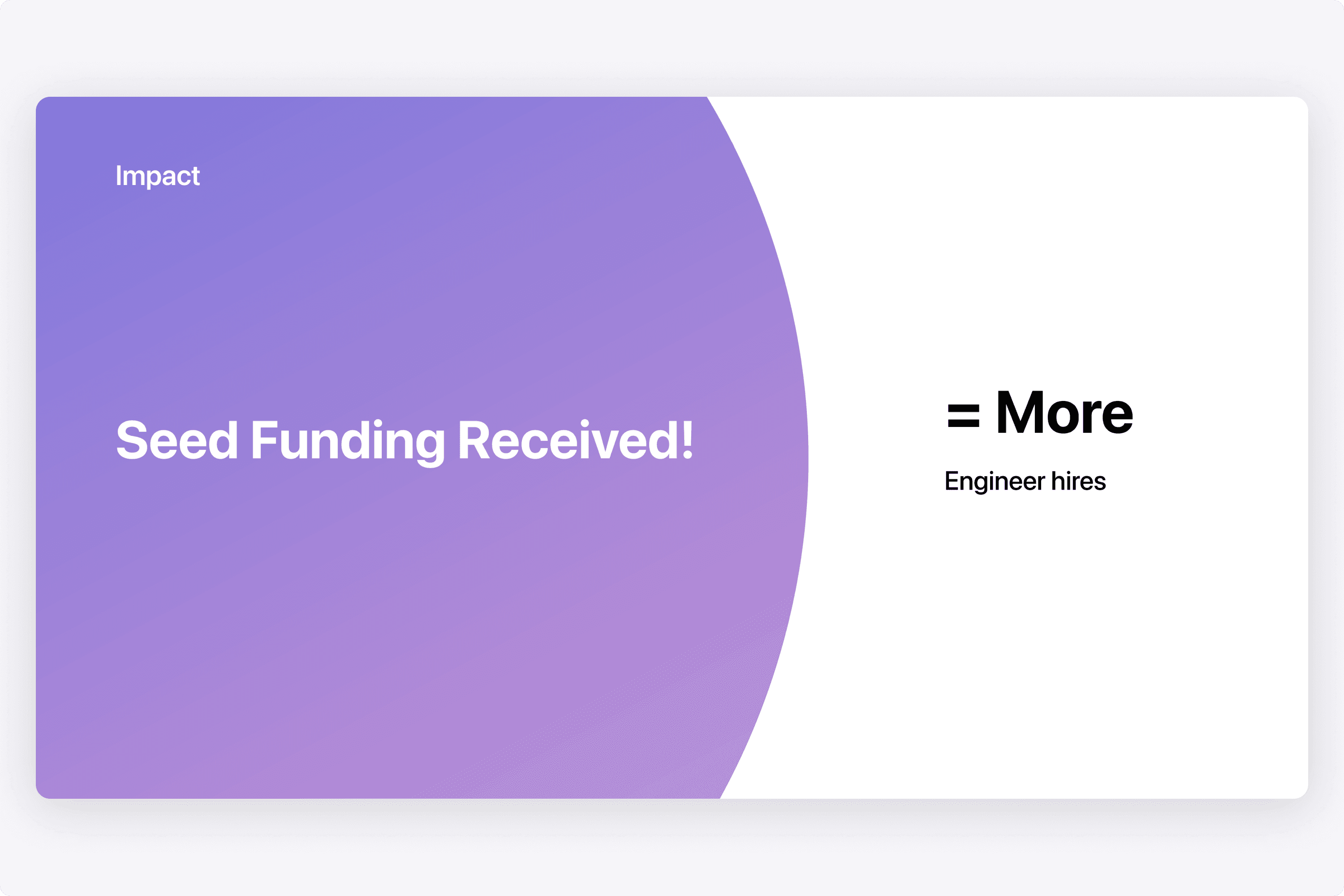
The team received seed funding to continue development! I was really happy to hear that, as it was cool that my design work helped show the vision.
I worked with a lot of talented engineers and explored many ideas.
Ultimately, it lead to the company receiving seed funding and continuing on!
With recent releases by OpenAI, the engineering team pivoted to focusing on a copilot for engineering. I've had a lot of fun designing this application, and getting immersed in the AI world!
