Sitecore Search
2022 - Now • Senior Product Designer
Sitecore Search
2022 - Now • Senior Product Designer
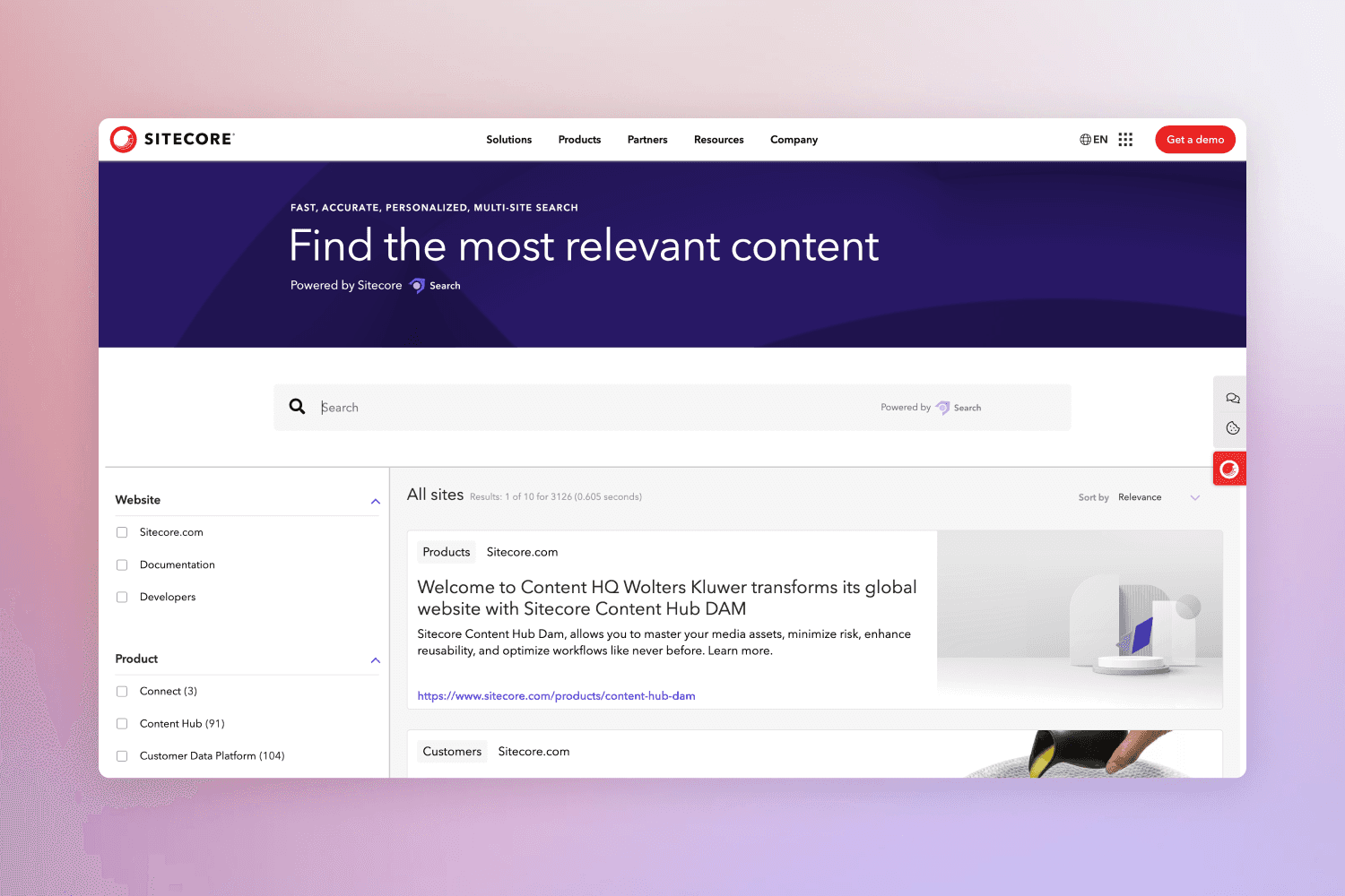
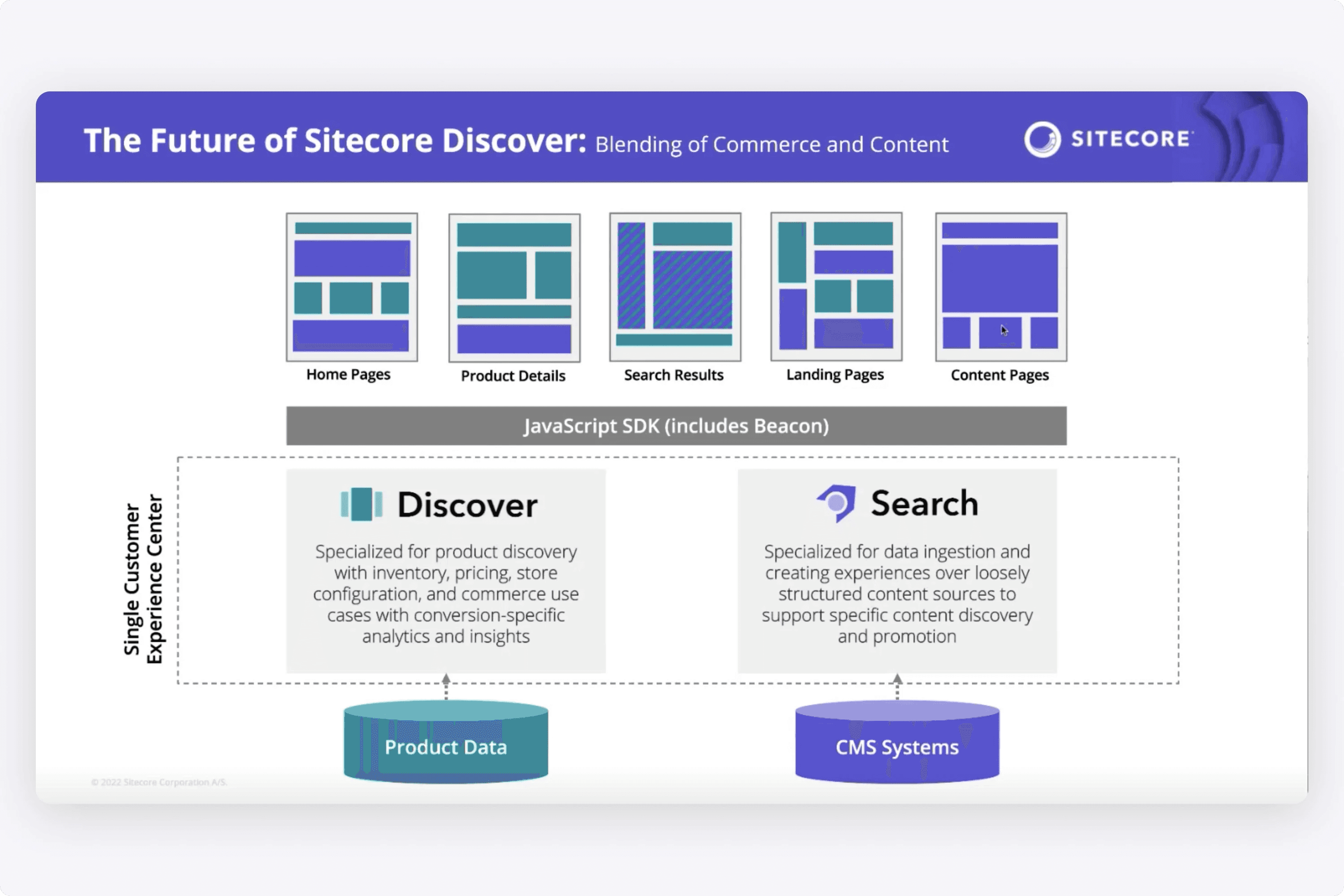
Sitecore Search is an AI/ML search platform that predicts search intent and personalizes search results on external websites.
I designed a SaaS platform where a customer can write rules that control how items show up in search, view analytics & their content catalog, and create data connectors to ingest the content that is displayed.
Overview
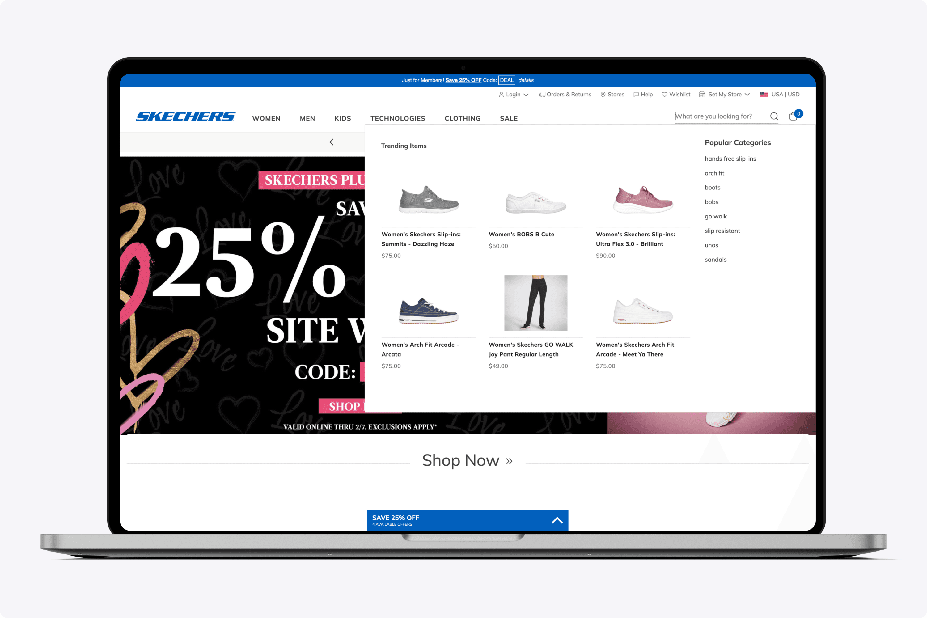
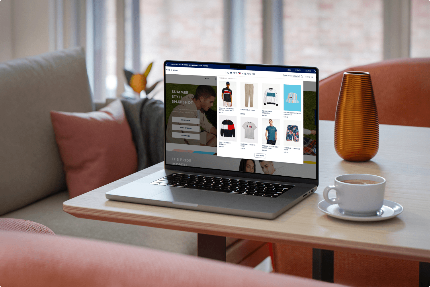
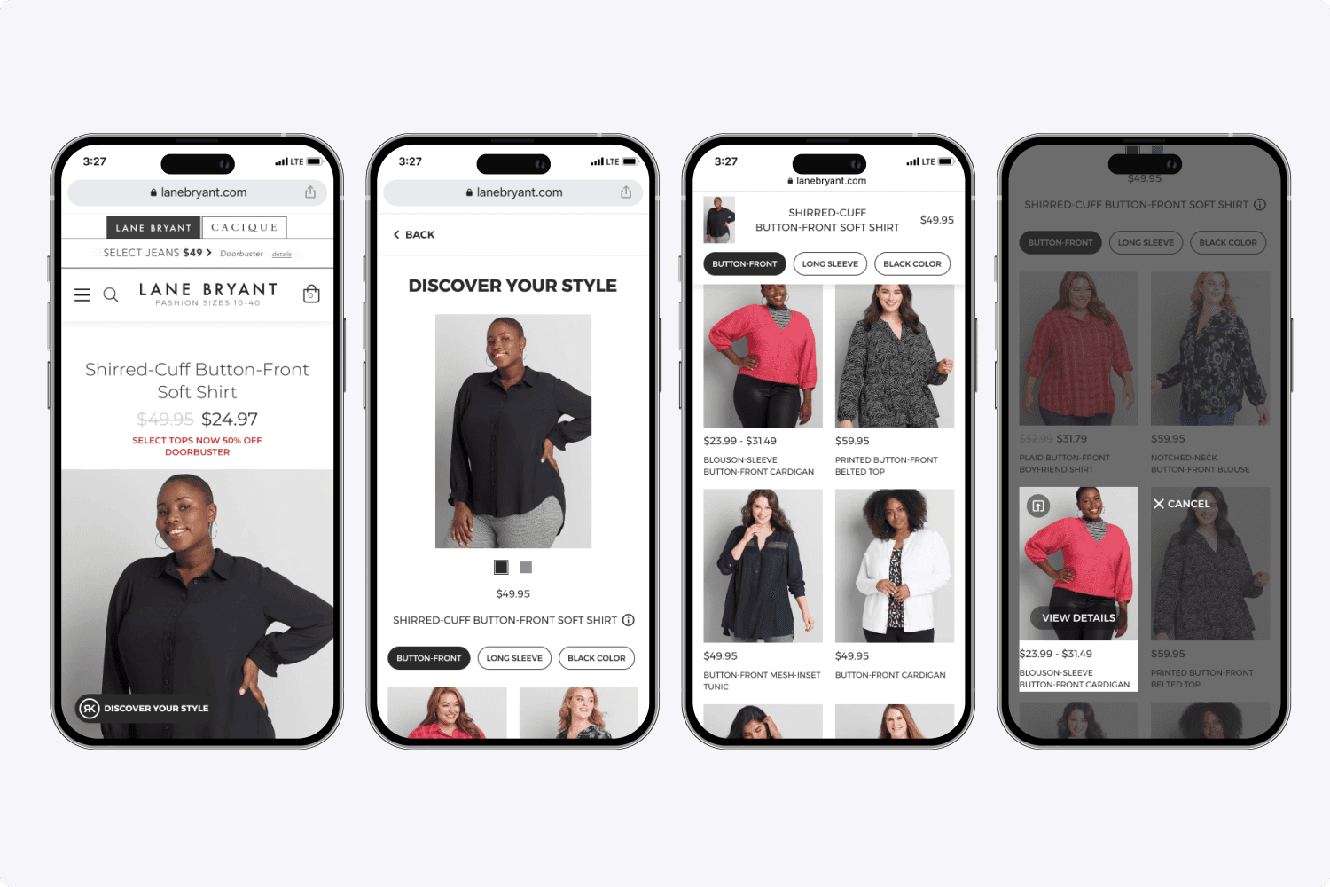
Sitecore provides algorithmically personalized widgets on end-user shopping experiences. For example, the contents of this overlay are algorithmically personalized to the website shopper.
Sitecore Search widgets provide lightning-fast predictive personalization. The AI/ML technology is able to understand visitors intent by what they have viewed and clicked, and provide the predictive recommendations.
My Role
I'm currently a senior product designer on the platform. I regularly meet with the global design sync team, product management, and the engineering team. Each week we present new work. My process entails doing research, high-fidelity prototyping, and delivering spec to engineers. My goal is to always keep project moving forward every week.
Problem
It's extremely technical for big commerce brands or enterprises personalize products or content on their websites. It's important that anywhere a product is shown on a site, the item is personalized and relevant to the visitor.
Shoppers want to things quickly.
Without personalization, the probability for churn increases.
Opportunity
Create a SaaS platform for large e-commerce brands where merchandisers can log in, manage how the content on their website is displayed, view analytics, view their catalog, and much more.
Process
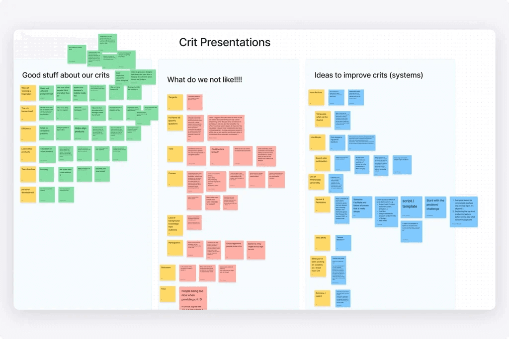
Our process always consists of doing our own research, creating high-fidelity prototypes, and then demoing all of this every week. I demo new things every week and continuously make progress. Customer feedback has always been extremely important to Sitecore. When we are designing and creating new modules, we will show mockups to existing customers to get immediate feedback.
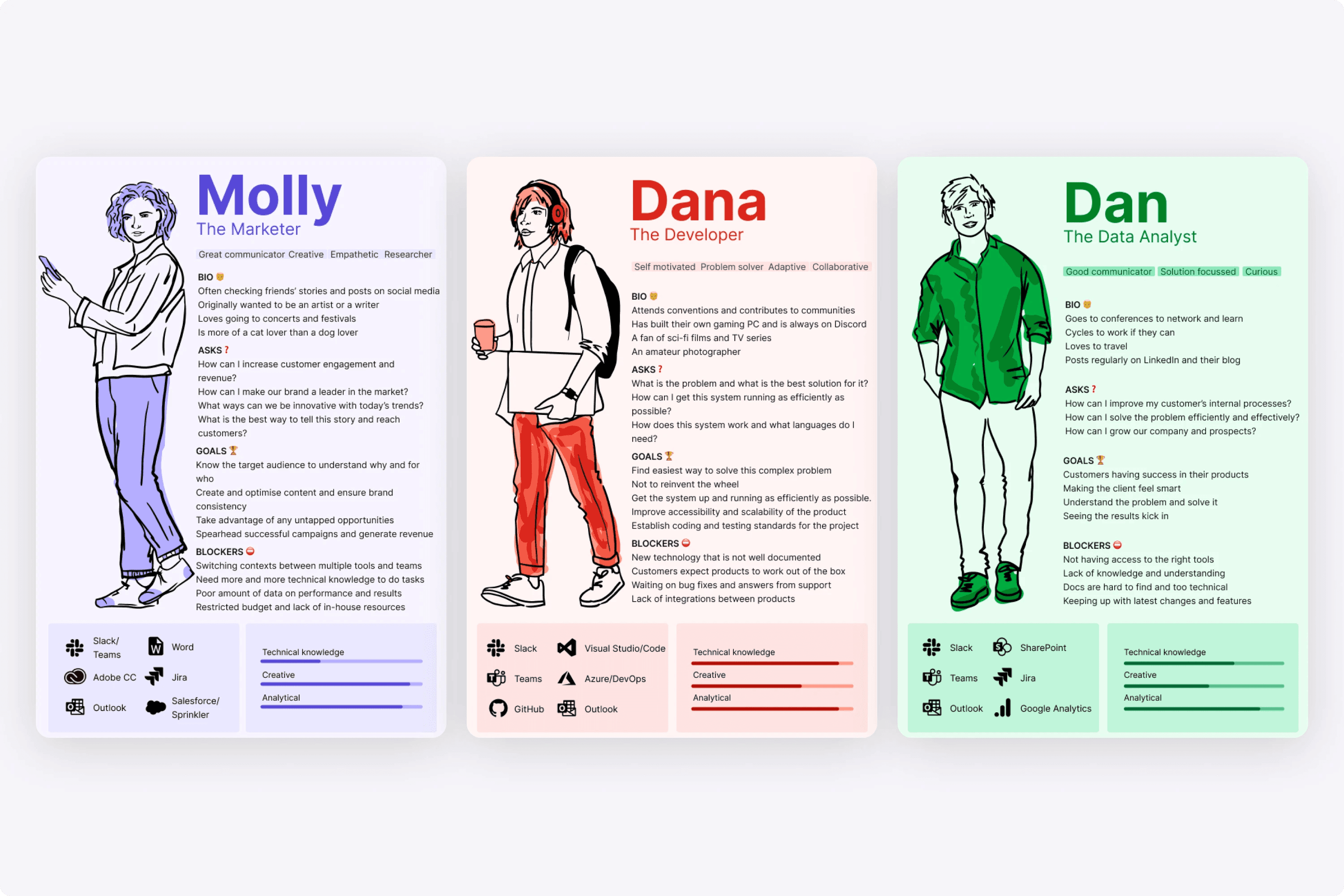
When designing, it was important for me to consider our personas, so that my design work was scalable. This meant avoiding the pitfalls of designing to one persona at the expensive of complicating the UI for another.
Design Thinking
My goal as a designer is to make the look and feel be clean, consistent, and simple. That meant using Sitecore's Blok design system to promote consistency and providing review videos while going in-depth to get as close to pixel perfect as possible.
Additionally, I've always created high-fidelity clickable prototypes for anyone to review, whether it's UX, engineering, product management and so on.
Designing Website Experiences
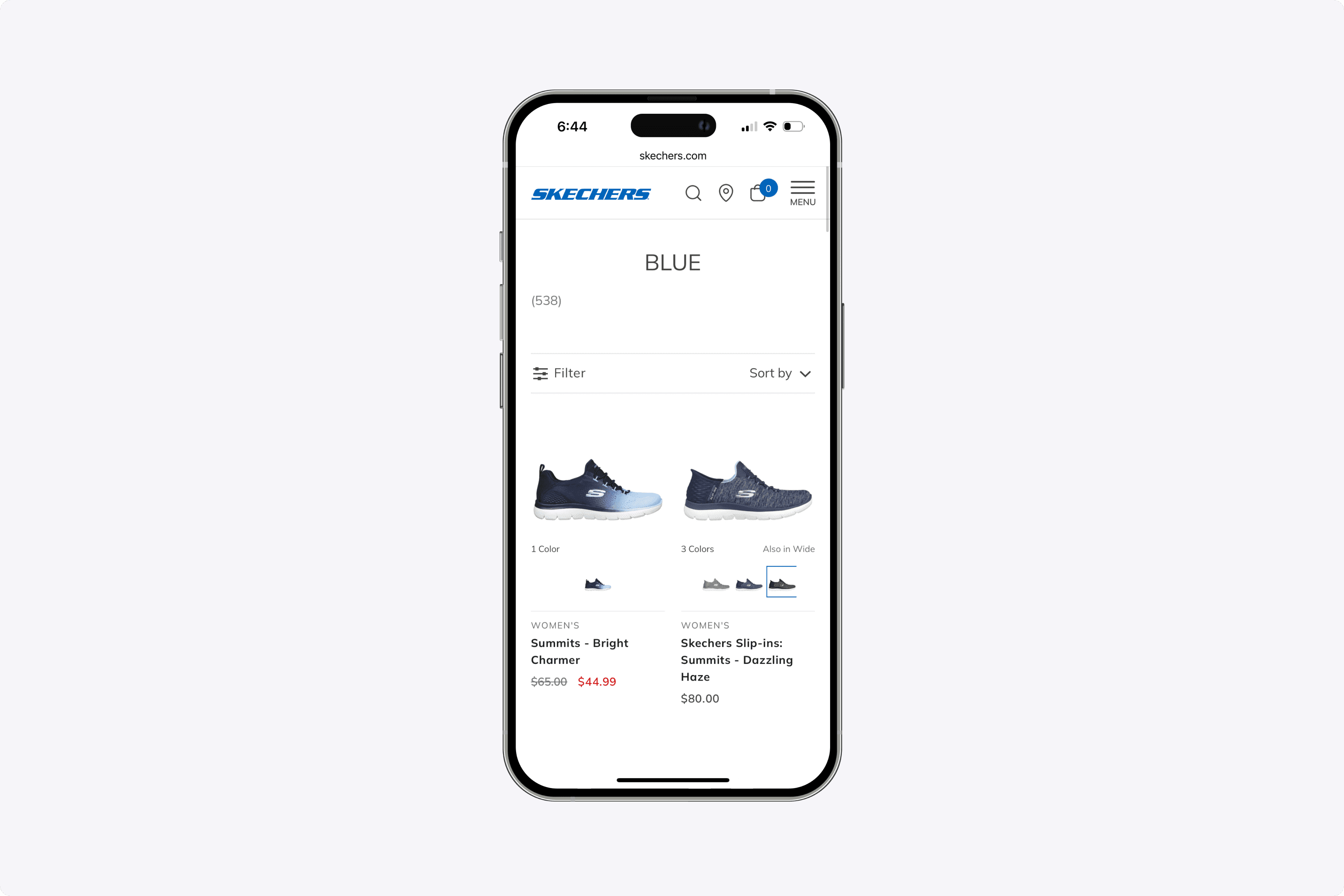
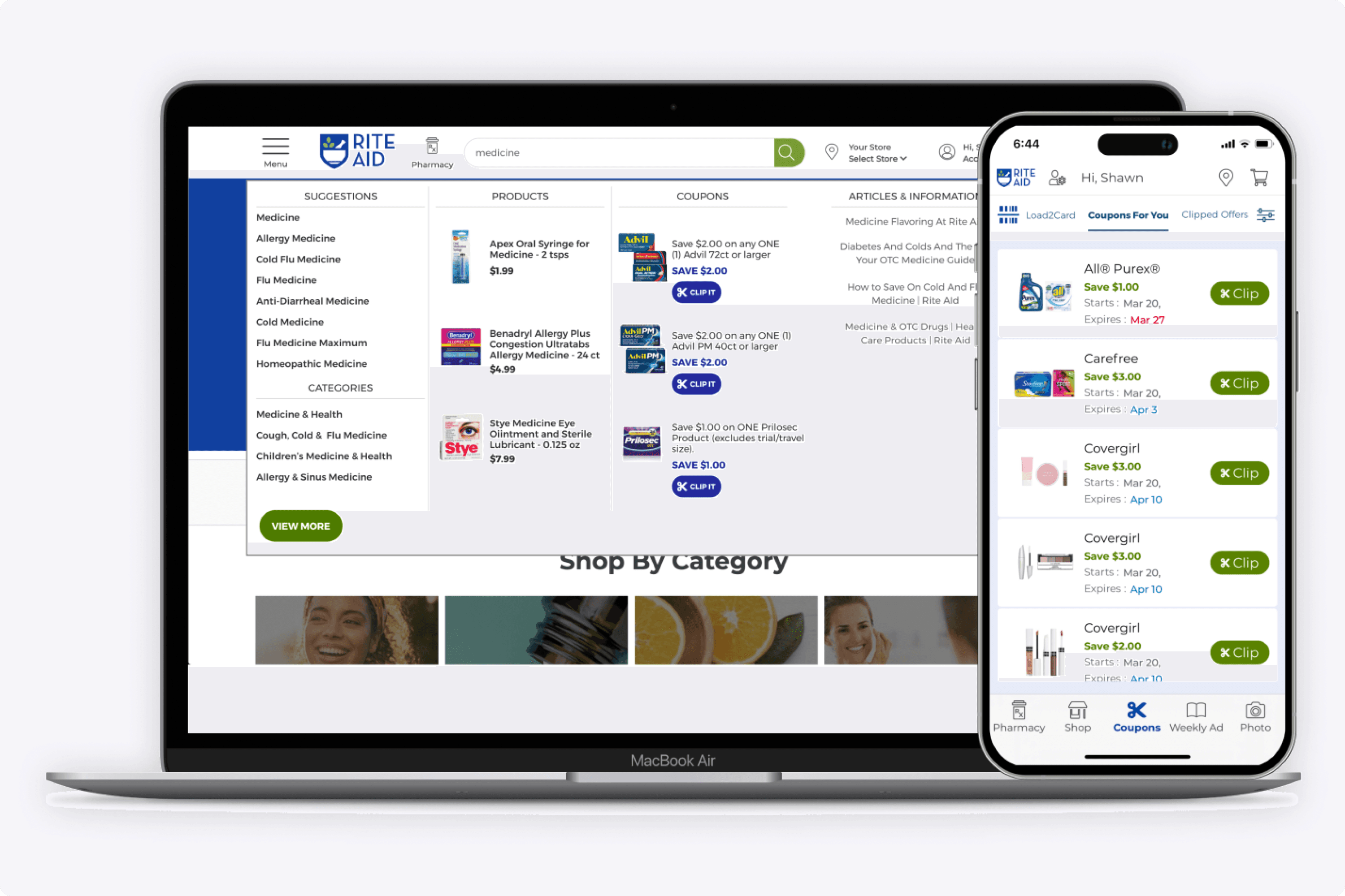
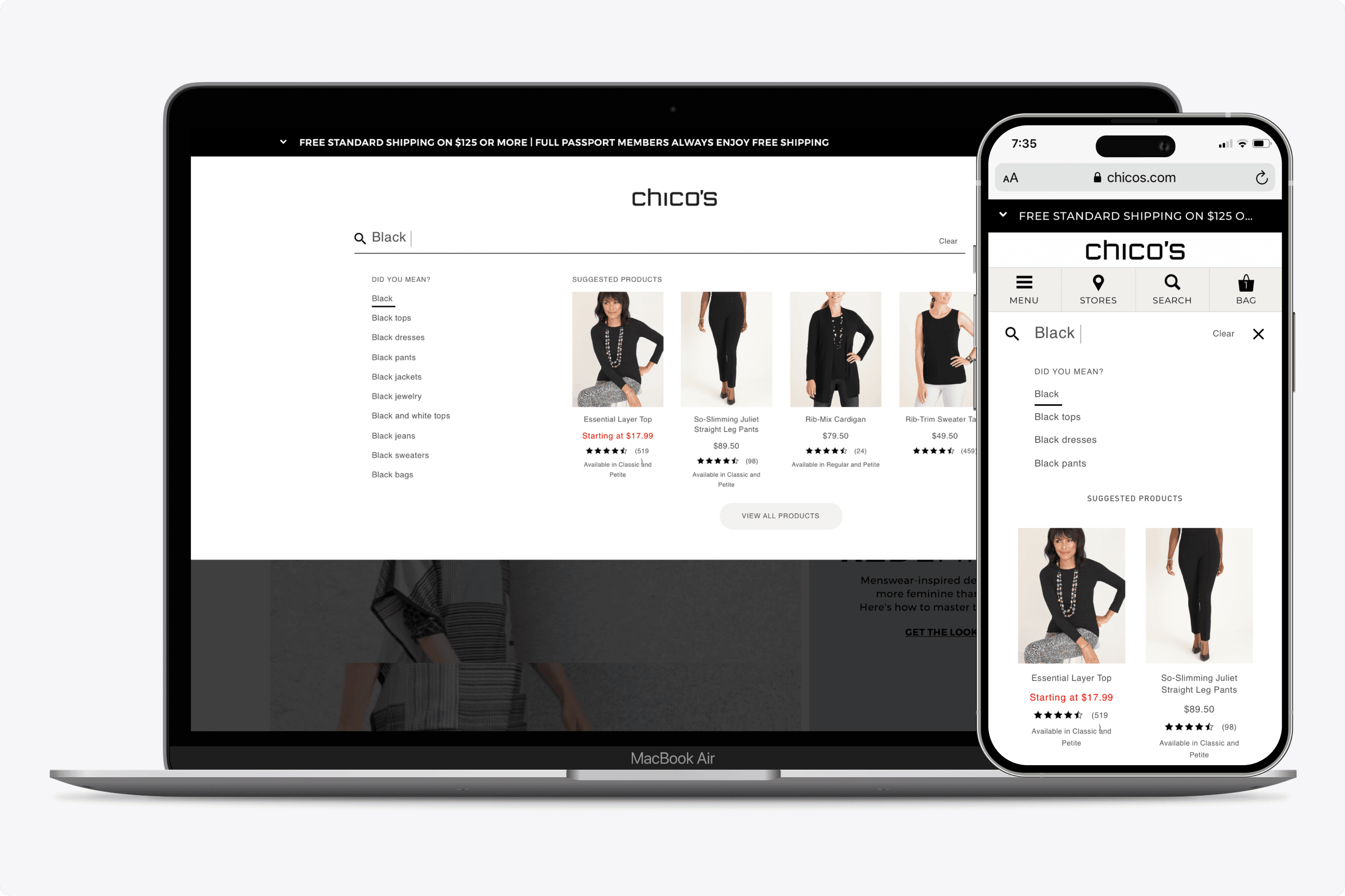
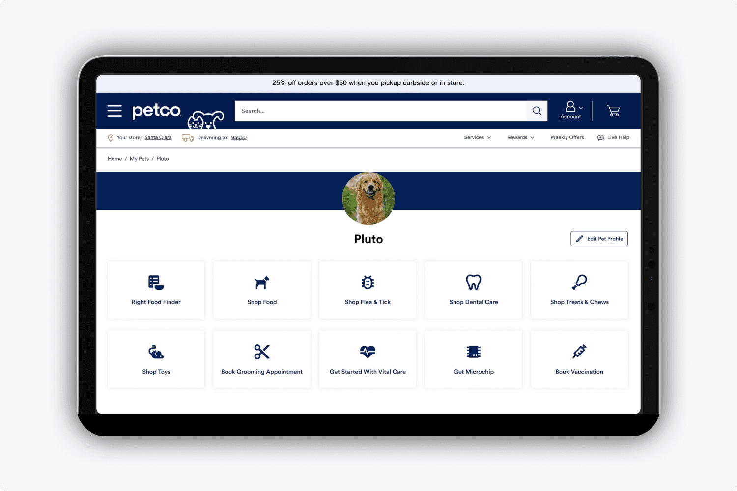
Many times I would work with the sales department to design high-fidelity mock ups to customers. This meant I would inspect a website, learn their design system, and turn around with the prototypes. People are visual, and seeing the end results greatly increased the chances of closing the sale.
Here are some examples of the experiences I designed.
My Work
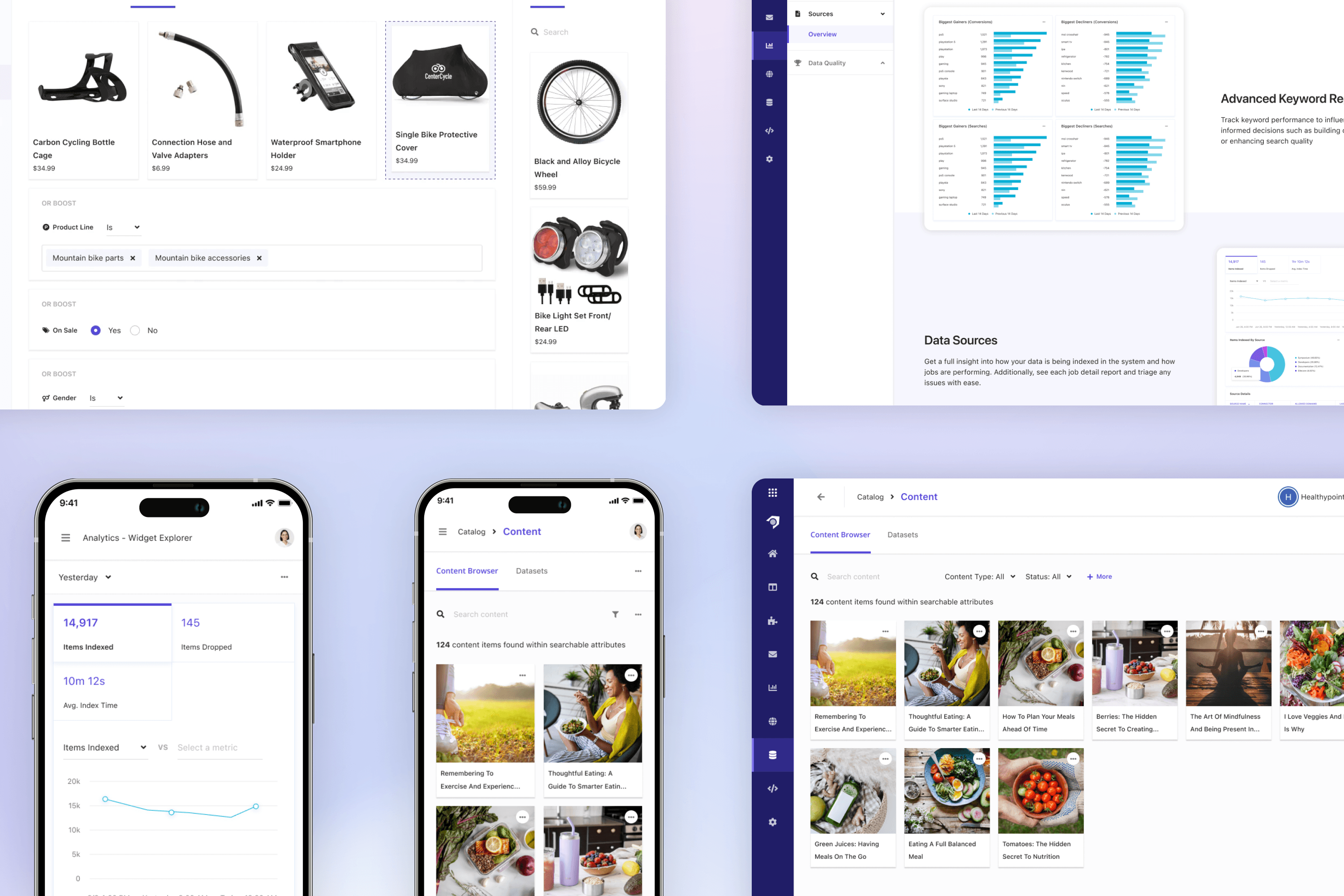
Here are some high levels shots of the platform I designed. Each feature required many design life cycles where I would take feedback from customers and stakeholders.
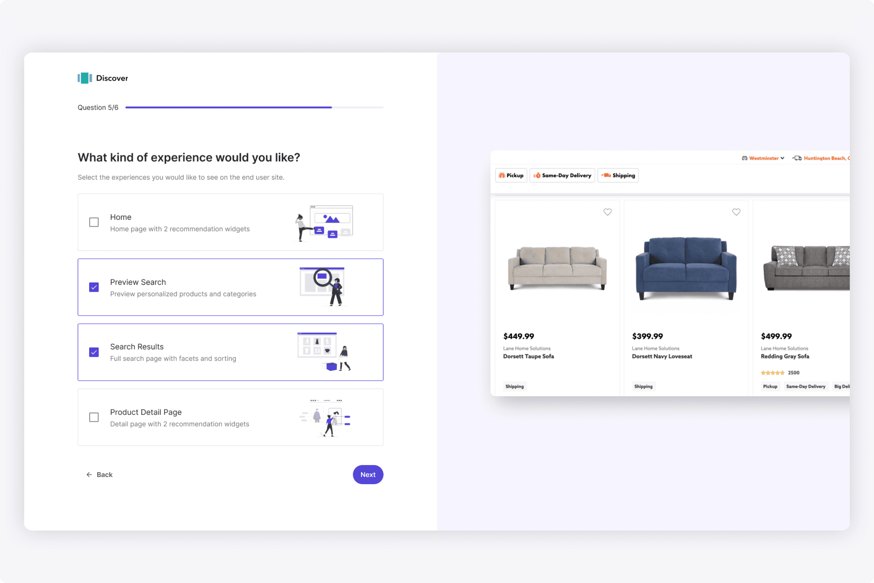
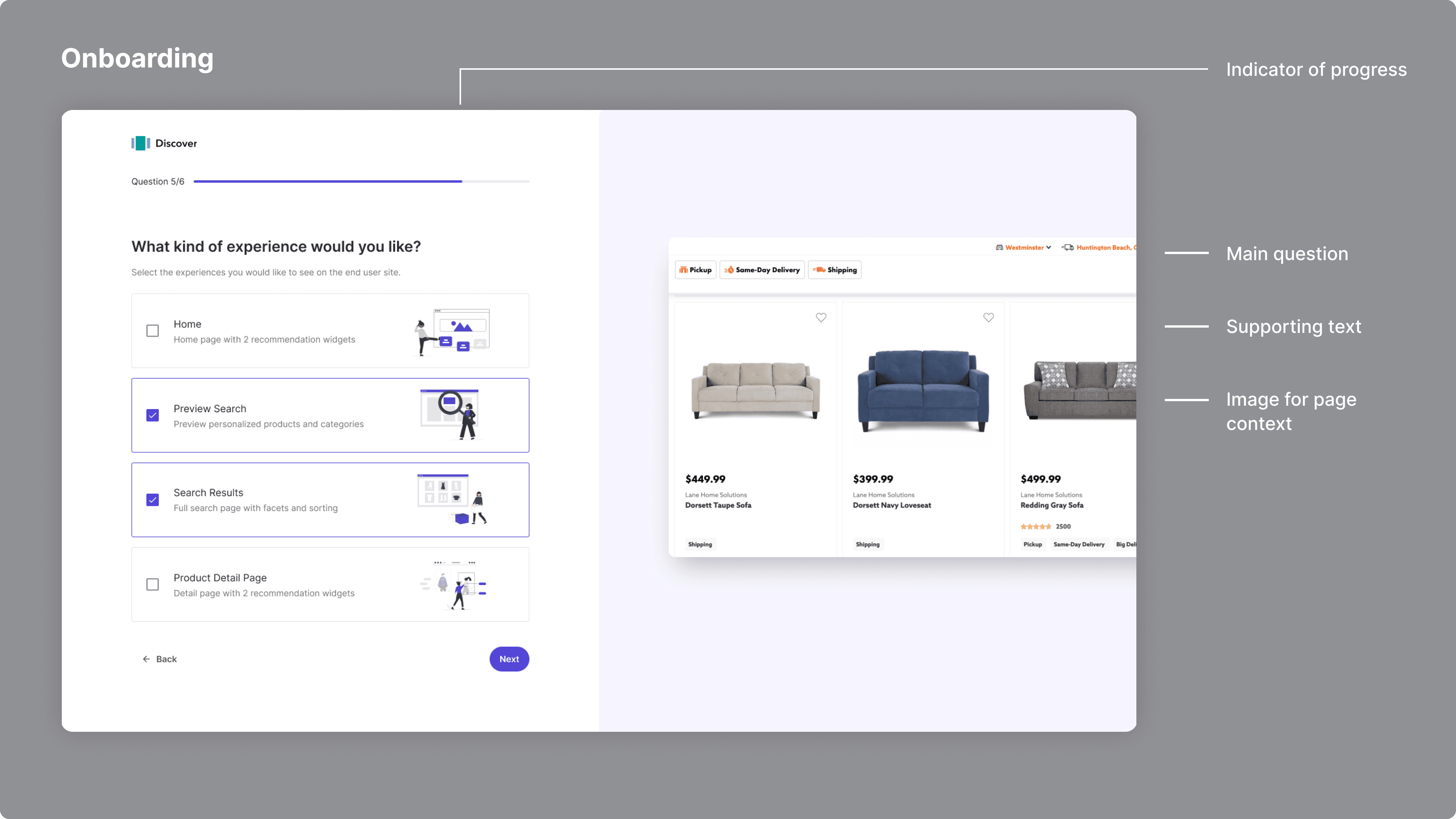
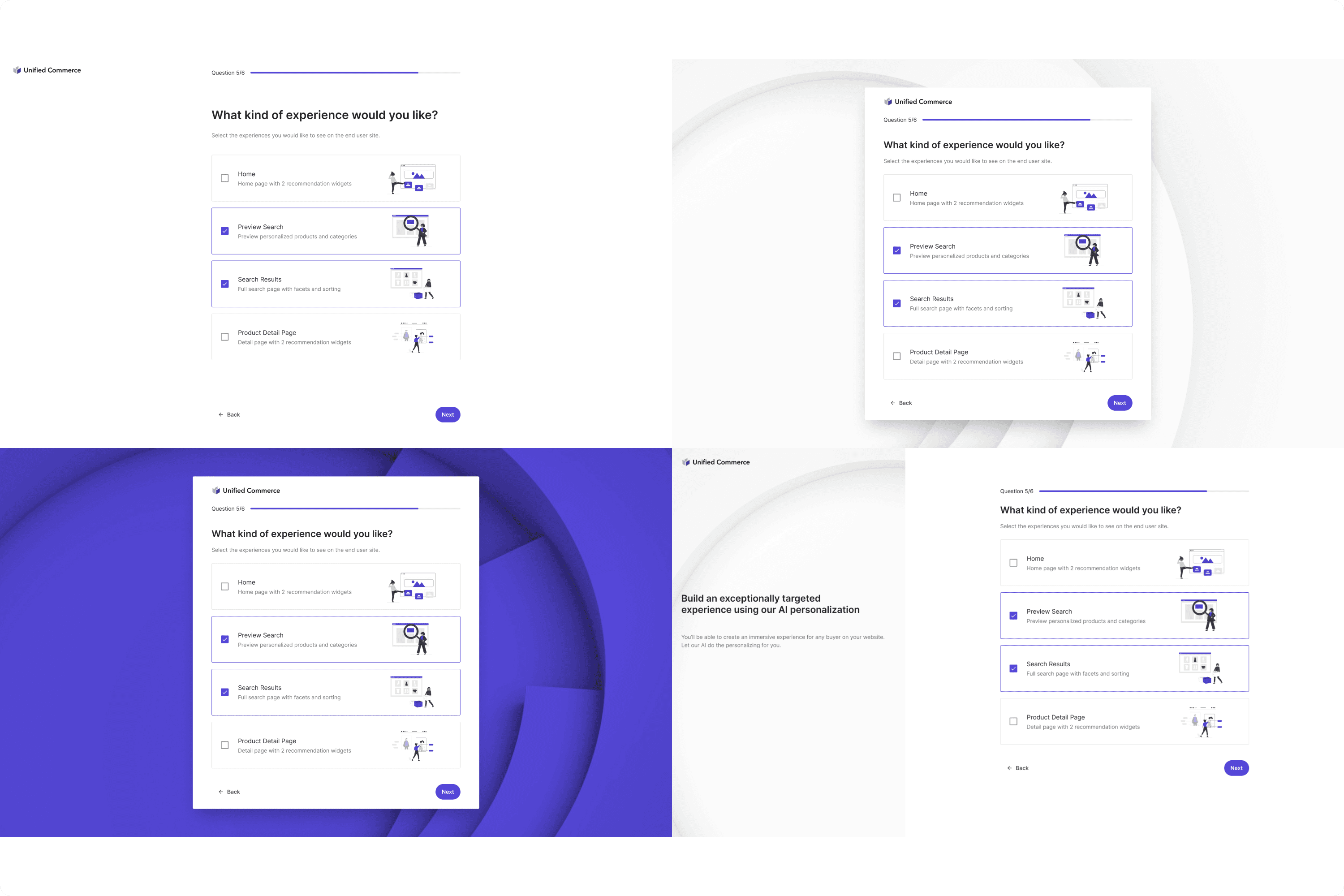
I designed this onboarding wizard to promote product-led growth. I did a lot of research on wizards and identified common patterns such as a progress indication, title question, and contextual image. I really focused on making it simple and clean.
In the design process, we may offer alternatives to the look and feel. These are examples of other styles I showed to the team.
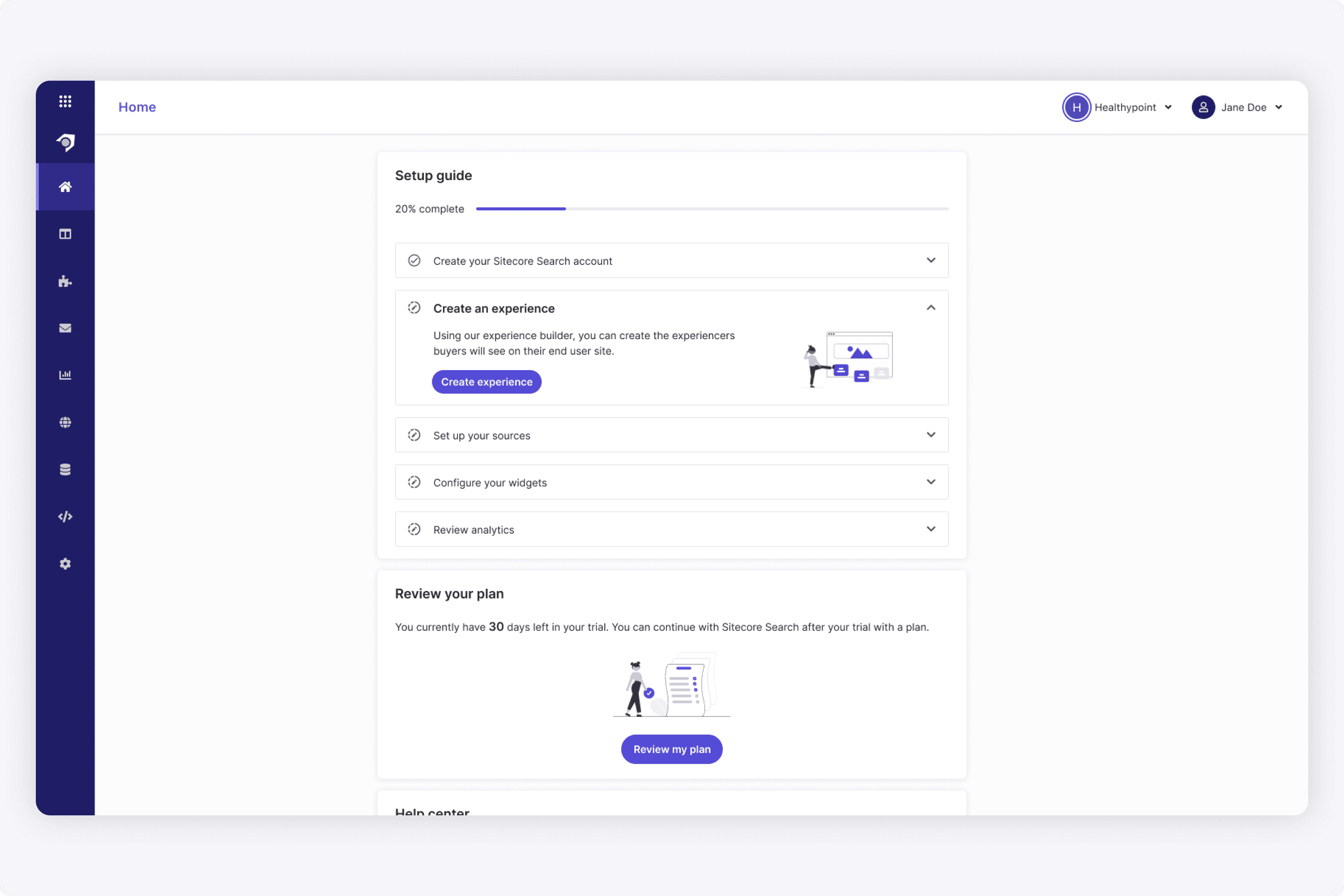
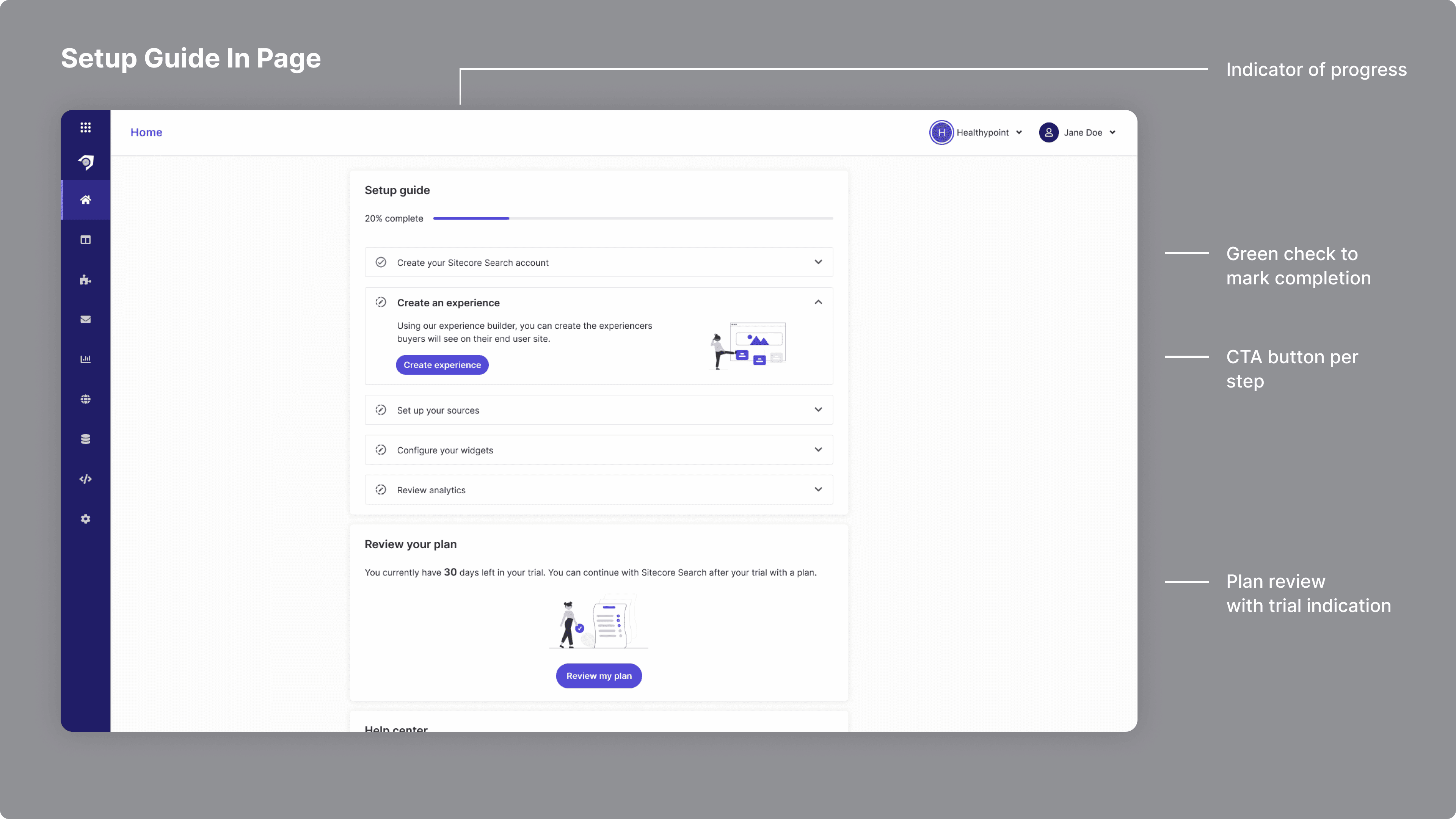
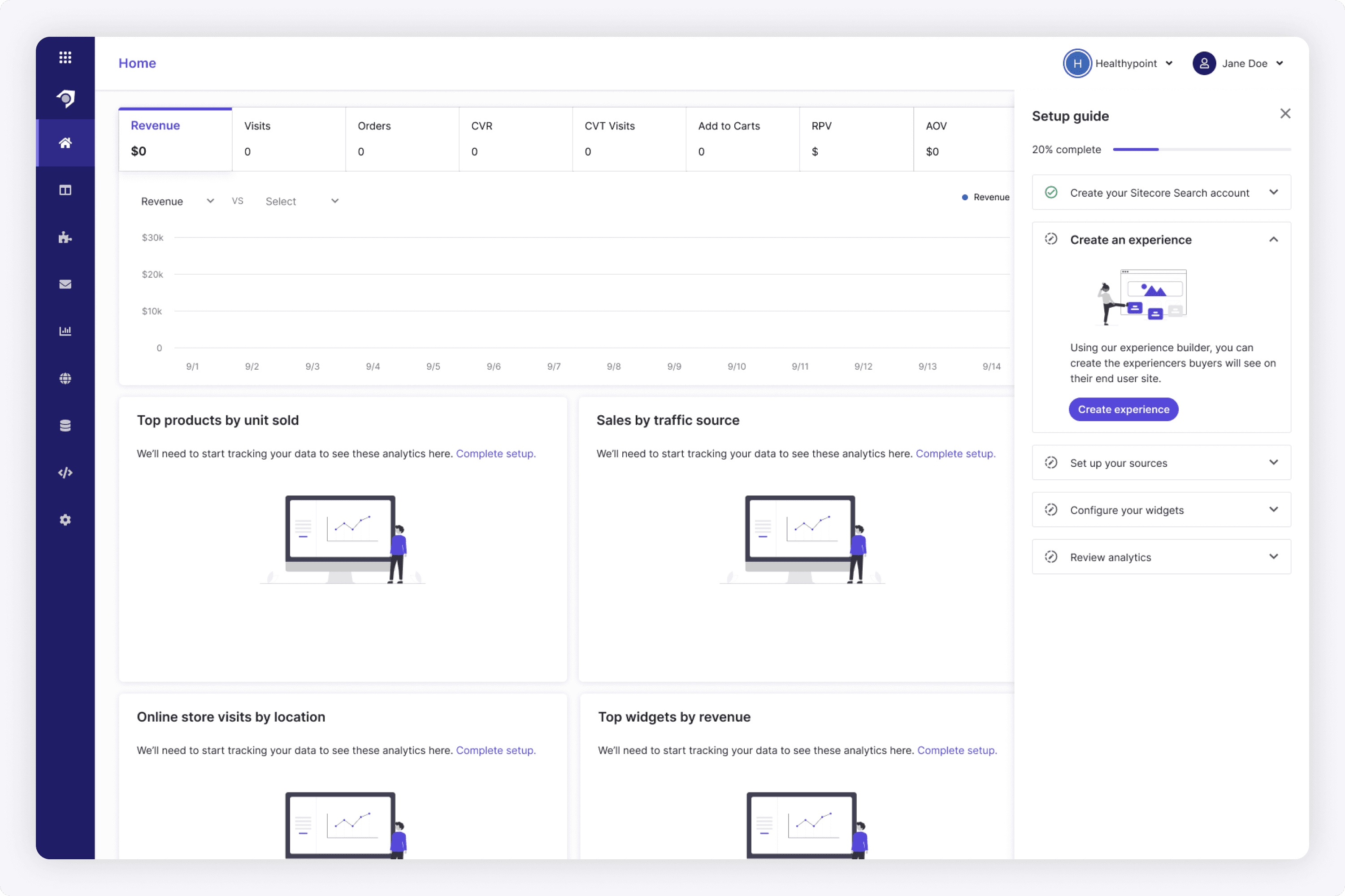
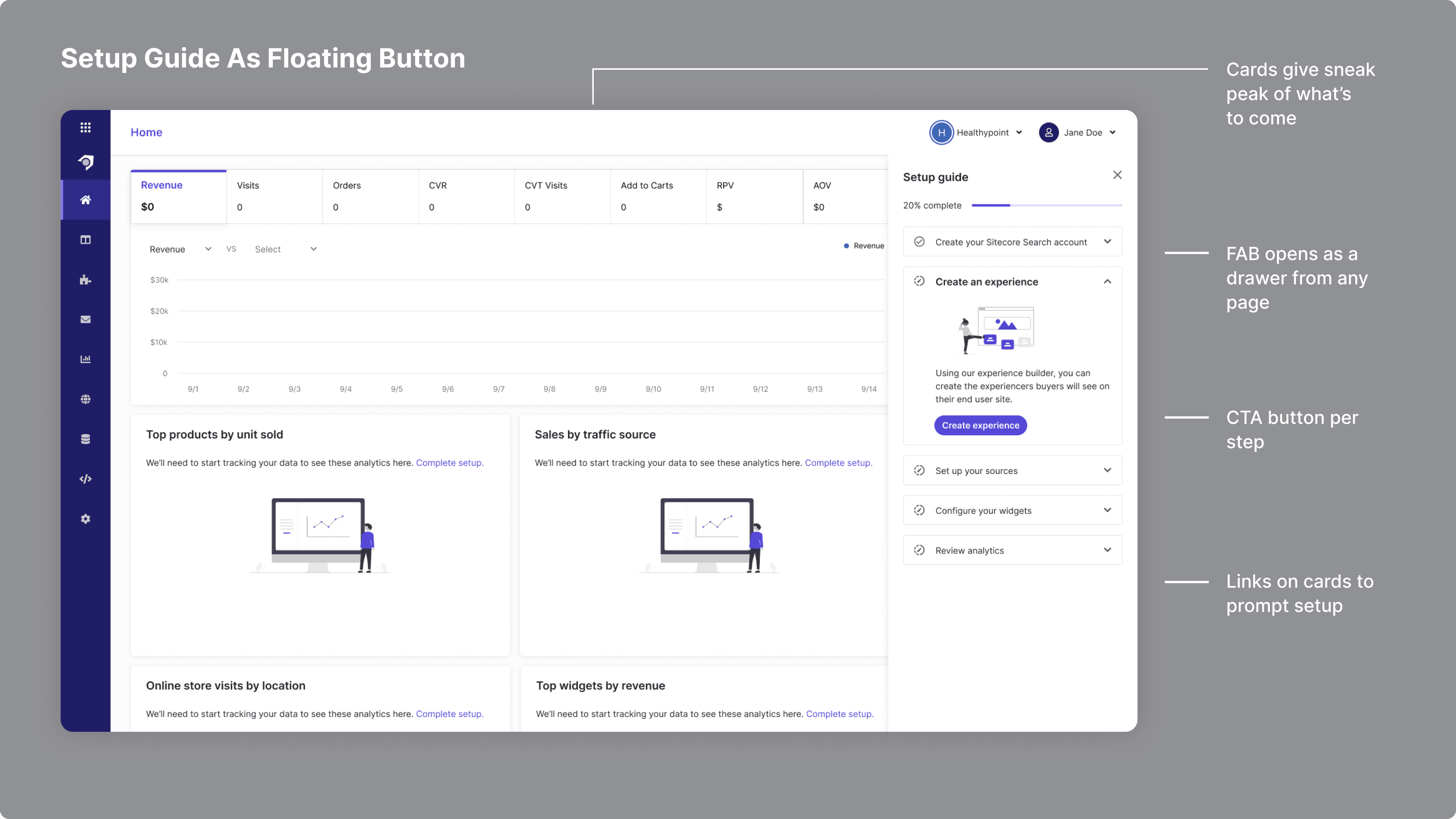
After a user was onboarded, we wanted them to have a clear step-by-step guide to setting up the rest of the platform. Since there are aspects of the product that are technical, it would require a developer persona to be involved to set up the beacon on their website, create data sources that ingested the catalog, set up attribute templates, and more. Therefore, it was critical to for me as a designer to surface all those details in guide that was easy to follow.
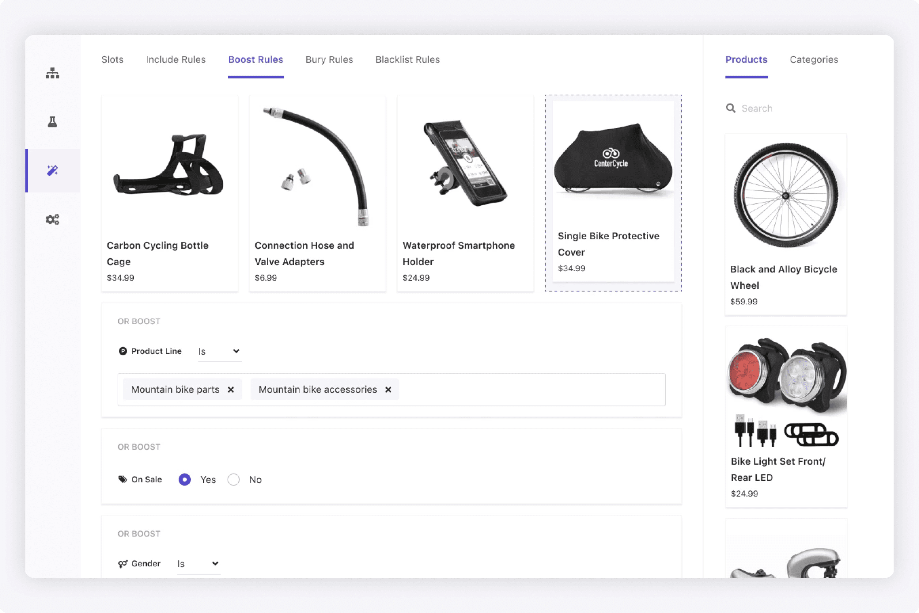
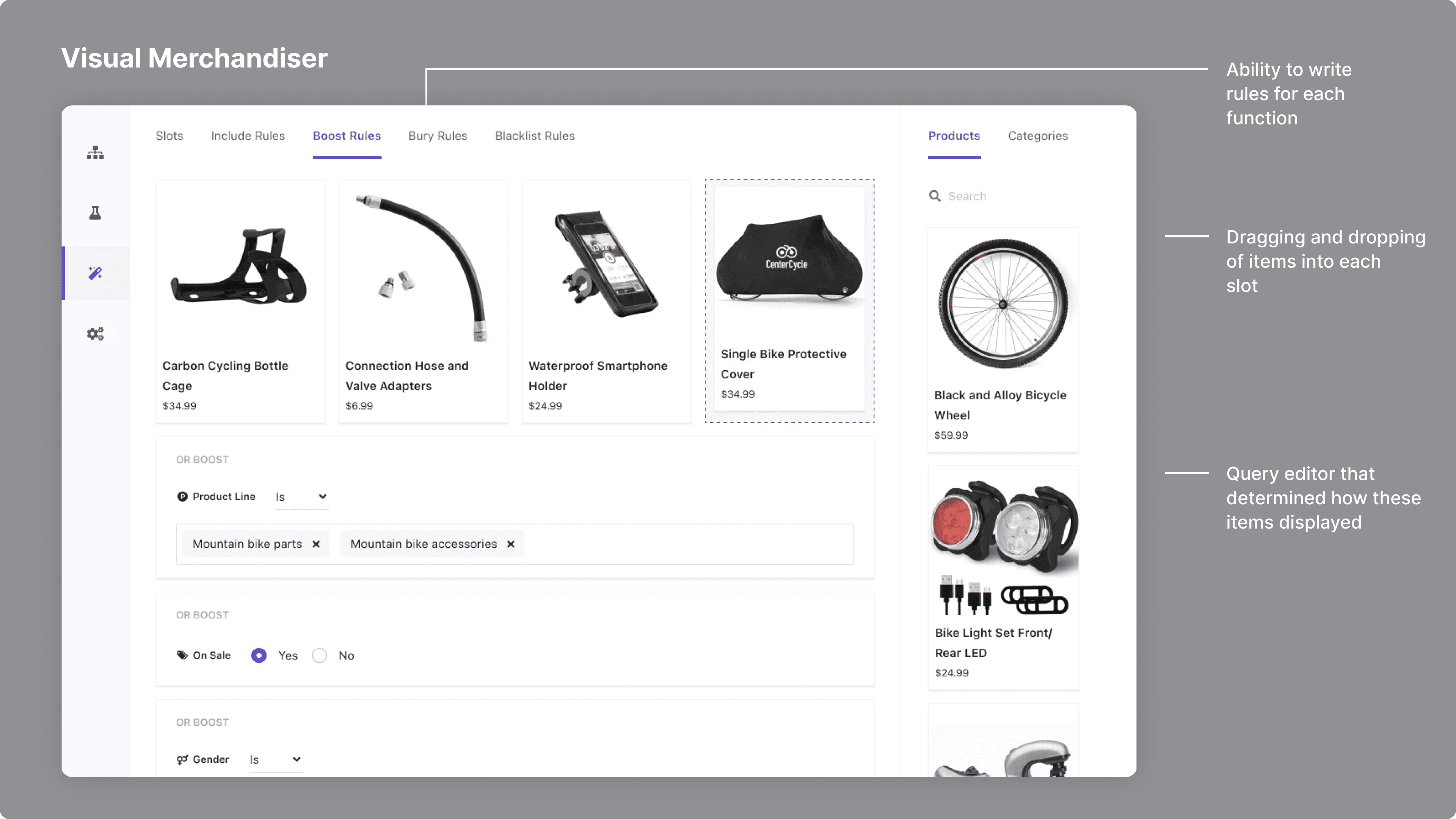
We created a visual merchandiser for manual merchandisers. This enabled marketers to visually determine which products or content were filling the slots on their website, and write the query for it.
By creating this WYSIWYG visual editor, a merchandiser or marketer can visually understand what particular product will be displayed in a slot. From there, they can write the full query that controls how it is displayed. From interviewing customers, we learned the important of being able to see the products themselves (versus just the query).
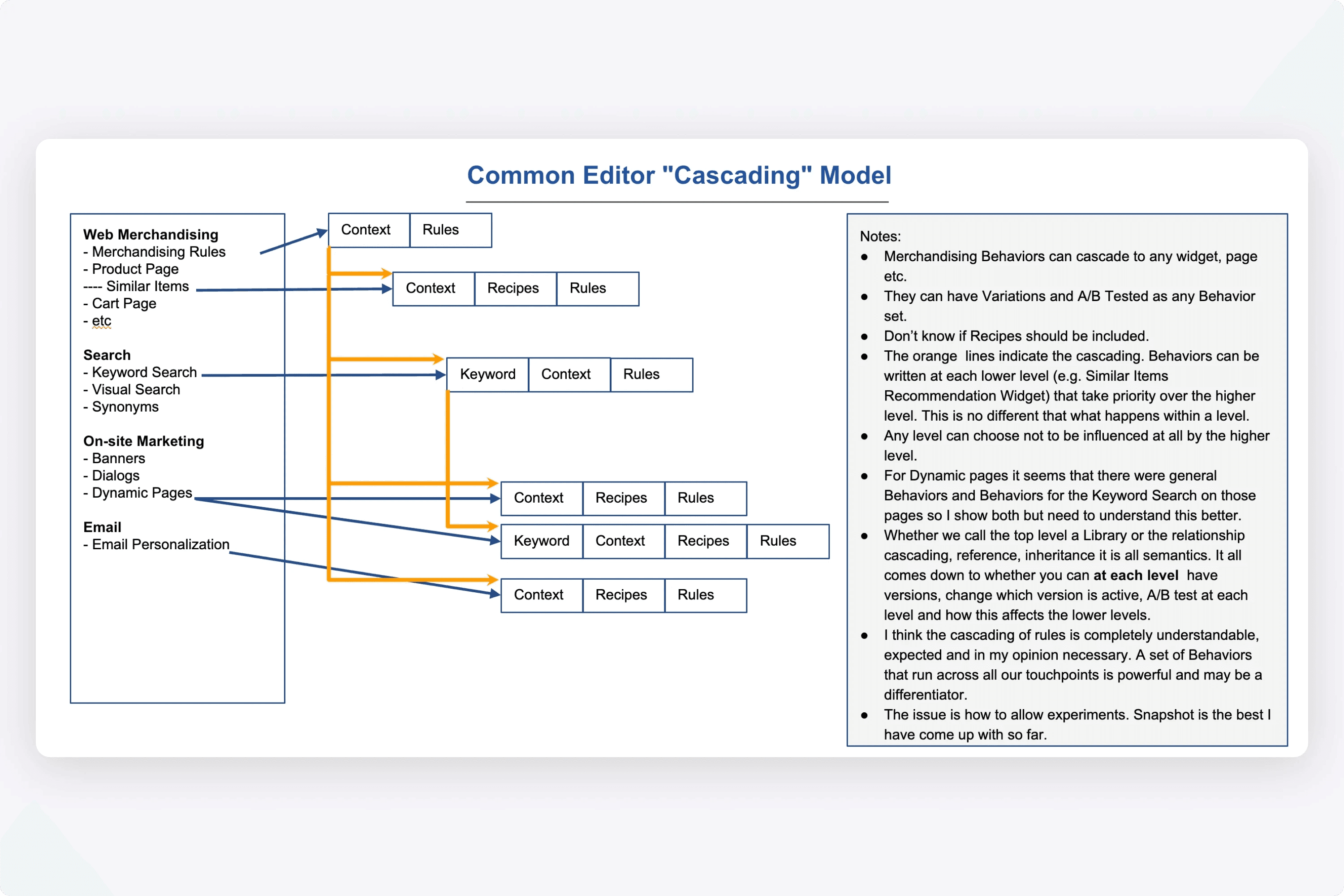
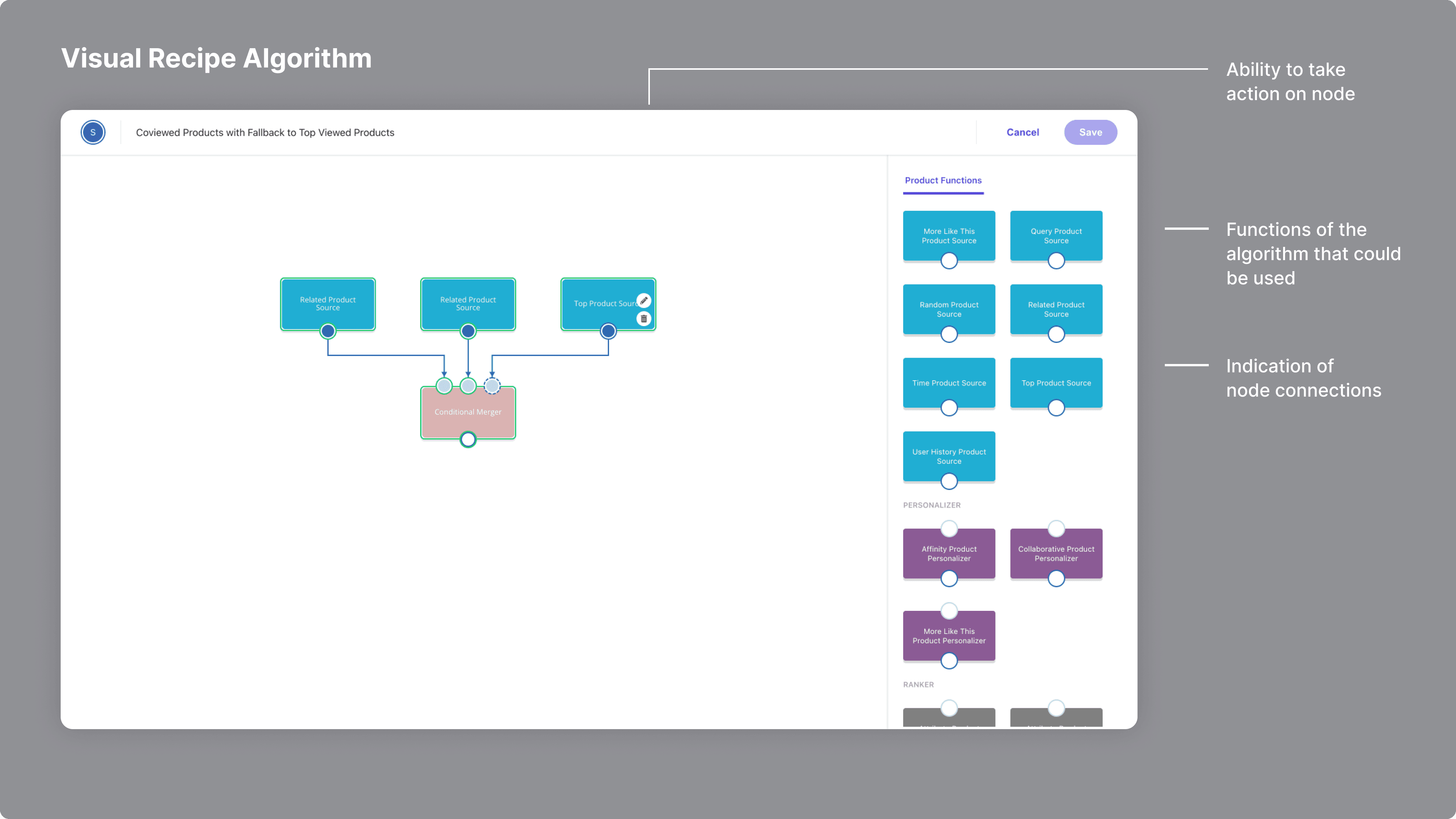
I designed this visual recipe algorithm, which is a node editor, where users can drag and drop functions onto a canvas, click the edit icon to input values, and then connect them all together. The connection of all the nodes created an algorithm, that could power a widget on the customer's website and algorithmically personalize products/content.
By having a visual editor, this gave users insight into the system (rather than it just being this black box of code). When designing this feature, I would research node editors and they generally followed a similar pattern.
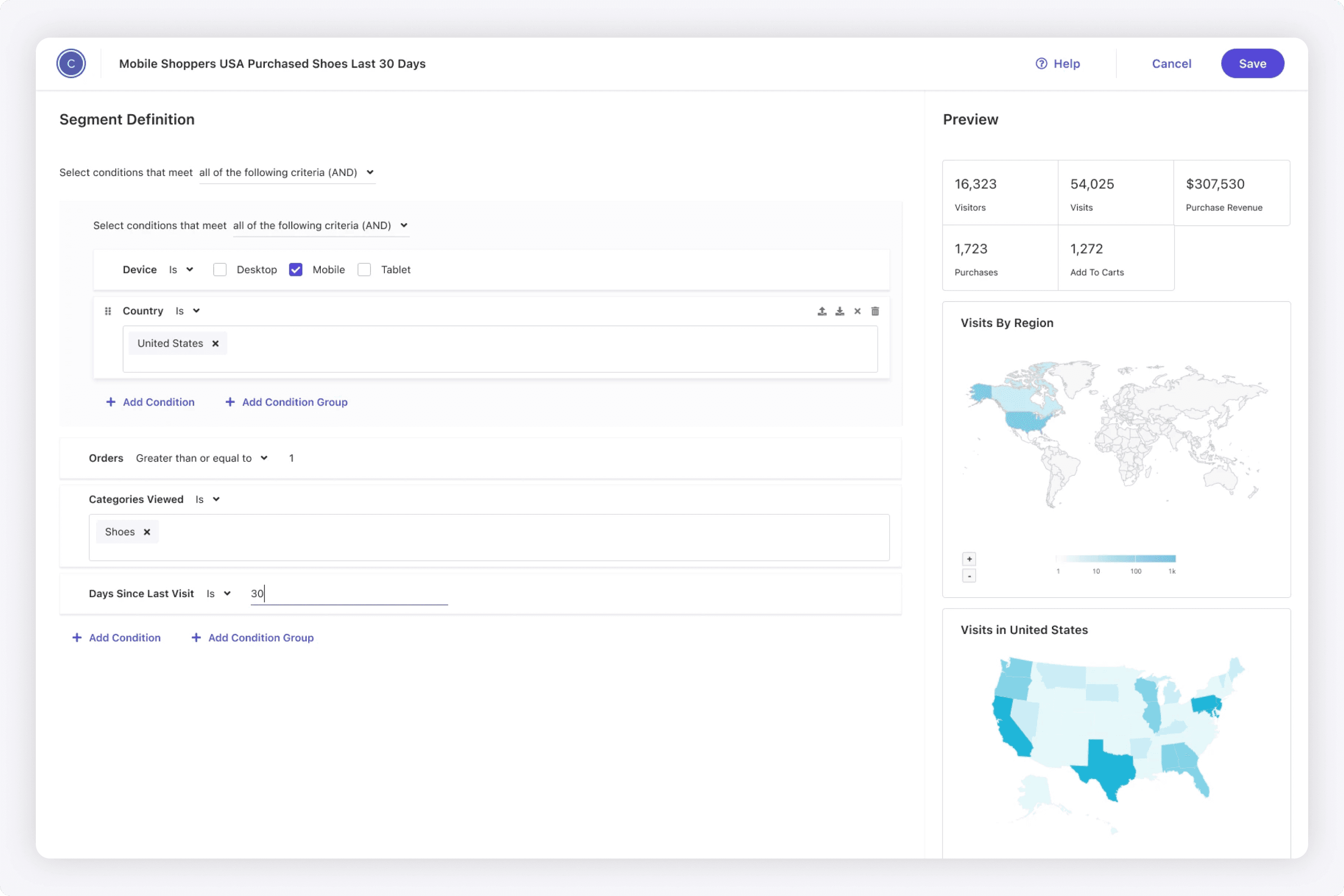
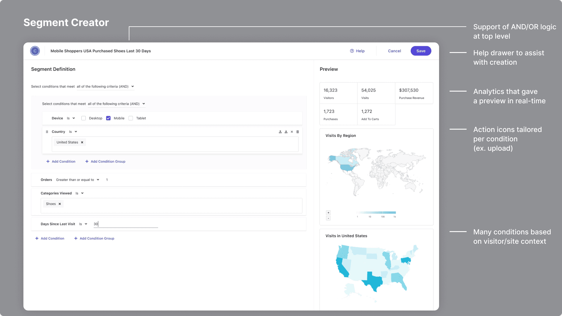
I designed this segment builder for advanced targeting, that also provided a real-time analytics preview. When we demoed this to customers, they thought it was a very powerful feature as we offered many attributes for each condition, to allow very granular targeting.
Users could use segments from external CDPs to build their own natively in the platform. When designing this, I did a lot of research on query builders. It required learning the patterns of adding conditions, grouping them, and the logic between groups. Additionally, I worked with the back-end team to understand what data we had on segments, and how that could be displayed in real-time.
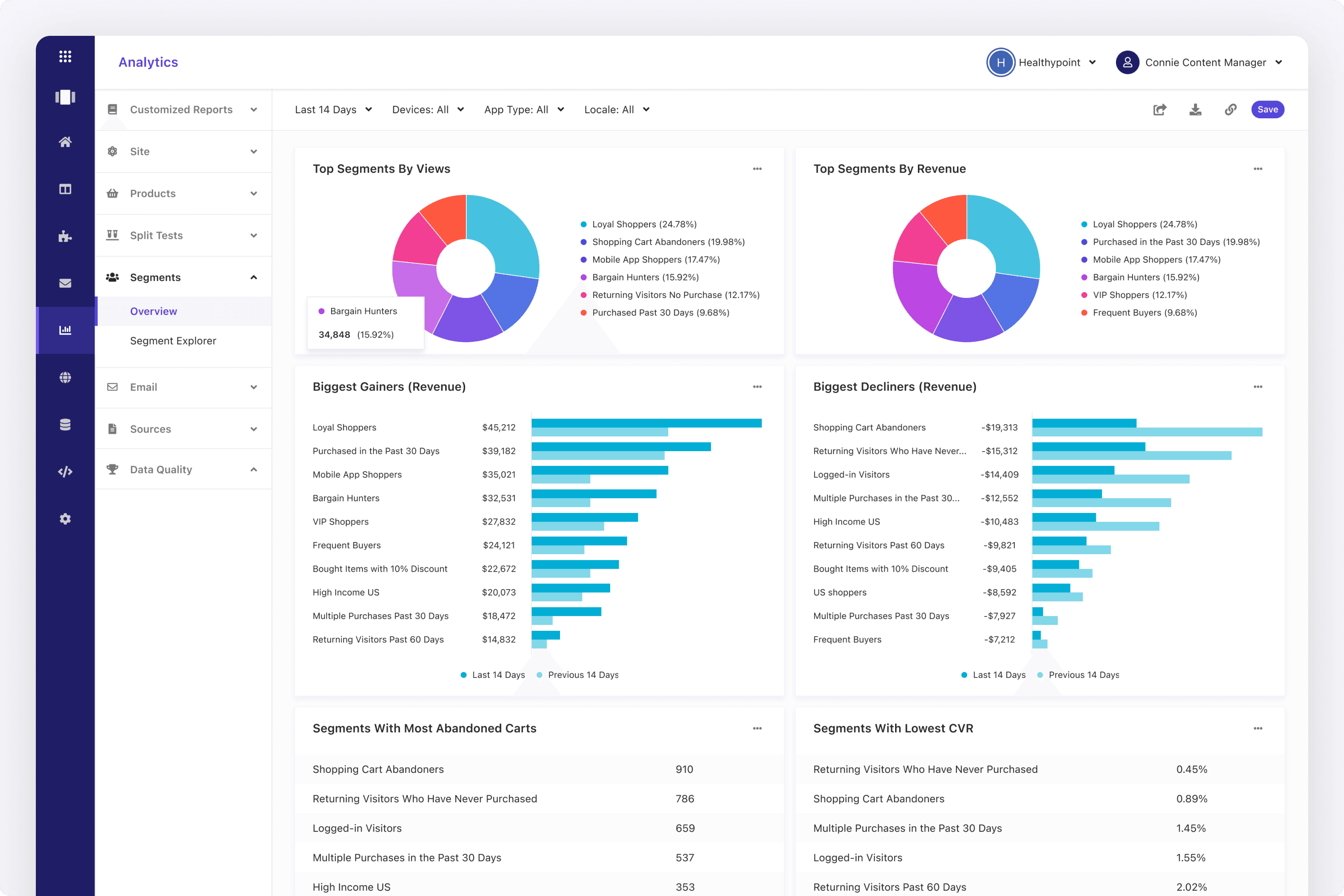
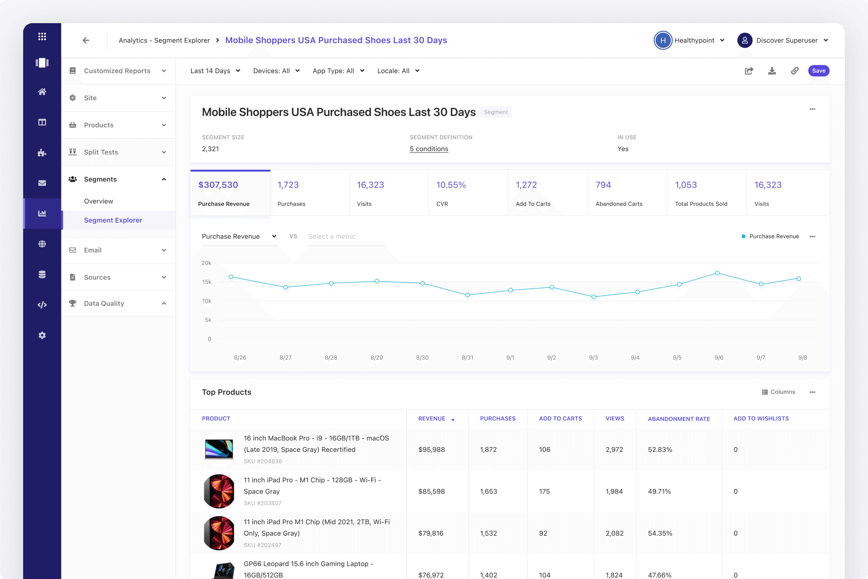
Users were able to view analytics on their segments. So, I also designed this segment reporting area as seen below.
When I designed this segment reporting area, I kept in mind that the goal was to help users identify trends and opportunities. From there, they could go back and improve their segments for advanced targeting. The idea was to show top objects (products, keywords, etc.), that helped marketers understand how to write better rules.
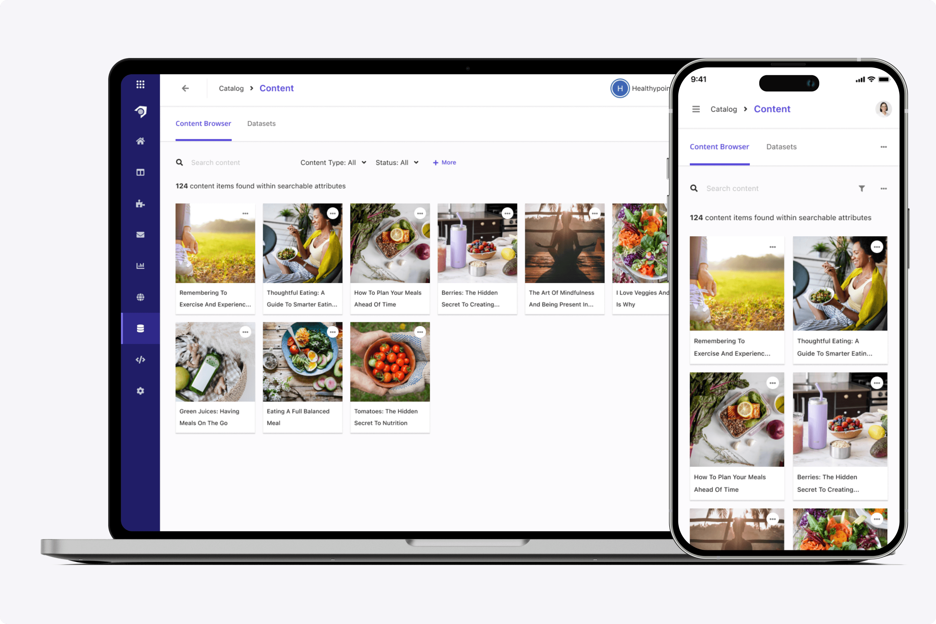
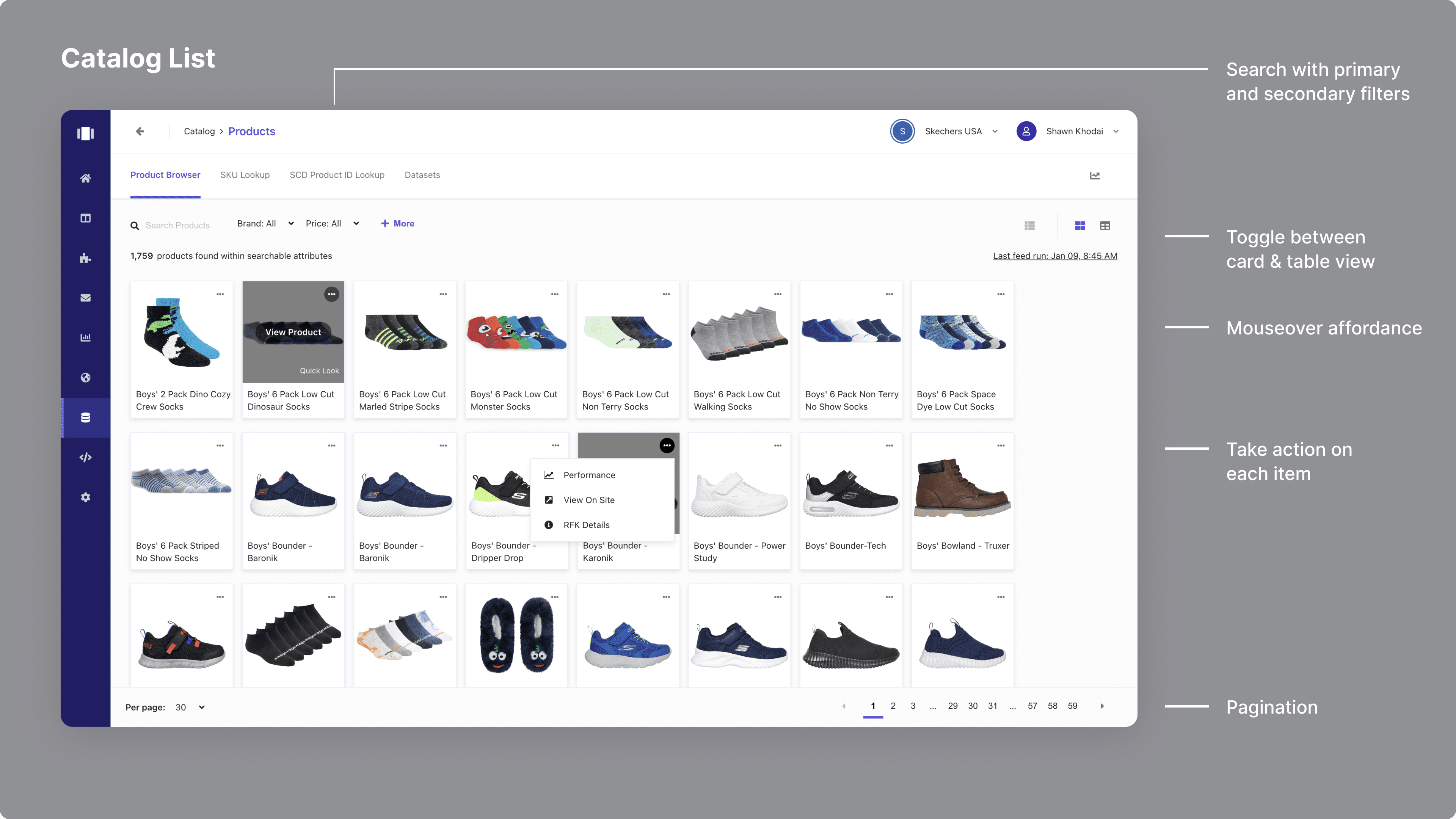
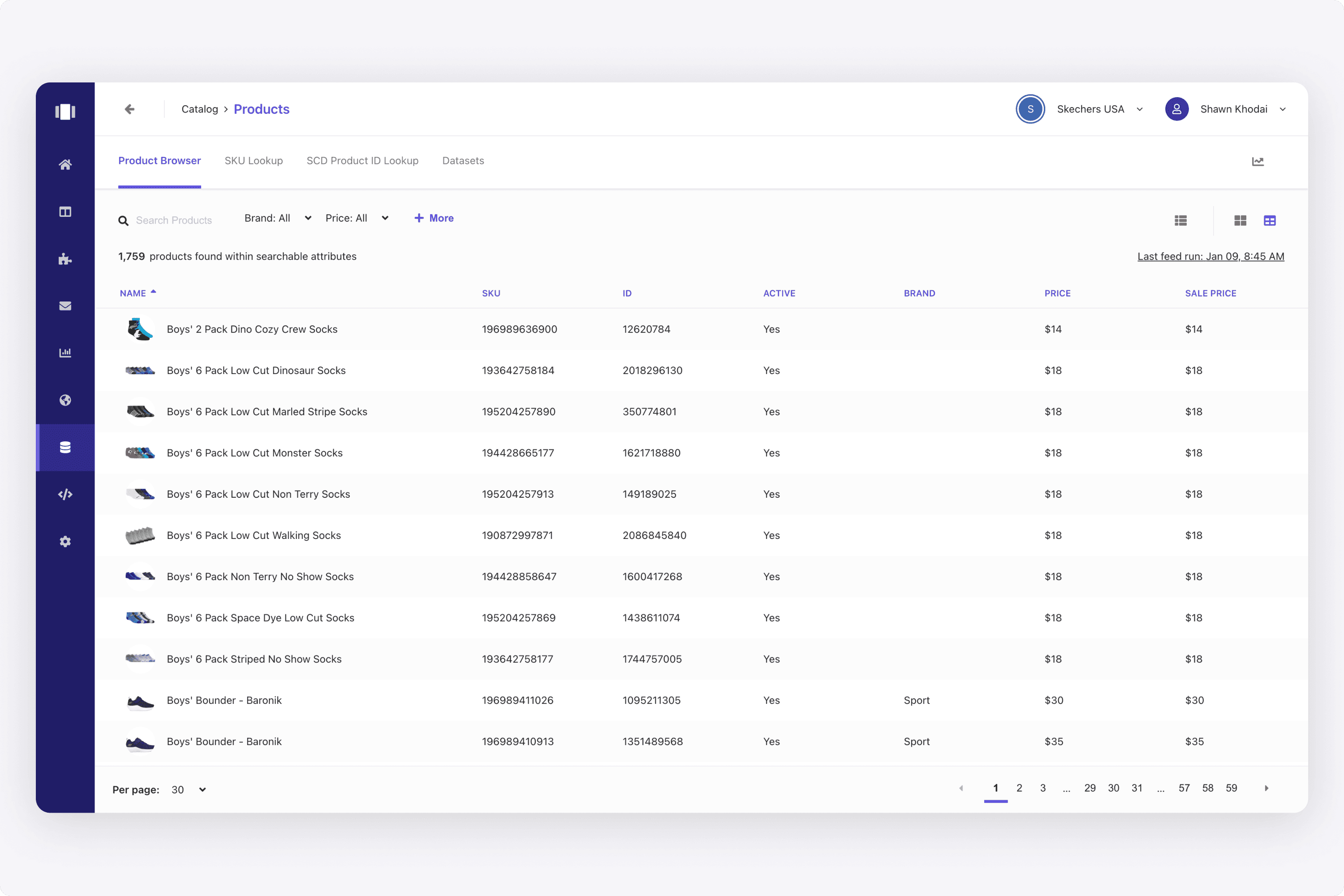
I designed a catalog for merchandisers that supported multiple entities: products, categories, content, articles, fitments, and more. When researching, I would at how other platforms in the e-commerce space had catalog management (ex. Shopify).
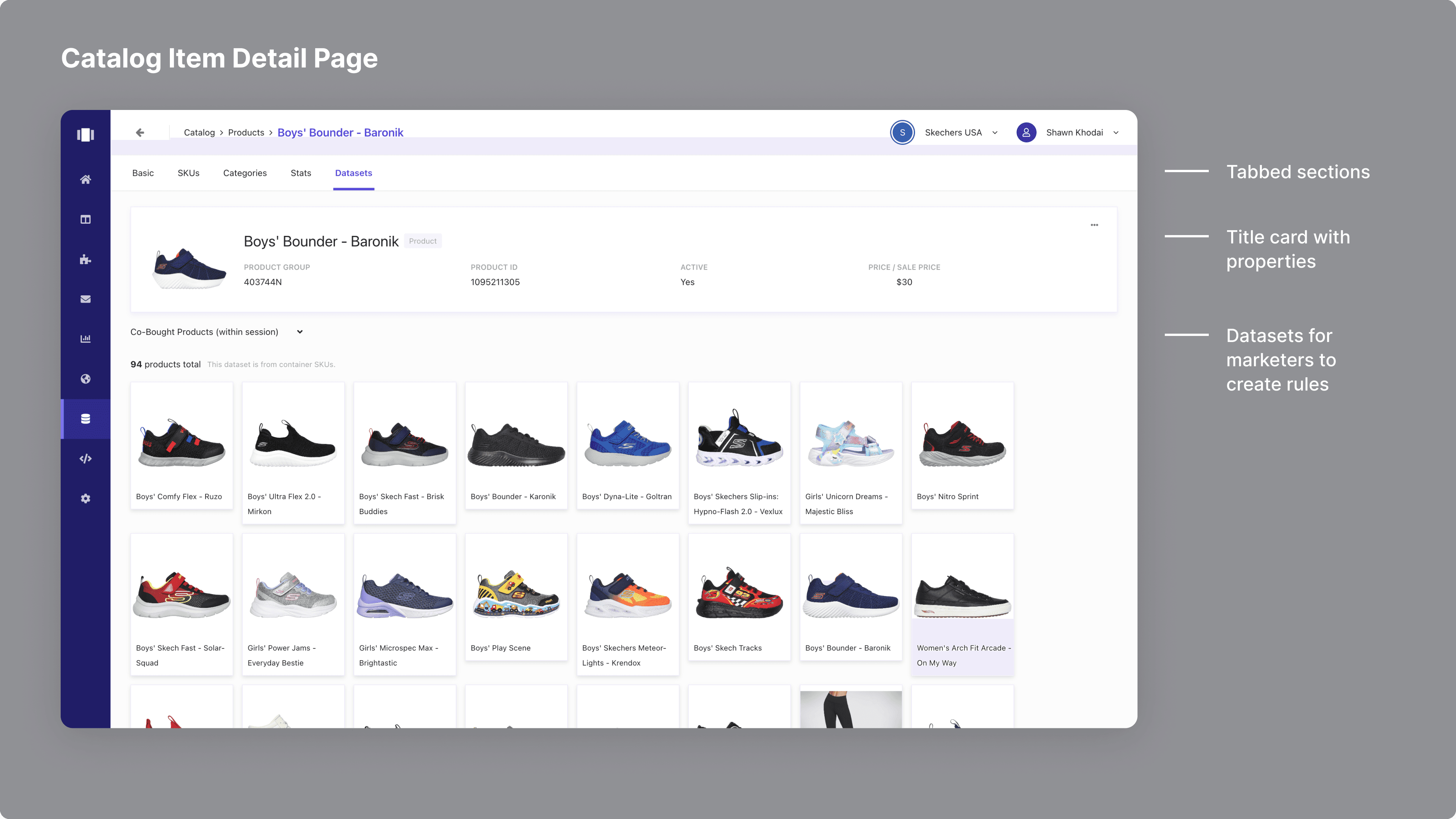
Since we were always thinking about how we could give opportunities and insights, the datasets tab helped our users learn more. In this example, a user can see the co-bought products within session. To take this a step further, this attribute of co-bought products could be used by in merchandiser writing a rule.
So in other words, if a user is looking at this shoe's product detail page, a merchandiser could write a rule for their "Customers Also Bought" recommendation widget to display these co-bought products within session. It was always about how we could deliver more and more value to merchandisers when they sold products or displayed content on a website.
Since we ultimately provided better website experiences for e-commerce brands, it was necessary to have a catalog.
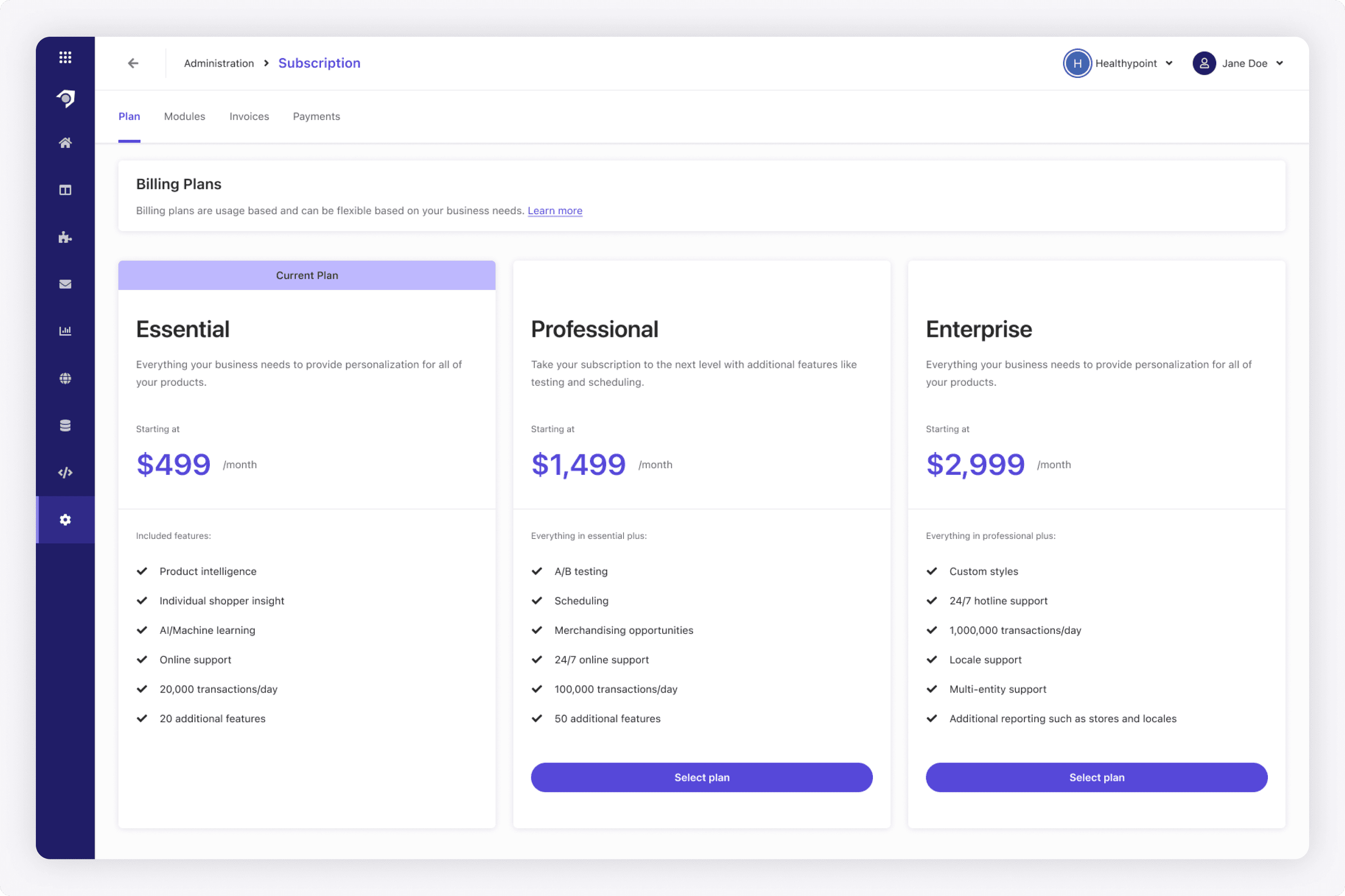
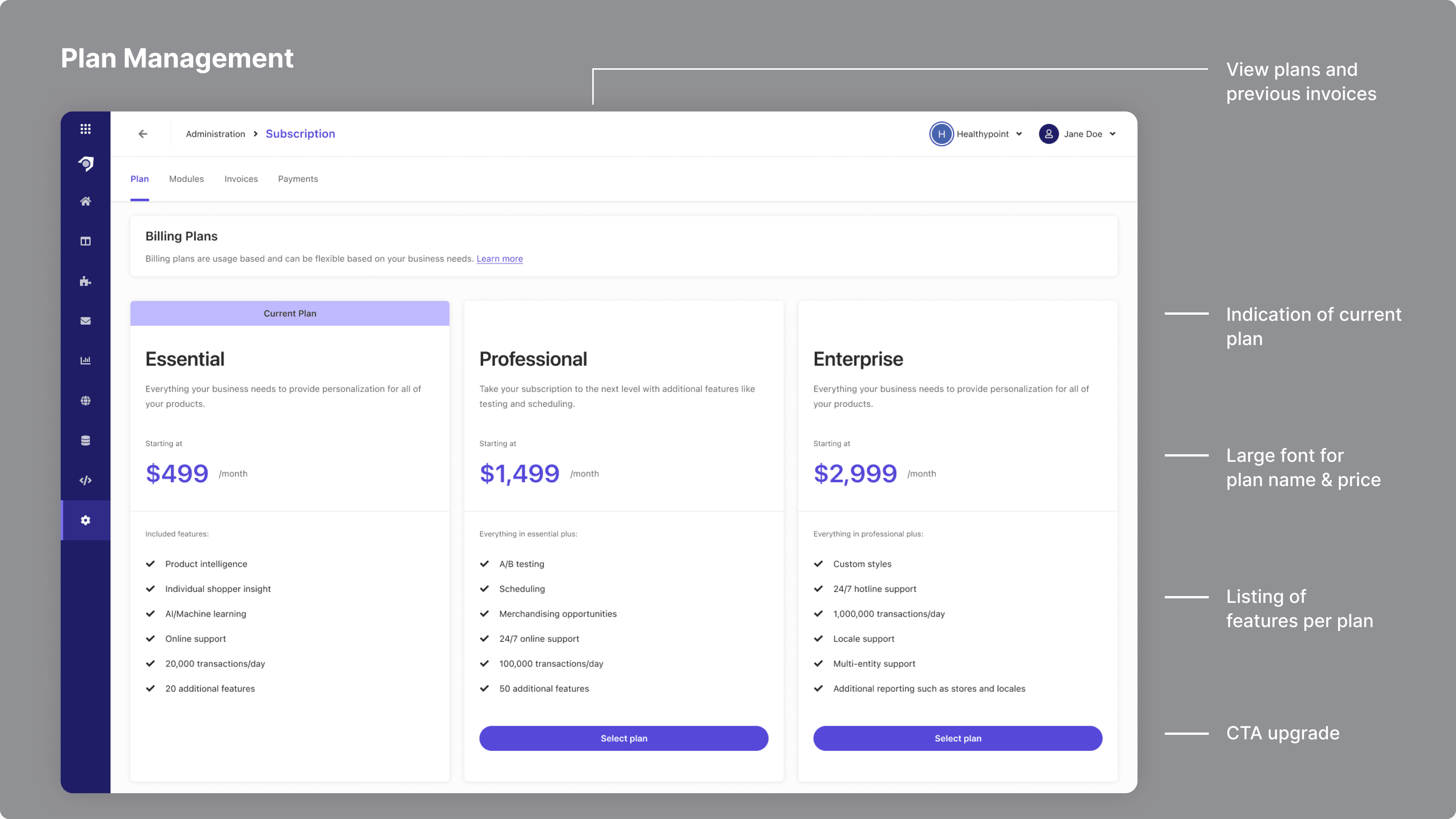
We wanted customers to have full control over their account and manage their subscription and more. The idea from a busines standpoint was to greatly reduce the creation of support tickets. I tried to make the subscription section clean in this shot. I'll use the squint test sometimes, and I wanted to highlight the plan, the price, and the CTA. I looked at a lot of other SaaS platforms and how they handled subscription for inspiration.
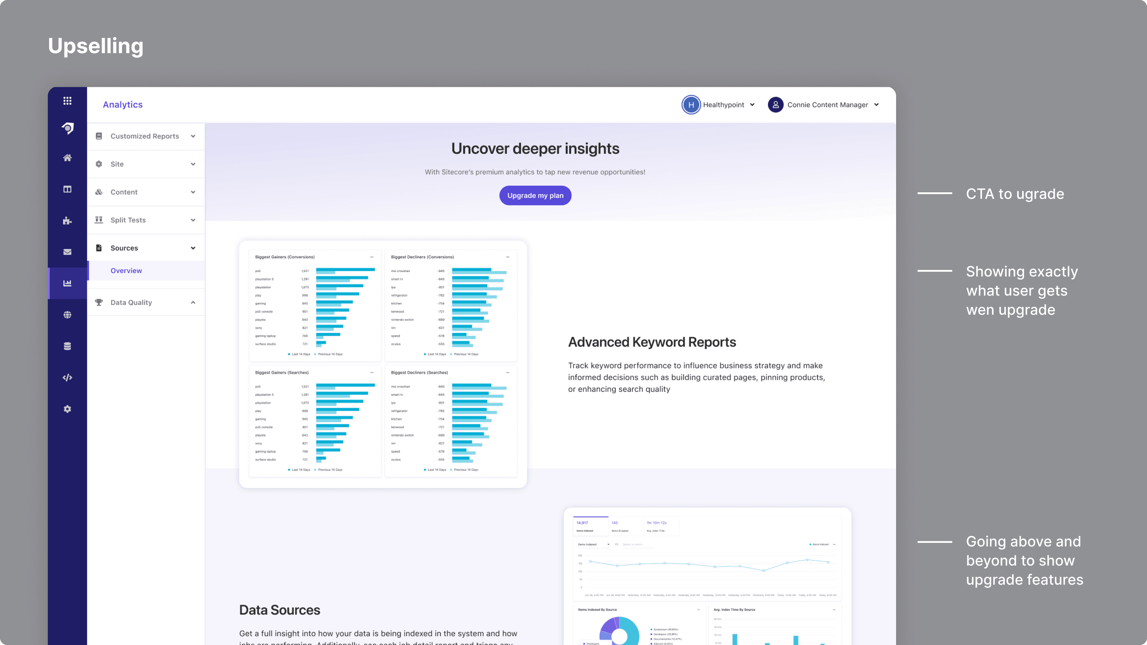
In designing this shot in particular, I really thought about: How can we deliver value in an upsell? In this case, we can employ the idea of showing, not telling, by using actual screenshots. This tells the customer very clearly what they would get if they upgrade.
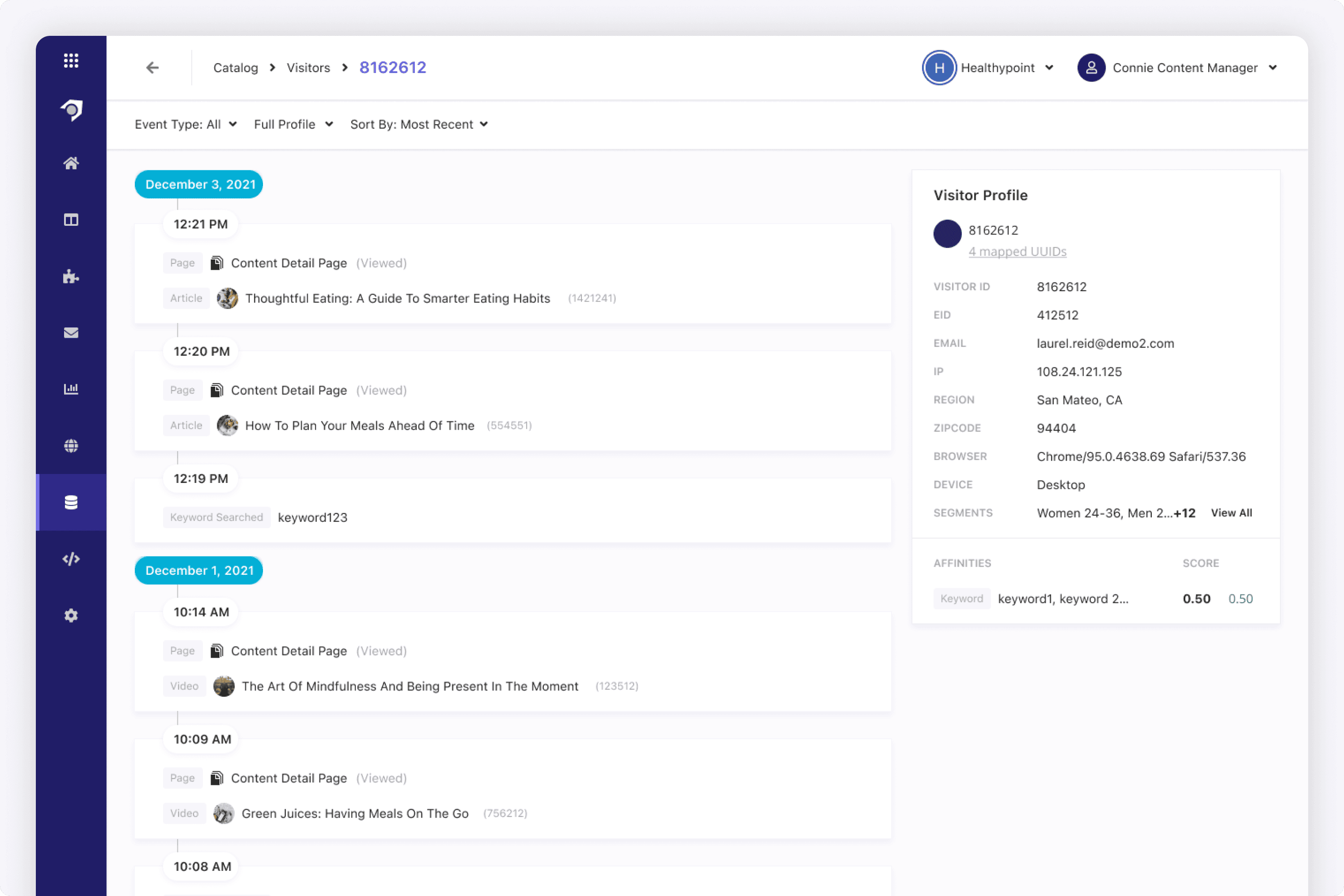
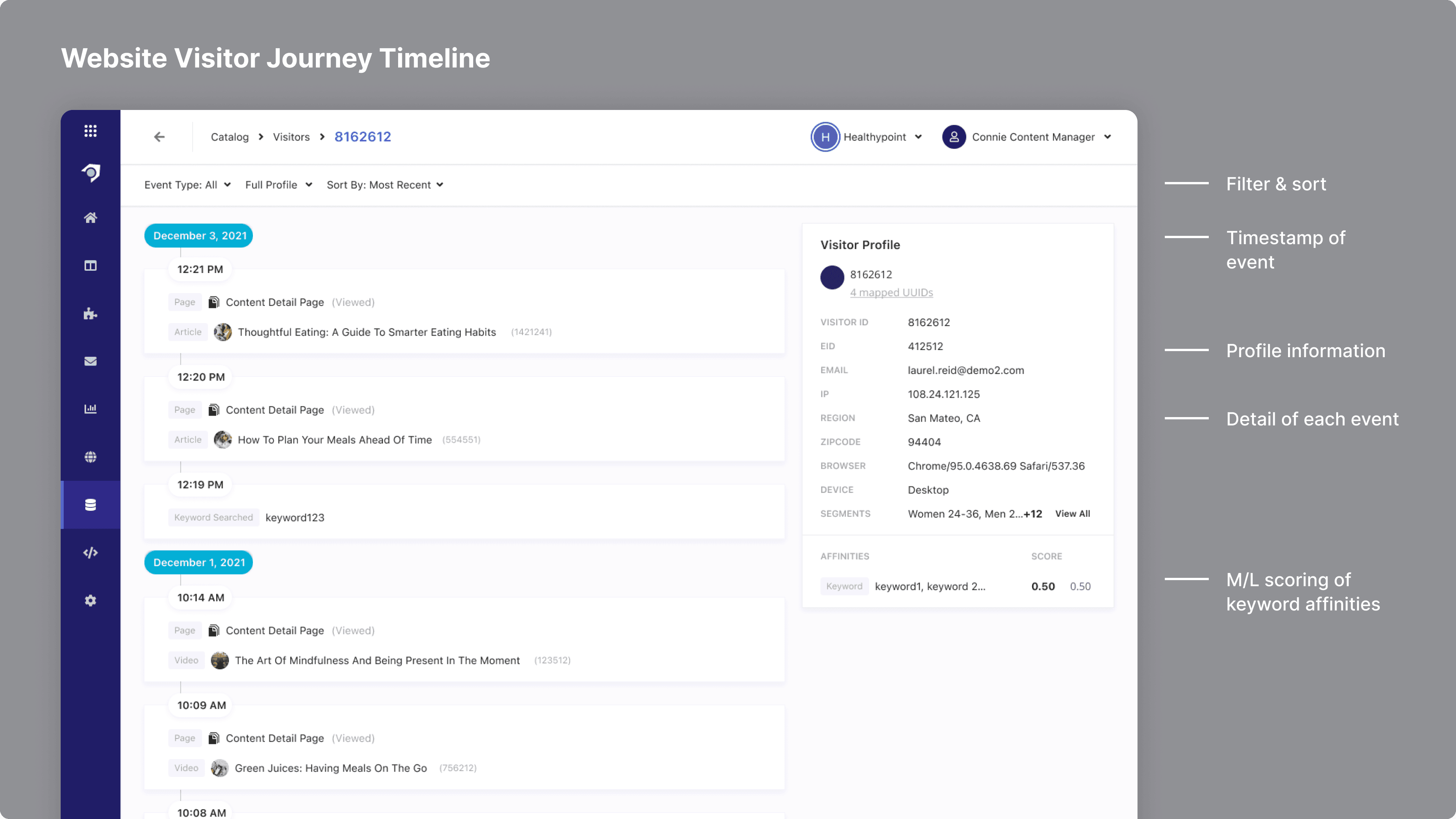
We were always thinking about how we could create opportunities for marketers. Since we tracked view and click events, we could create a visual timeline for marketers to view.
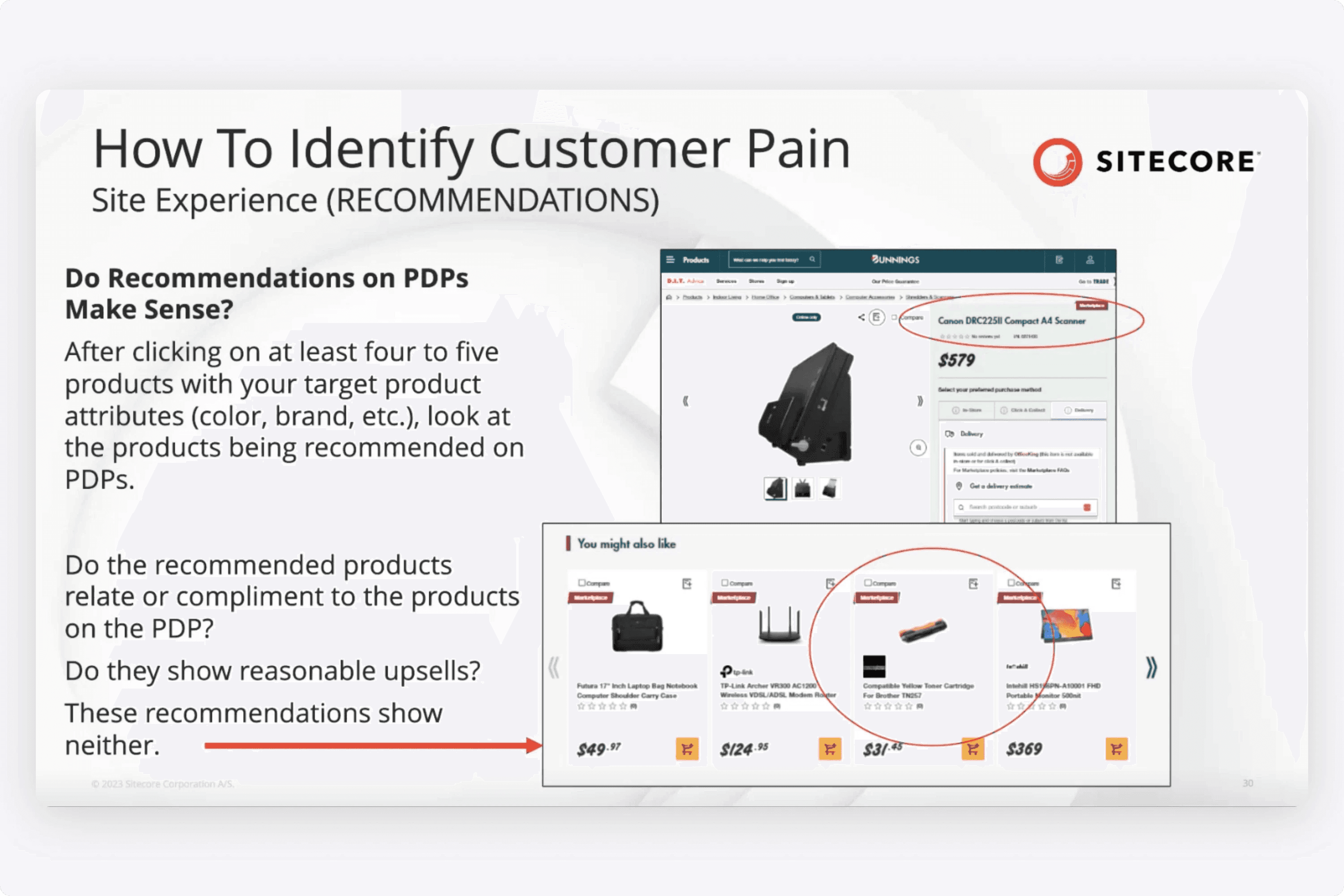
The predictive capabilities for this helped influence how products were recommended. For example, if we tracked what visitors would typically view or click after visiting a particular product page, those products could show up under "You May Also Like".
I designed this timeline that enabled marketers to look up a user by an ID, and see all the things they viewed and clicked on. We were always thinking about how we could provide insights and opportunities. Customers could look up a visitor's ID, and understand the timeline of their view/click event history.
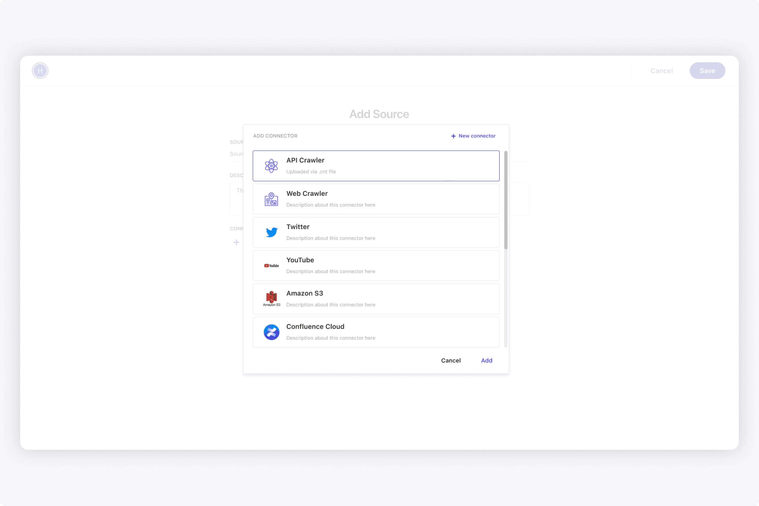
A core persona for the platform are developers, who are involved in the creation of data sources (crawling, API, pre-packaged). When designing this module, I worked closely with the back-end team to make sure the UI matched every parameter.
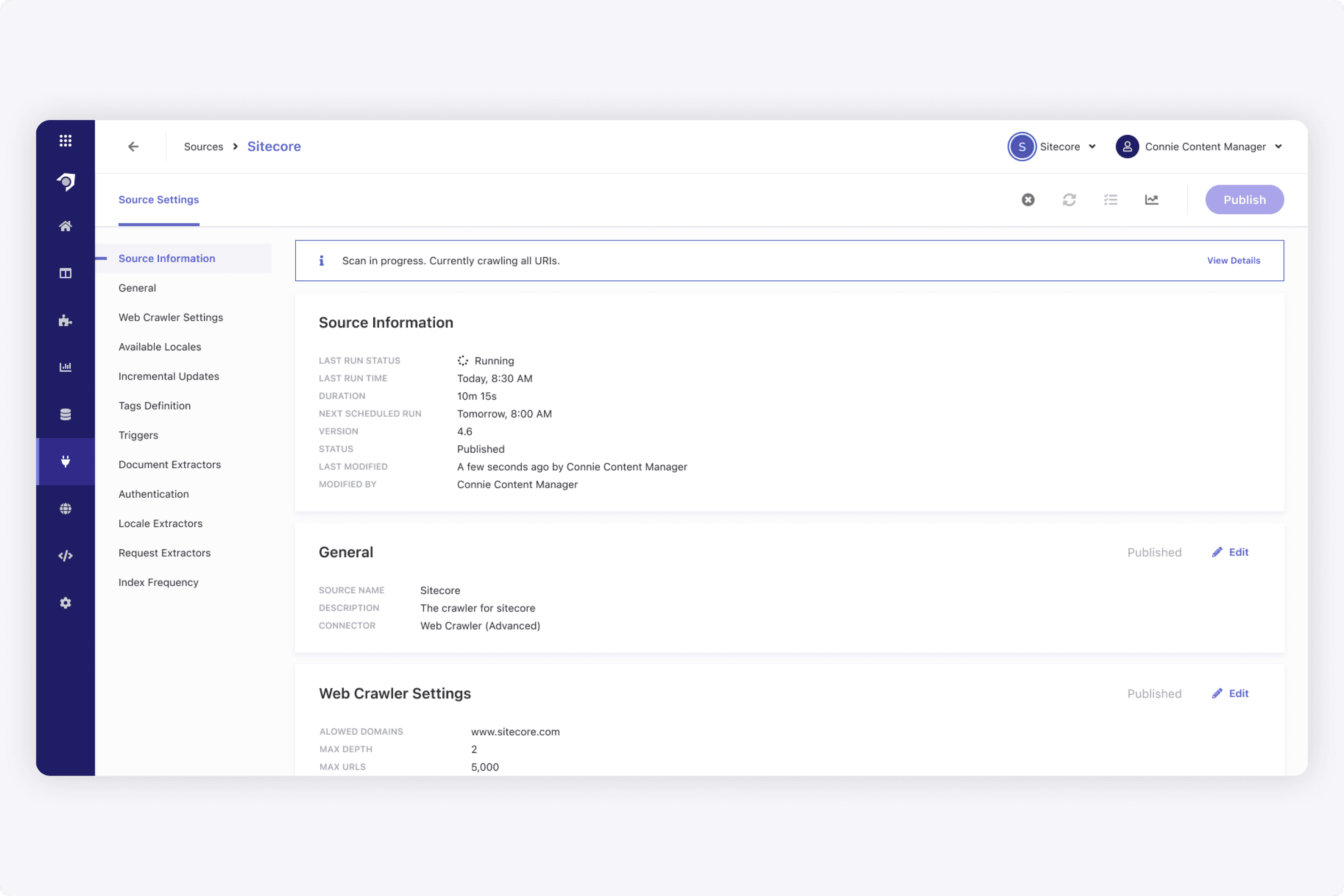
I worked with our back-end team a lot when designing the configuration of data sources. Although it was very technical, I still wanted to make it simple to understand what a user can do on this page. Additionally when a scan is in progress, it was important to really call it out. The mental model of all our object pages was to put each section in a block, and have all the action icons in the upper right corner.
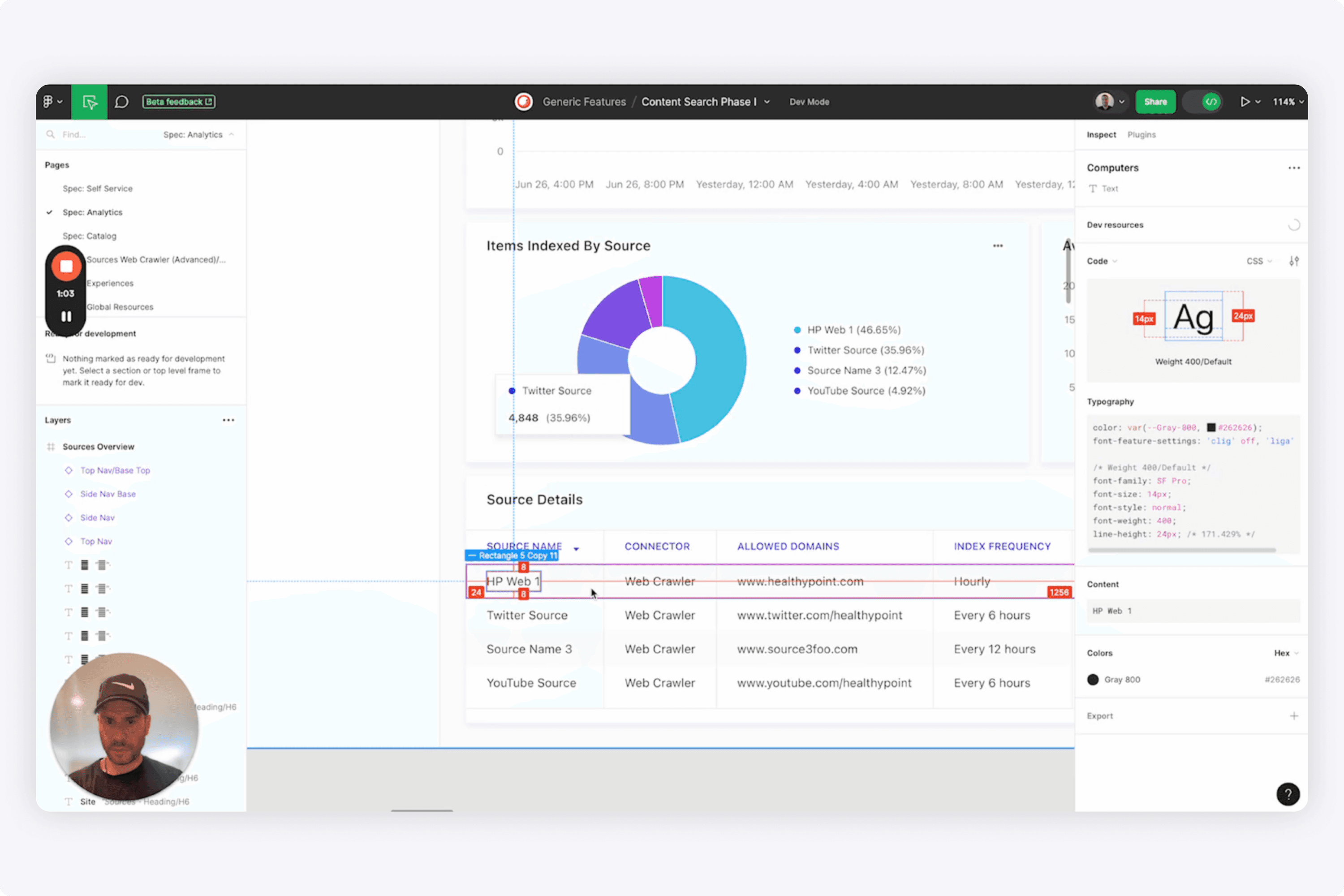
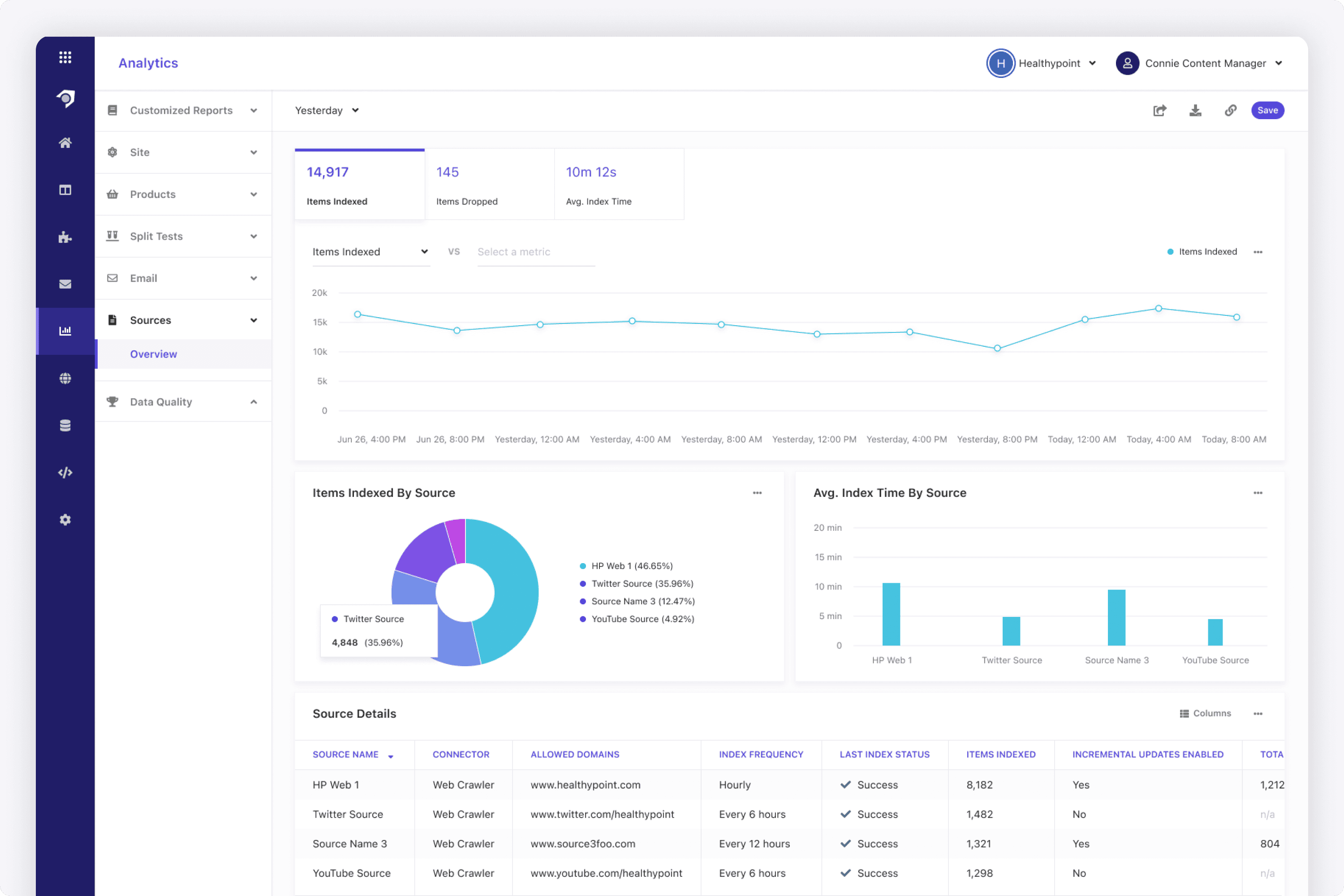
Users also needed a place to view their source analytics. I designed the reporting area below so users could see an overview, then drill into each source or job to see more.
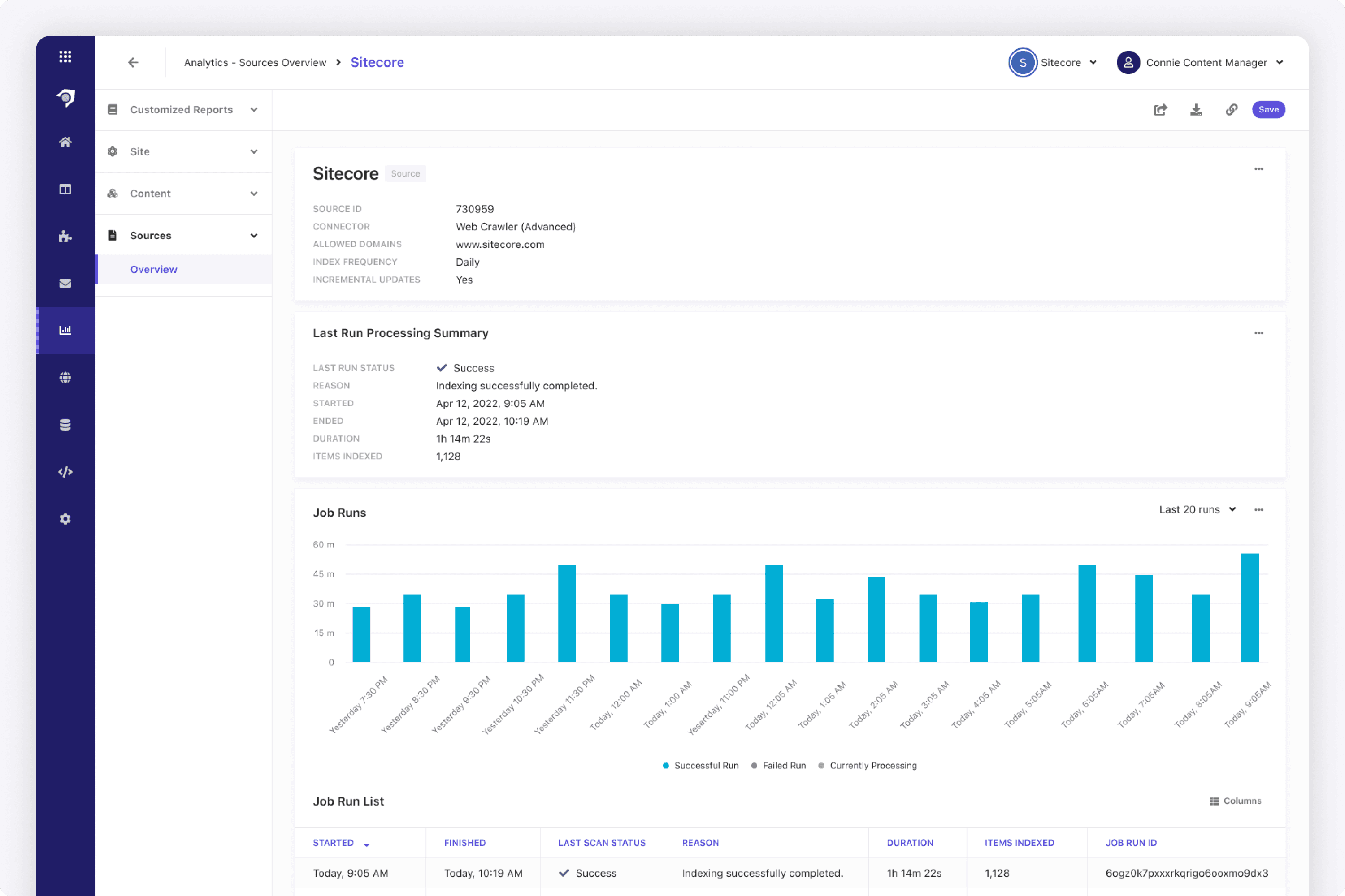
Users can drill into a data source, and see a breakdown of all the job runs. When I designed this page, I wanted each job run to be a column in this column chart. This way, it serves the purpose of giving the user the length of time it took to process, and would change color accordingly (ex. column is red when failed).
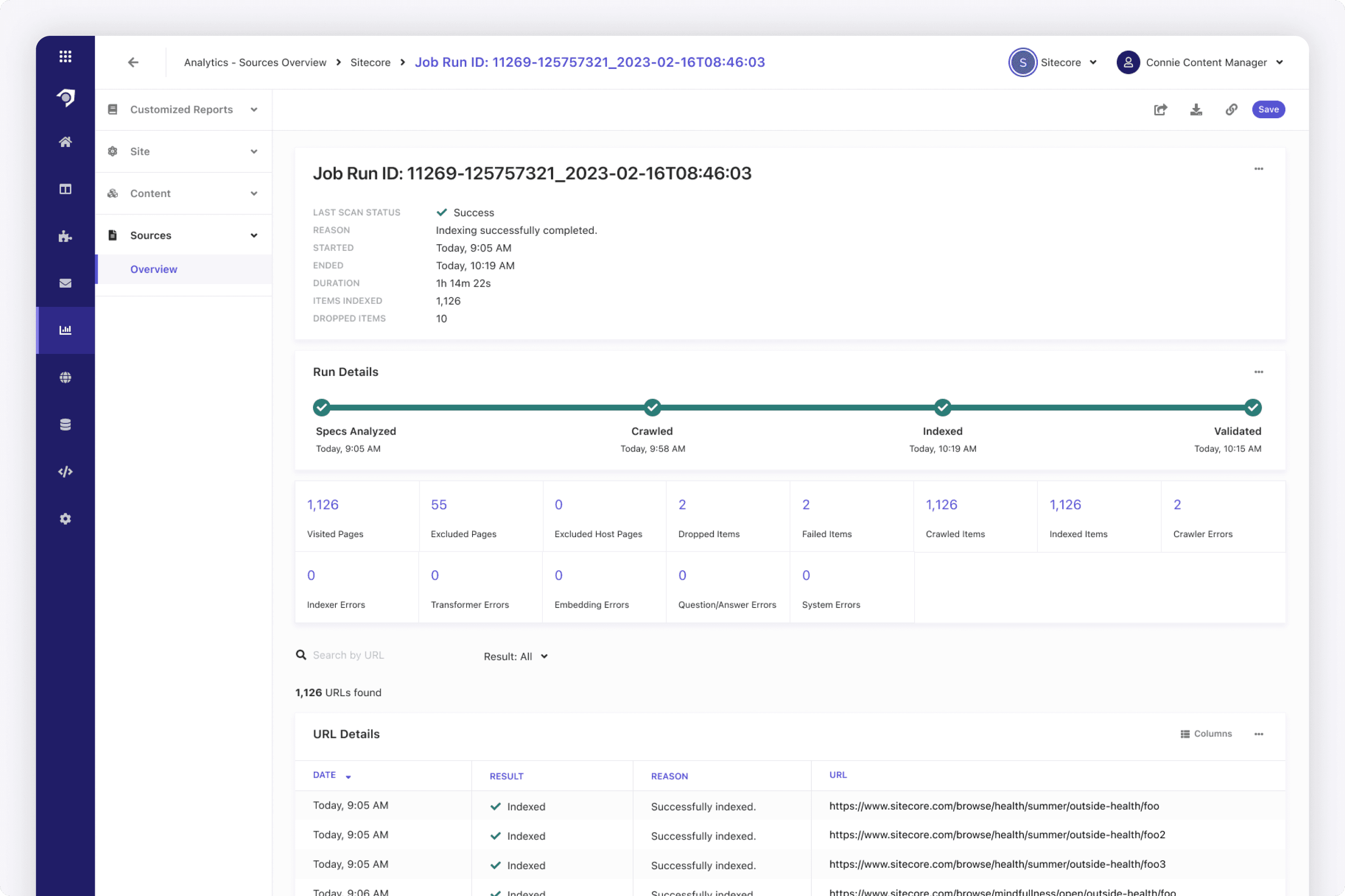
When designing this page, I wanted to give the users a timeline of events so they can see each stage, and when it was completed. This gave users a view into our back-end a bit. But really, what mattered was the items that were processed.
In the case of this web crawler example, it was the table of URLs indexed, where each URL is an article. Each one of those crawled URLs became a content item in the catalog.
As a SaaS platform with many technical aspects, it was important for developers to see if things went wrong. I designed several modules to assist any devops or L1/L2 engineers:
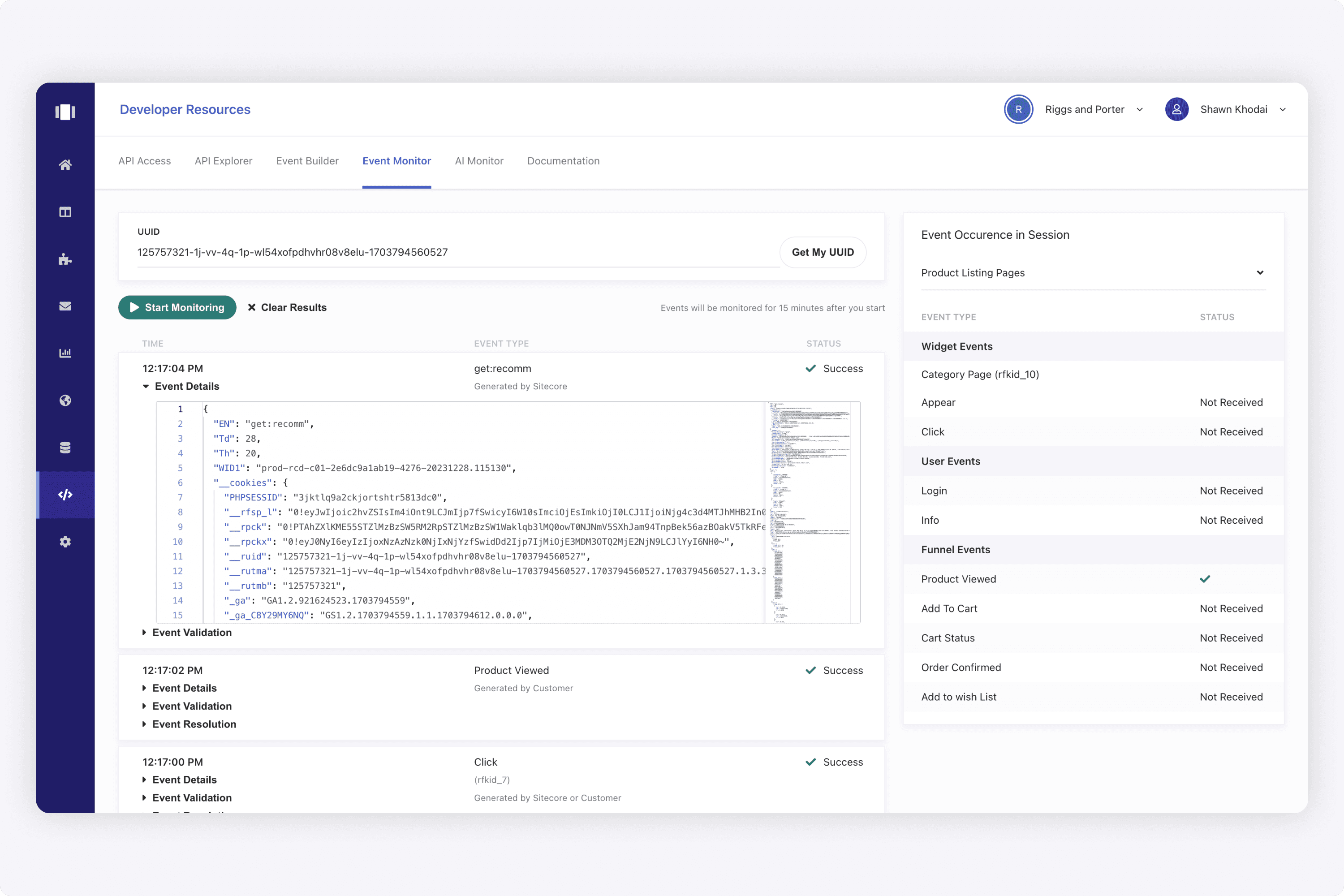
An event monitor to track that view and click events were working on the end user website.
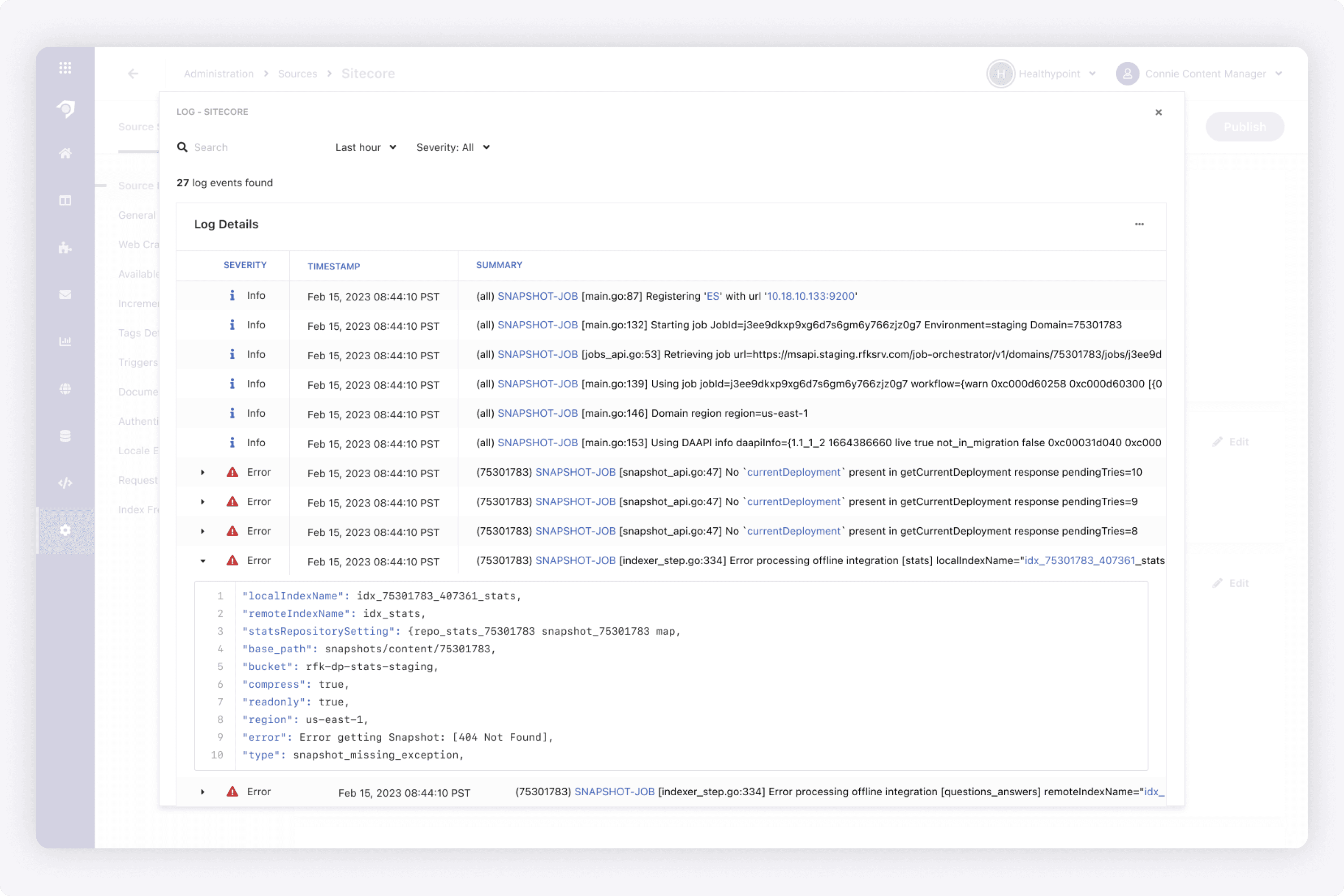
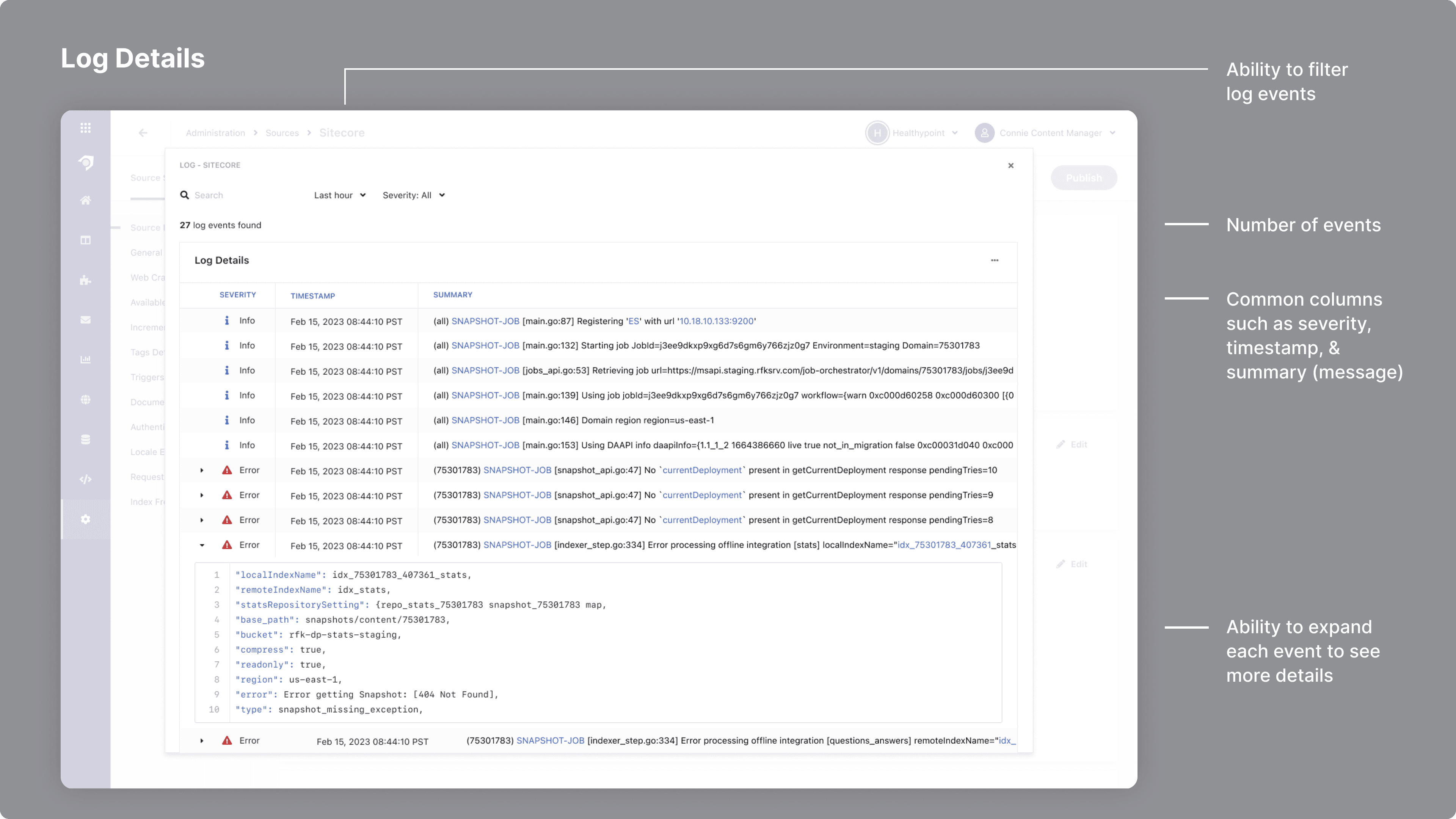
A log explorer to make sure events in the data pipeline were firing correctly. For this, I looked at log explorers from cloud platforms such as AWS and GCP to identify and use common patterns.
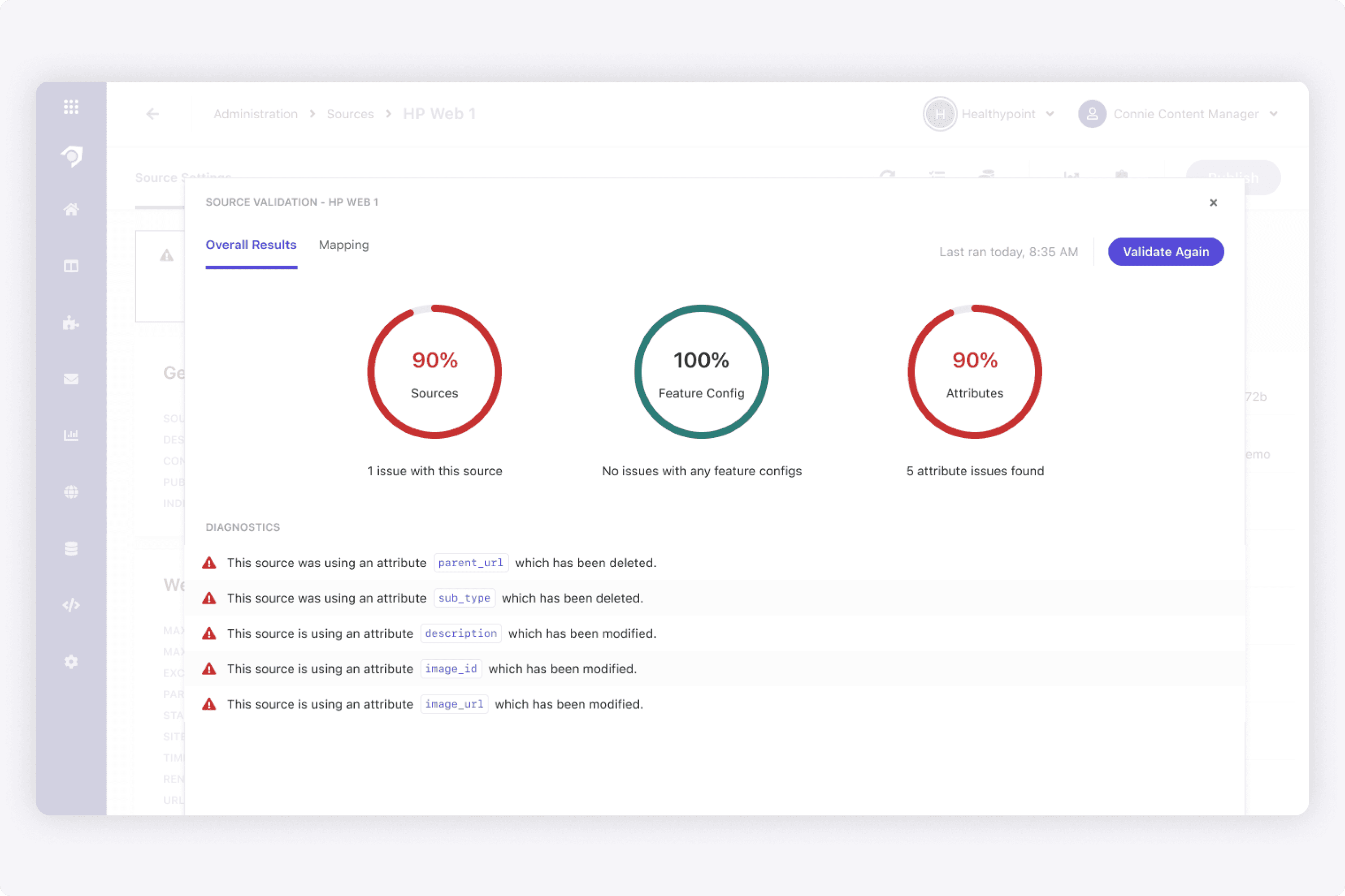
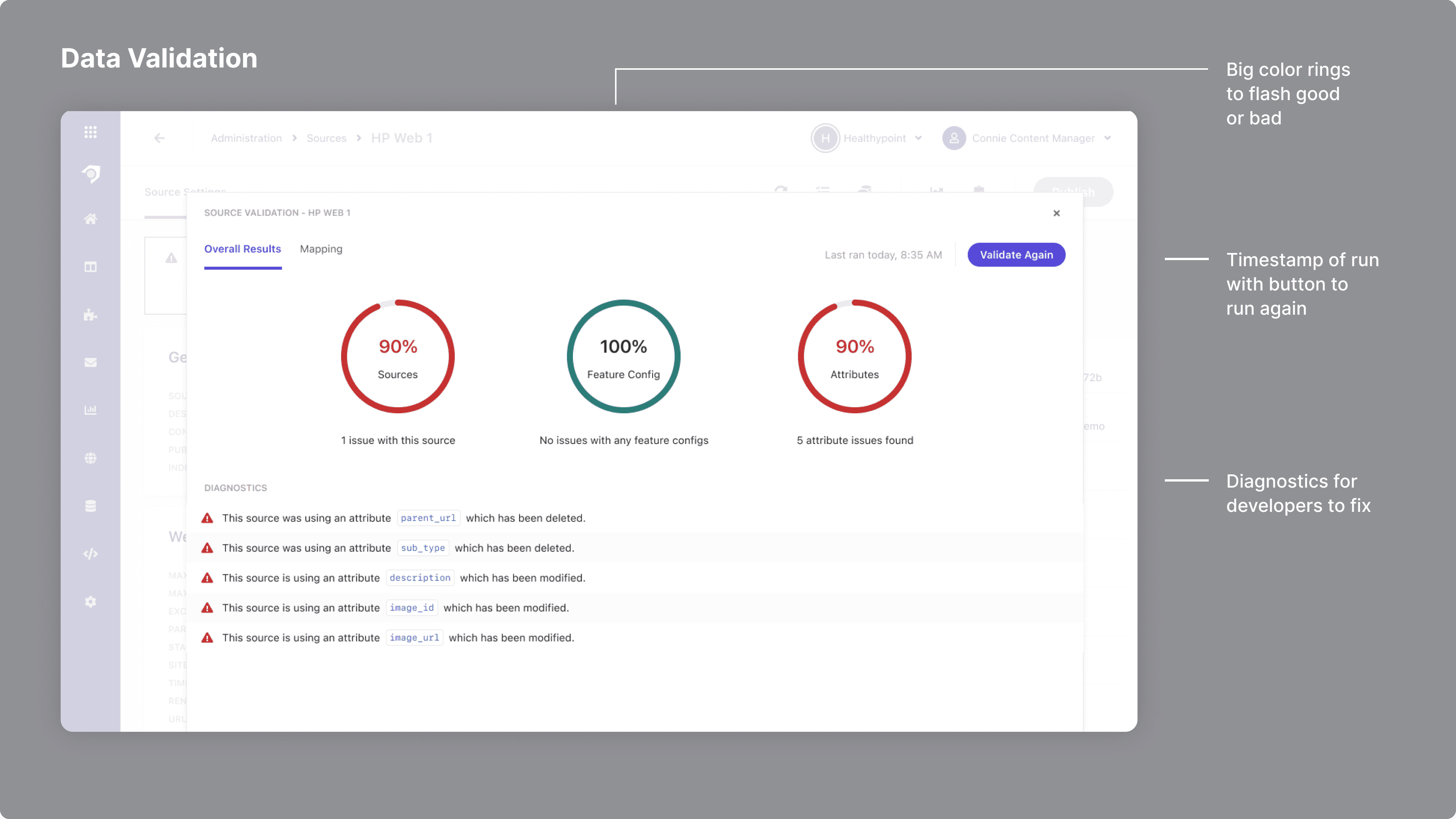
A data validation report that gave a high level indication of issues, with specific diagnostics for a developer to go fix.
The idea here was to use common UX patterns that the developer persona was familiar with. From a business perspective, the goal was the reduction of support tickets.
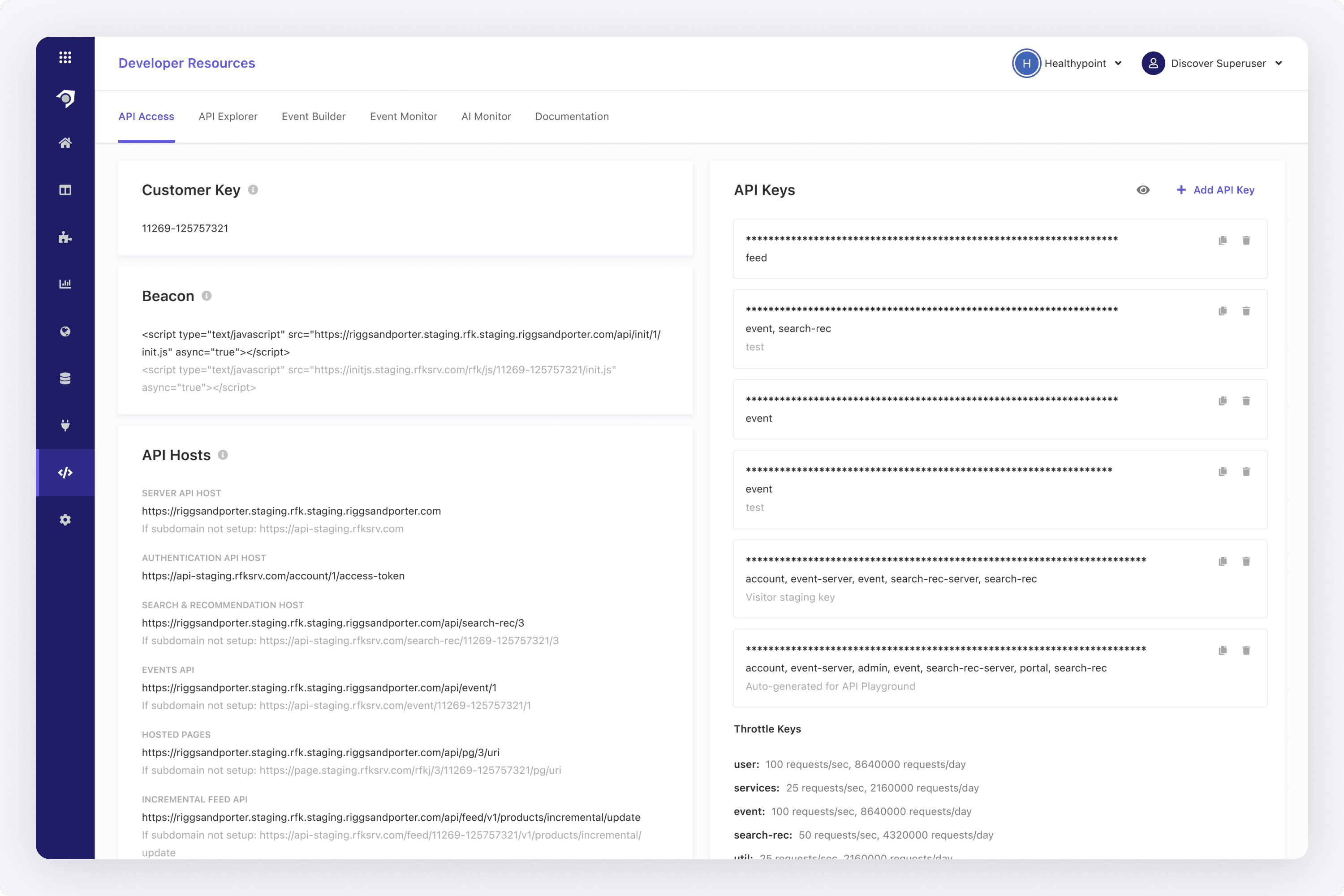
To track view and click events, customers would add the beacon (a code snippet) to their website. In this event monitor I designed, they could test that all the view and click events are firing accordingly.
We also wanted a feature where users could validate a data connection. The idea was to click a button, have a process run, and then return the results. A user could easily see if there are any issues, and what the diagnostics are.
When designing this, I saw how other diagnostic reports would list them out with error icons, or have some kind of big flashy way of showing when something is wrong. For this, I used a ring. It highlighted when things are good/bad, but also served as a way to section off the important items. Meaning, three rings for all the three sections where the data is validated.
On the data connection side, I designed this log explorer to highlight events occurring, and if there were any issues. When doing research for this, I looked at event logs from cloud providers such as AWS or GCP. I identified common patterns such as an indication of severity, a timestamp, and then some kind of summary or message that could be expanded further.
Designing Analytics
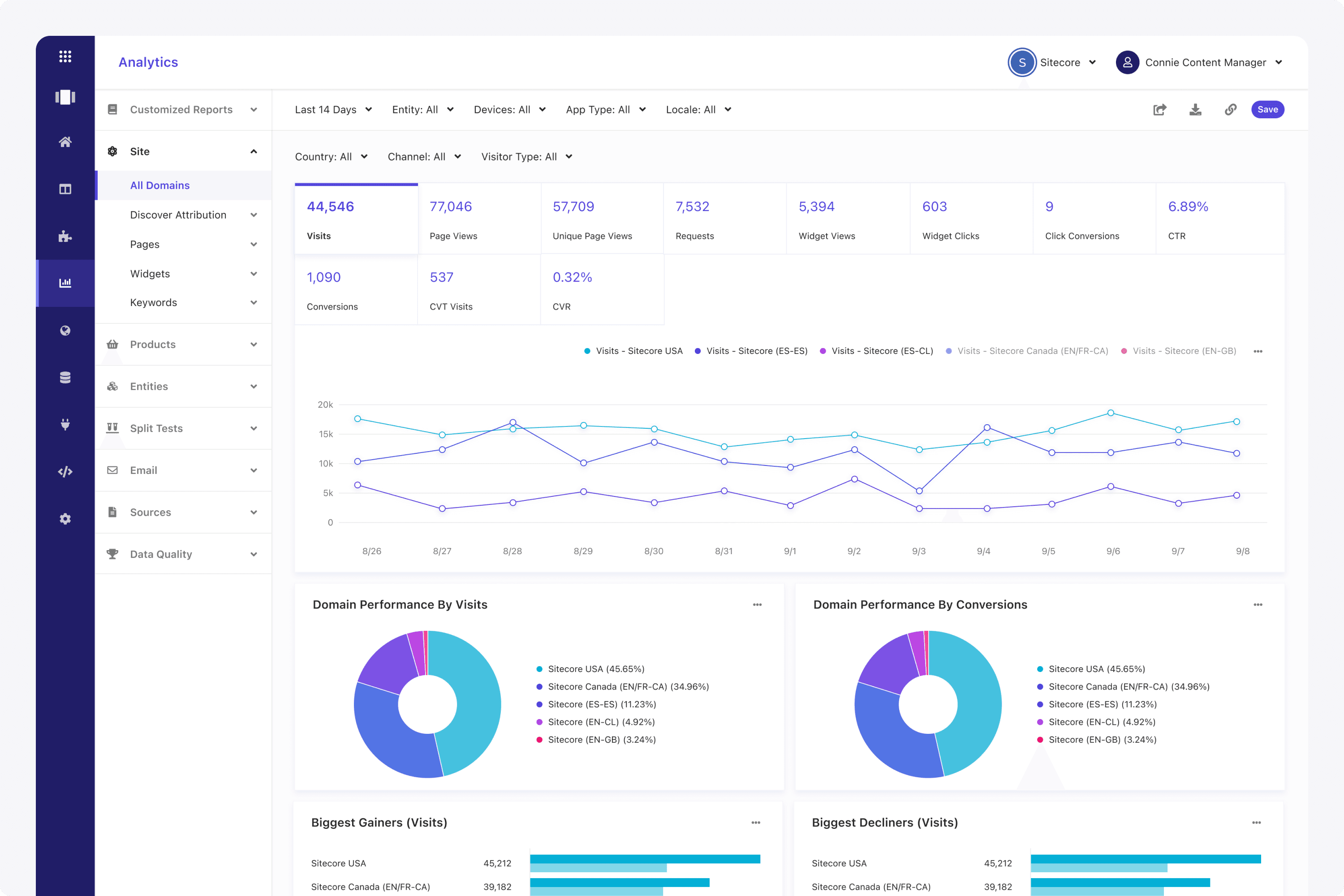
I worked closely with the analytics development team to create the analytics reporting module. We would meet twice a week for design syncs over many years. The goal was to create a feature that rivaled Google Analytics or Mixpanel, but was tailored to e-commerce. This was a key selling module that Sitecore customers loved.
From a UX standpoint, I would think about what opportunities the marketing persona is trying to find. This would influence how they would create rules to determine which products or content would be viewable on their site.
I was always looking at other e-commerce platforms and researching how marketers and merchandisers manage their catalogs. It required talking to customers directly constantly, so we built the reports they wanted.
I spent years designing and working on most of the analytics reporting area. This included features such as scheduling, saving, and much more. I would meet with the analytics engineering team twice a week, as this became a key-selling module.
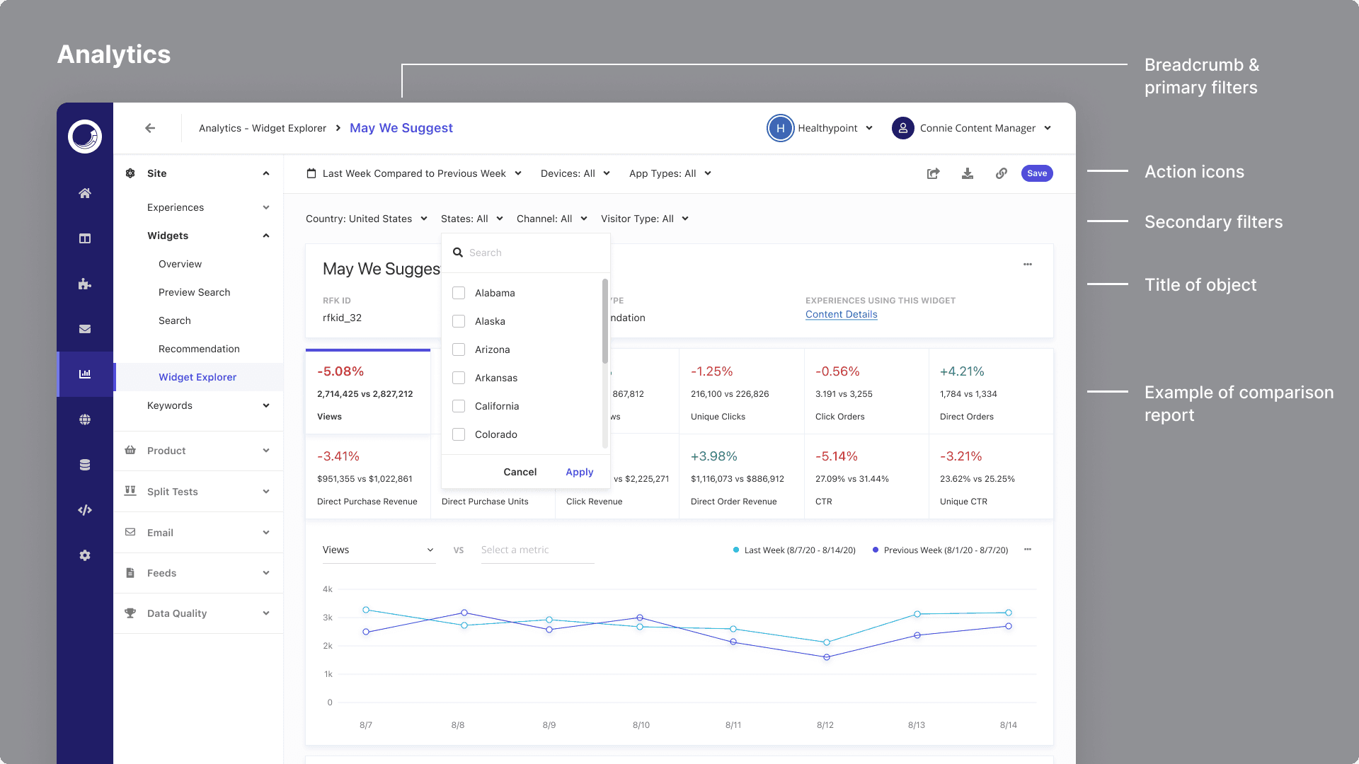
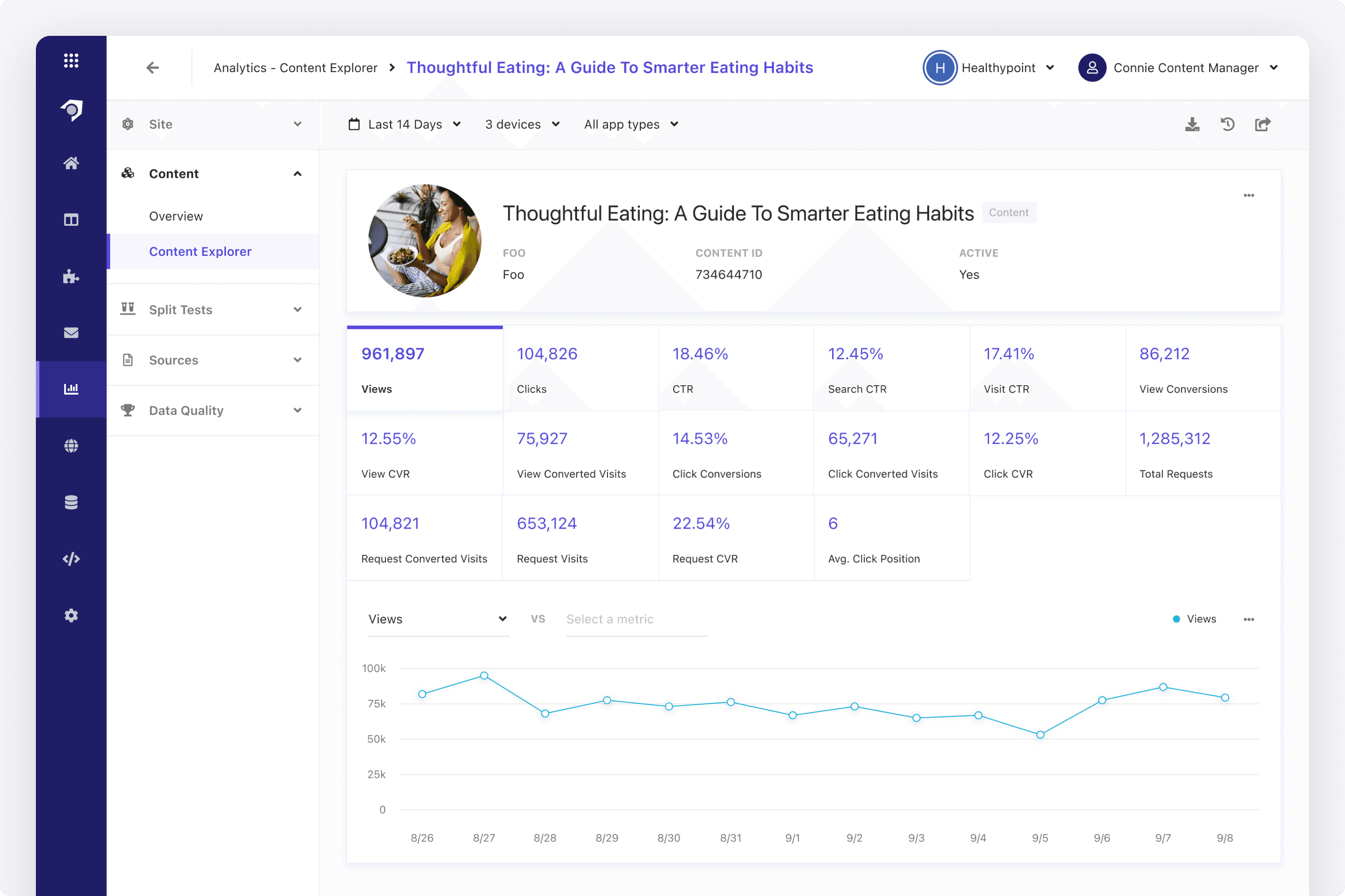
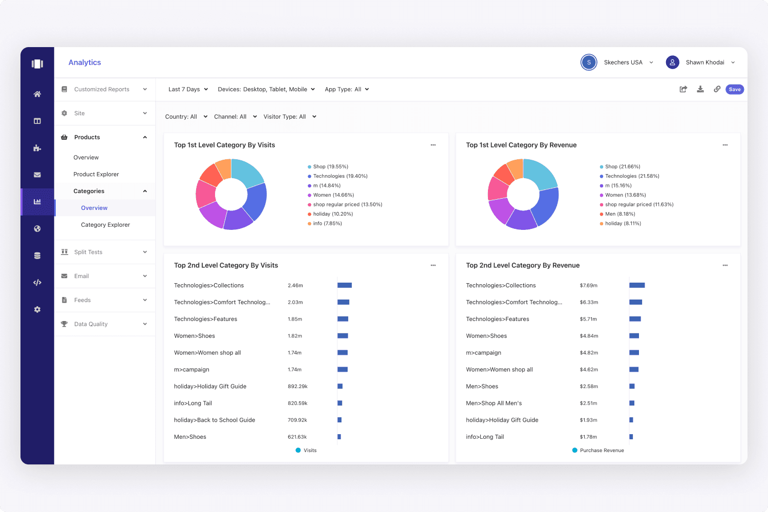
When designing the analytics, we had a common pattern for every page, regardless of whatever reporting area a user was on. We had an overview page, an explorer page to see the entire object list, and a detail page. This created a consistent look and feel.
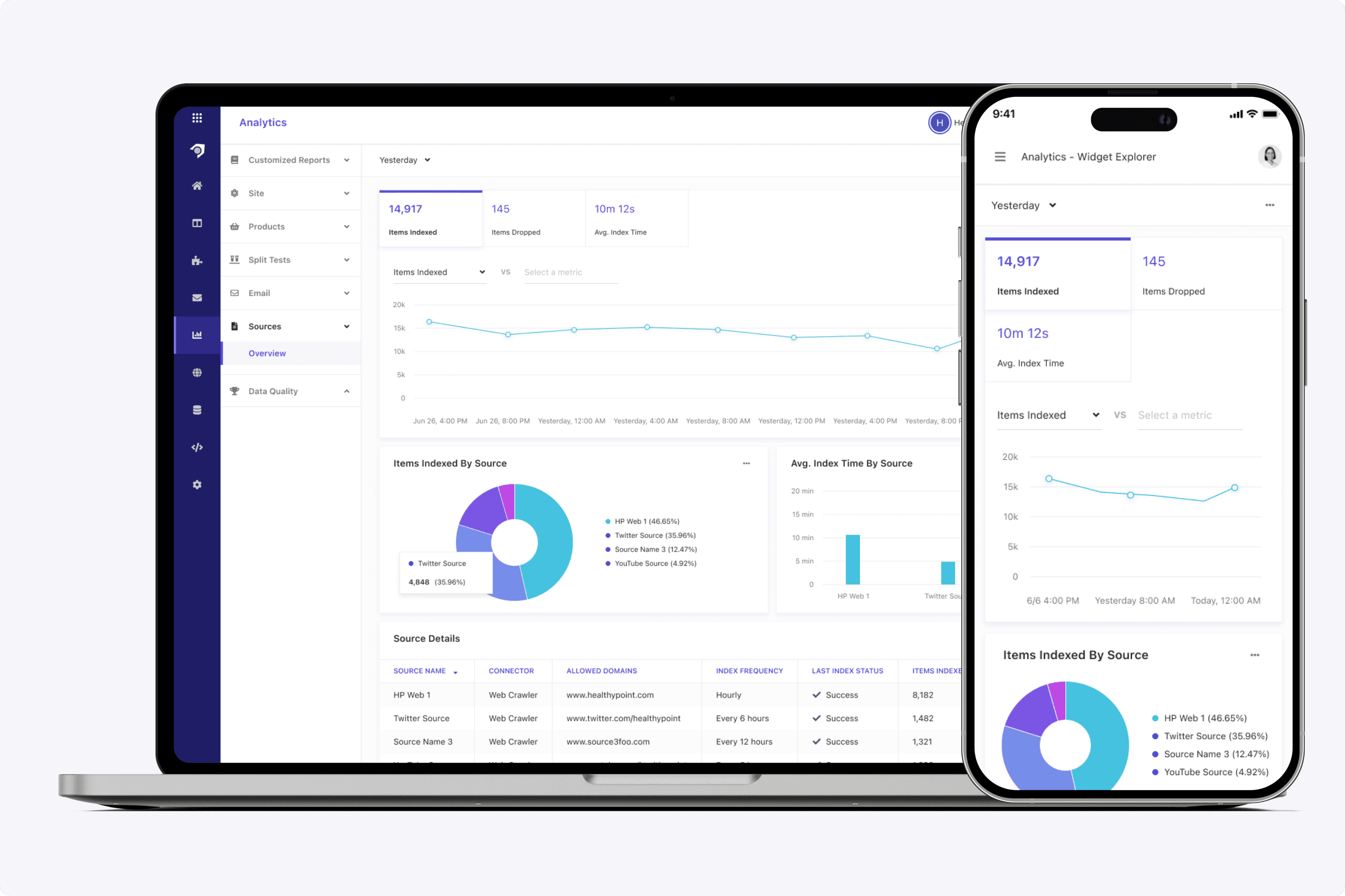
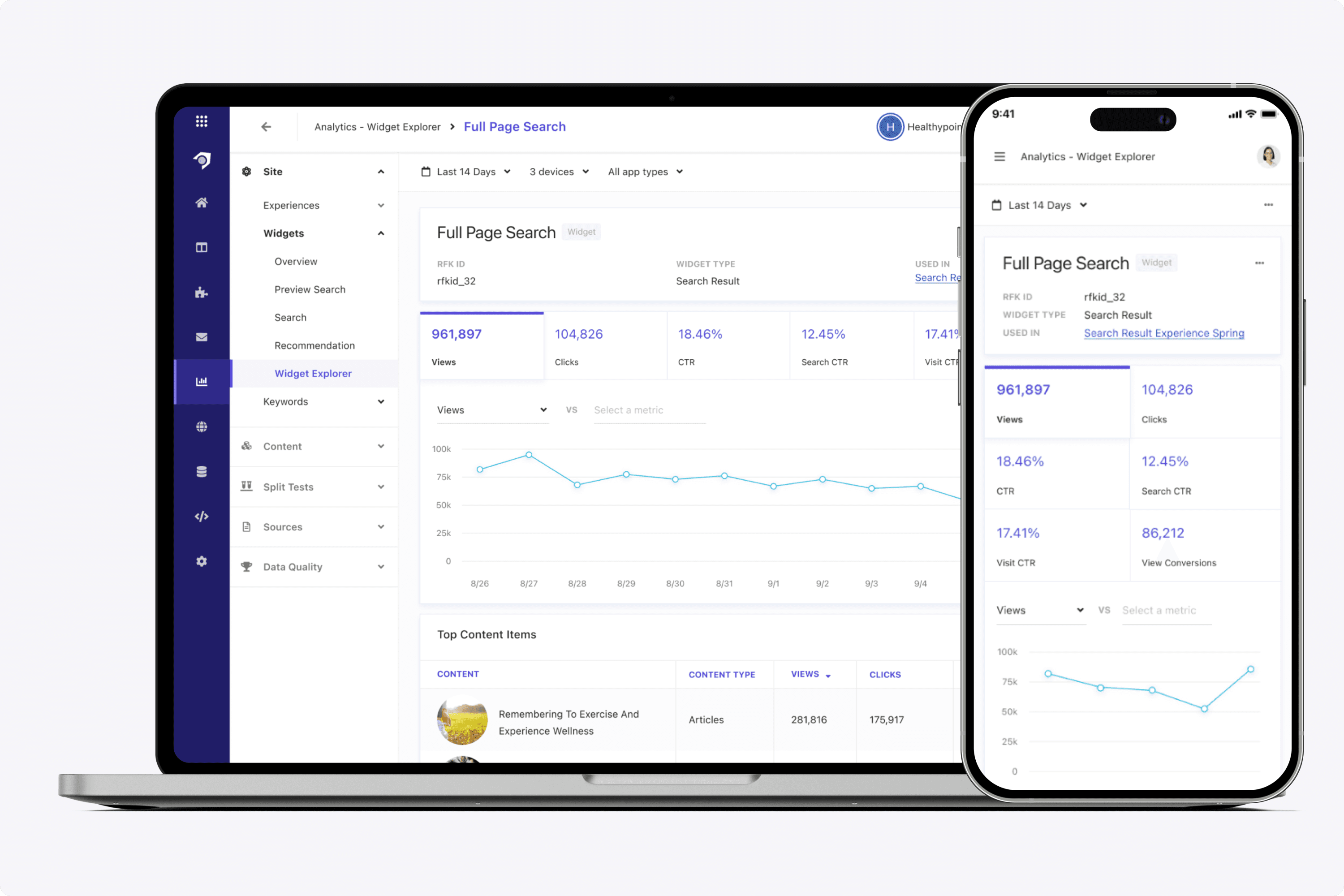
I also designed our analytics screens for the various screen sizes. A merchandiser or data analyst may want to view analytics from a phone, and not always their desktop. From a UX standpoint, it meant:
Deciding which icons to put under a three dot (...) menu.
Horizontally scrolling data tables
Redesigning time series plots to show less data points
And much more.
I'd have to look at each analytics card and see how that would fare in a different screen size, and create those rules for design and development.
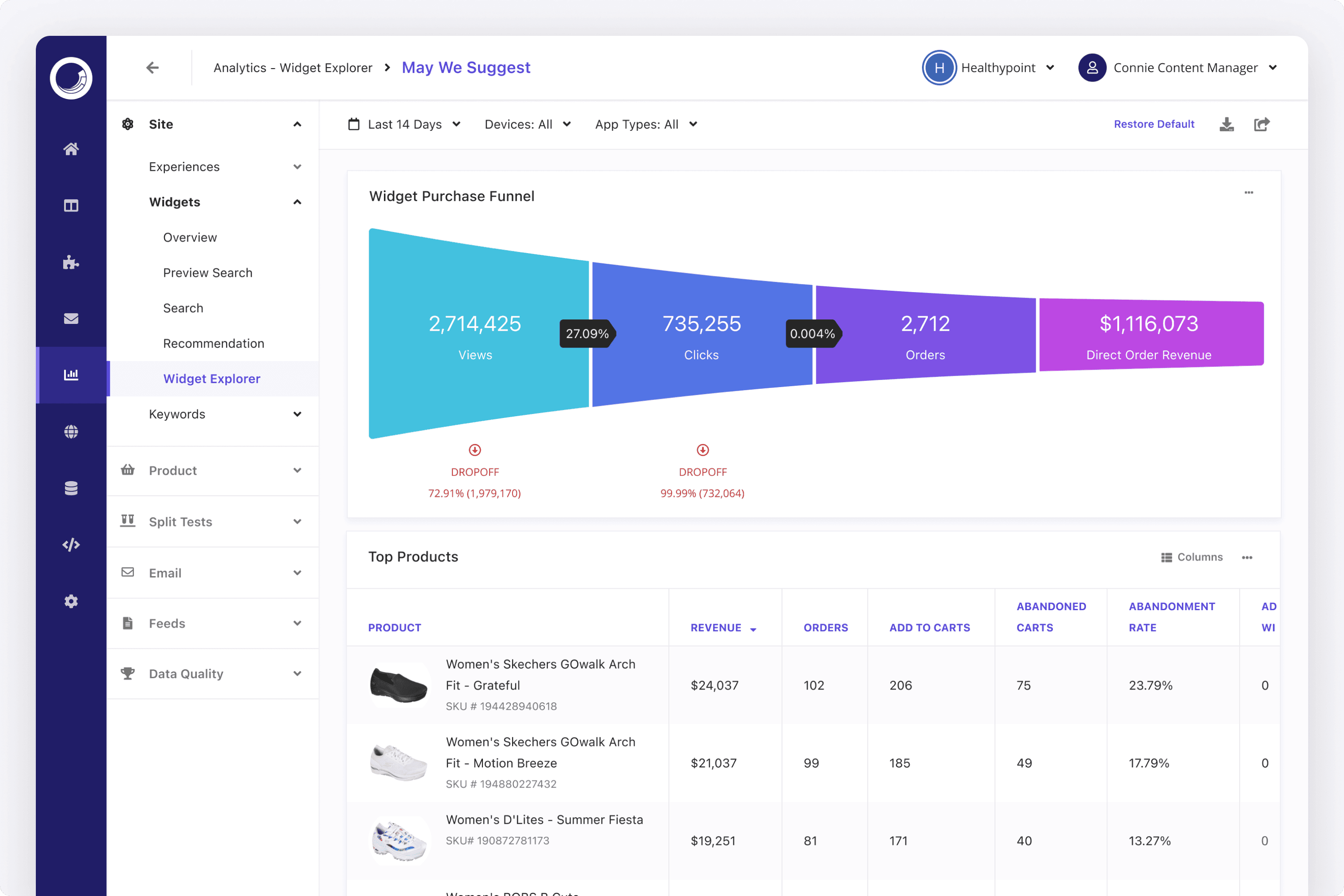
Our overview reports would give a high level snapshot of what was happening. From here, a user could always click on any object to drill in.
On any report, a user could click on an object to drill into its detail page. So in this screen, if a user clicked on a product, it would go to that products detail page and re-anchor the breadcrumb and left nav to the Product reporting area. We decided not to have the breadcrumb continuously go down many levels (like Google Drive does for example). It would require truncation and storing the path that we collectively decided wouldn't be the right model for us.
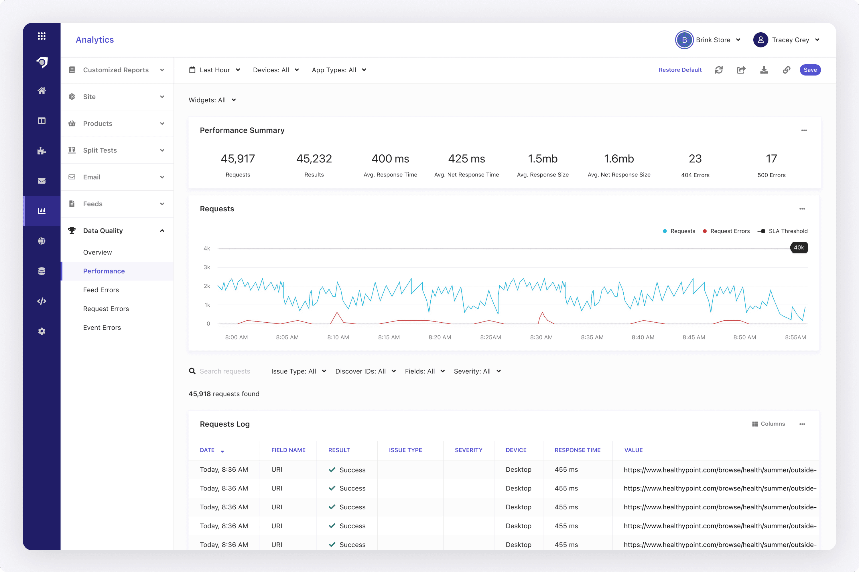
In addition to generalized reporting areas, I designed reporting for the data analysts or engineers. In this performance report I designed, a devops or L1/L2 engineer could look at the overall system performance. These type of metrics could be viewed in data warehouse platforms like Snowflake, but exposing it in the Sitecore UI gave a nice value add.
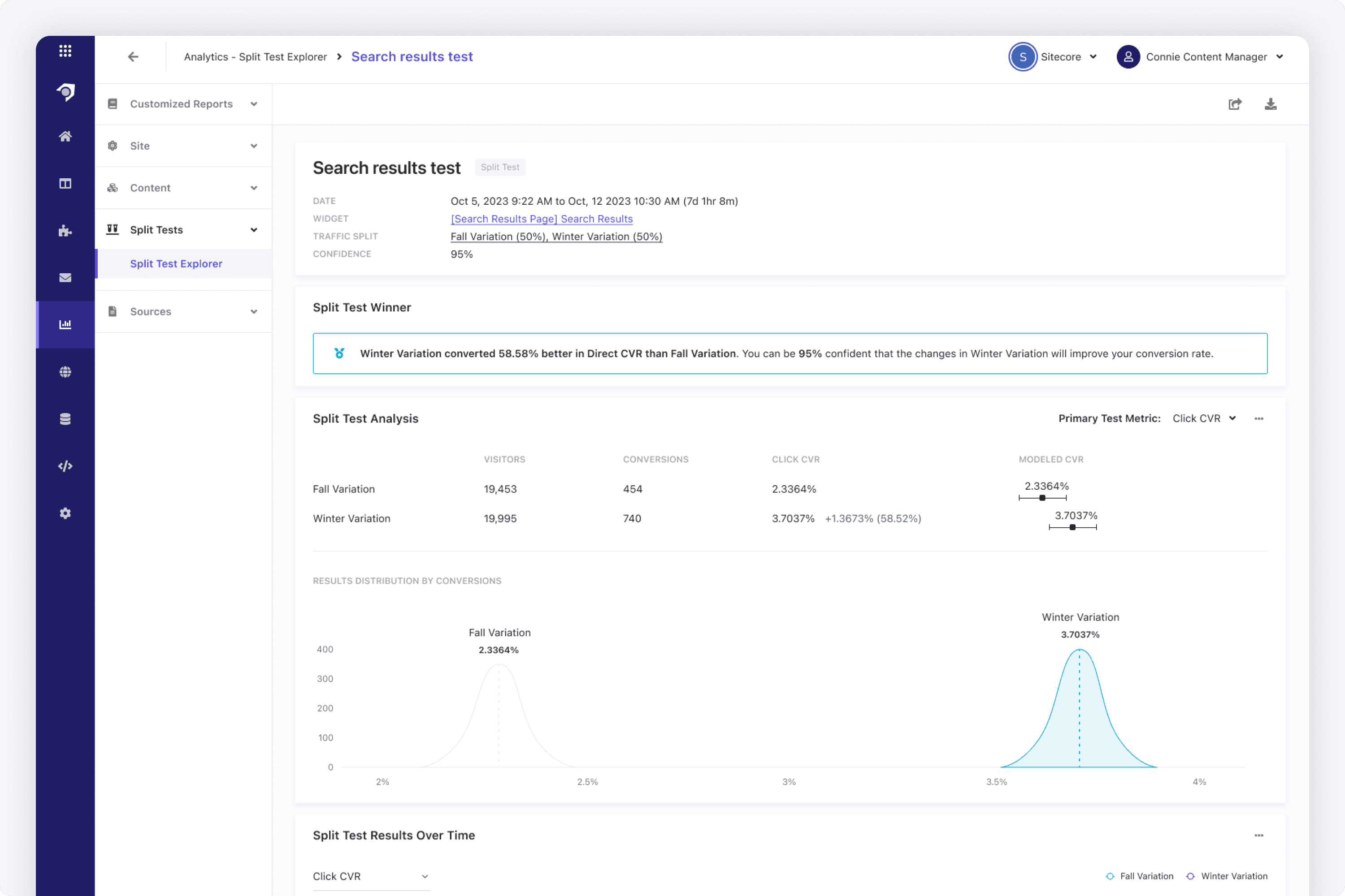
Customers could run A/B tests between widget variations to determine the best merchandising opportunities. I designed the A/B test flow, from setting up the test -> running-> viewing this report seen above. When designing this, I researched how data analysts determine statistical significance, and what they need to see when viewing an A/B test report.
Analytics were provided for multi-locale accounts across the world. I designed the reporting area that looked across all accounts and locales. That meant reports, metrics, and currencies were tailored to the region.
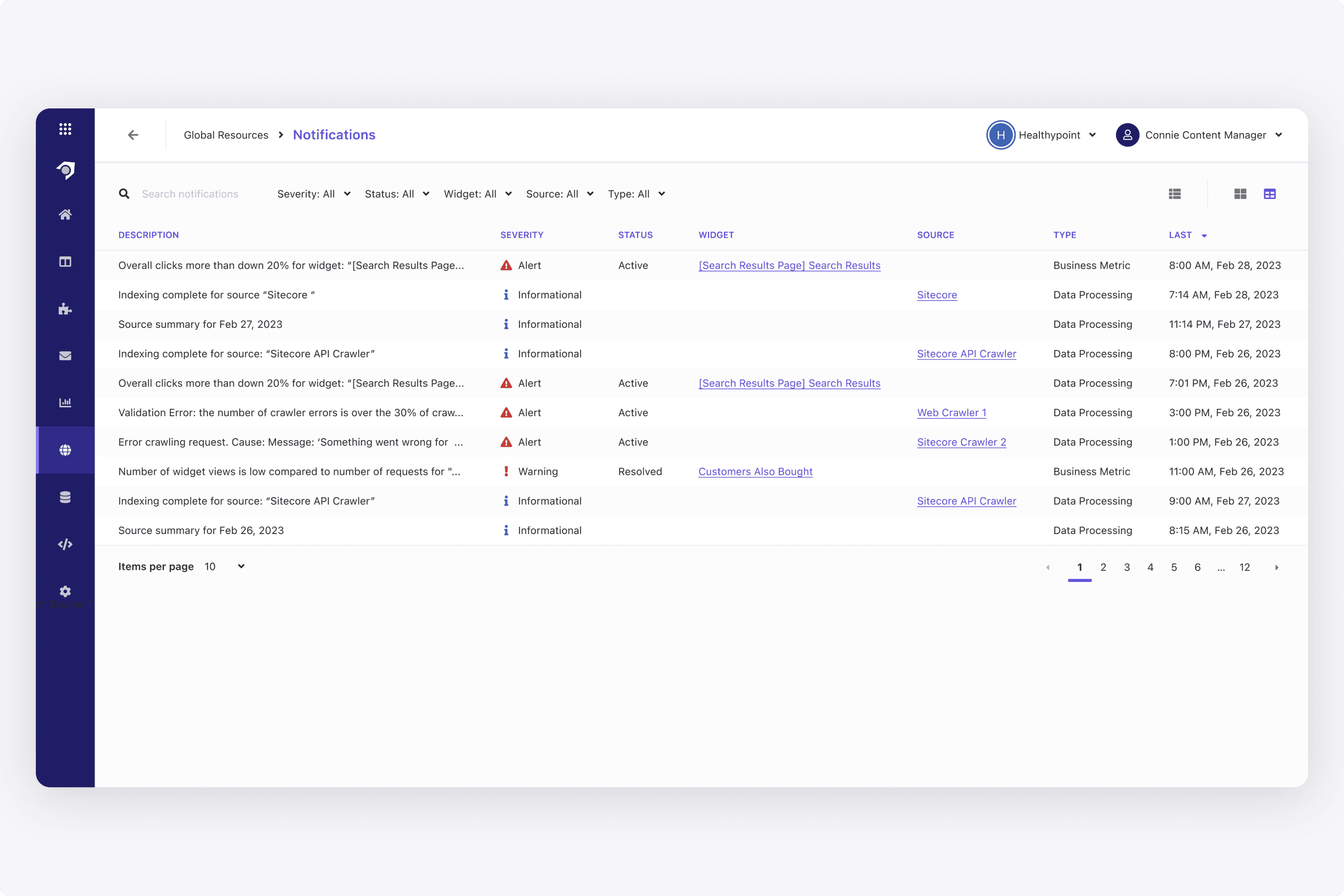
I also designed the notification system for Sitecore customers, which entailed being alerted not only of system issues, but when certain analytics thresholds were met (ex. clicks on a widget were down 20%).
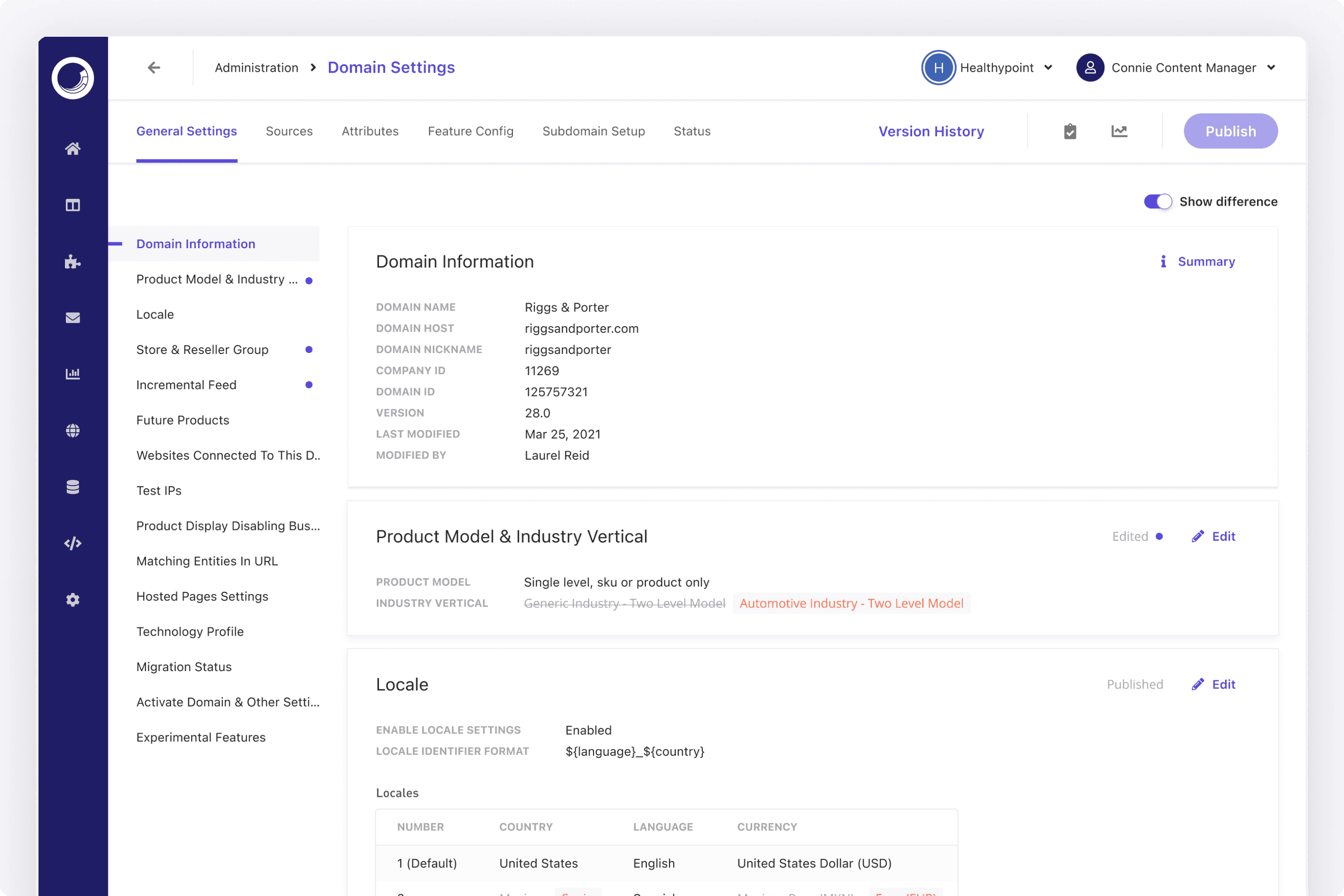
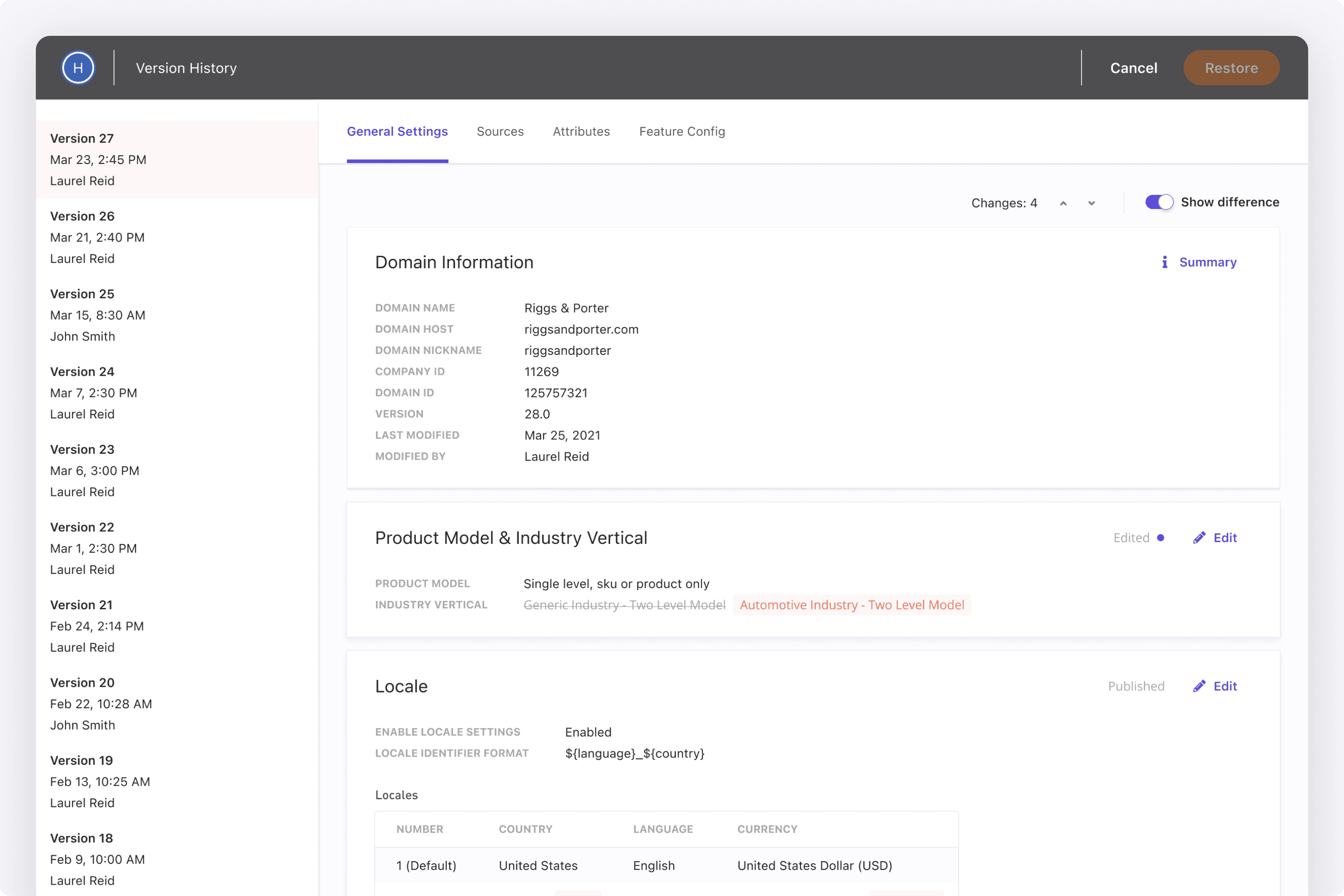
Since all domains were versioned during publish, we offered a version history to each domain. I designed the ability to see the version history, and see the diff between versions (both in the version history dialog and when simply lokoing at a domain's settings).
Using AI
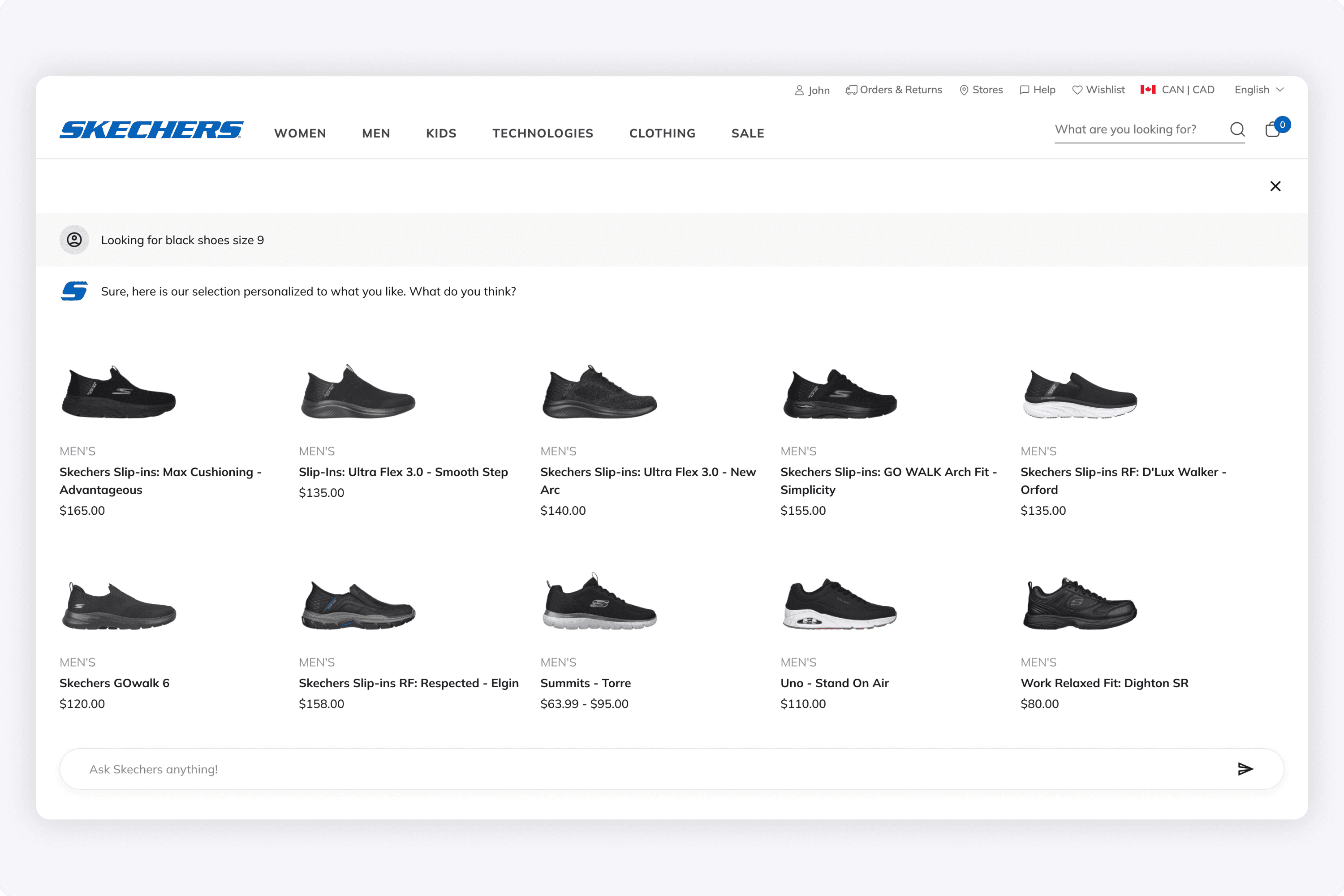
With the explosion of AI, we looked at ways we could use it to enhance our platform. I played around with how AI could be used in the end user shopping experience, where the typical facets and filters would be abstracted away, and a user would chat with an AI bot.
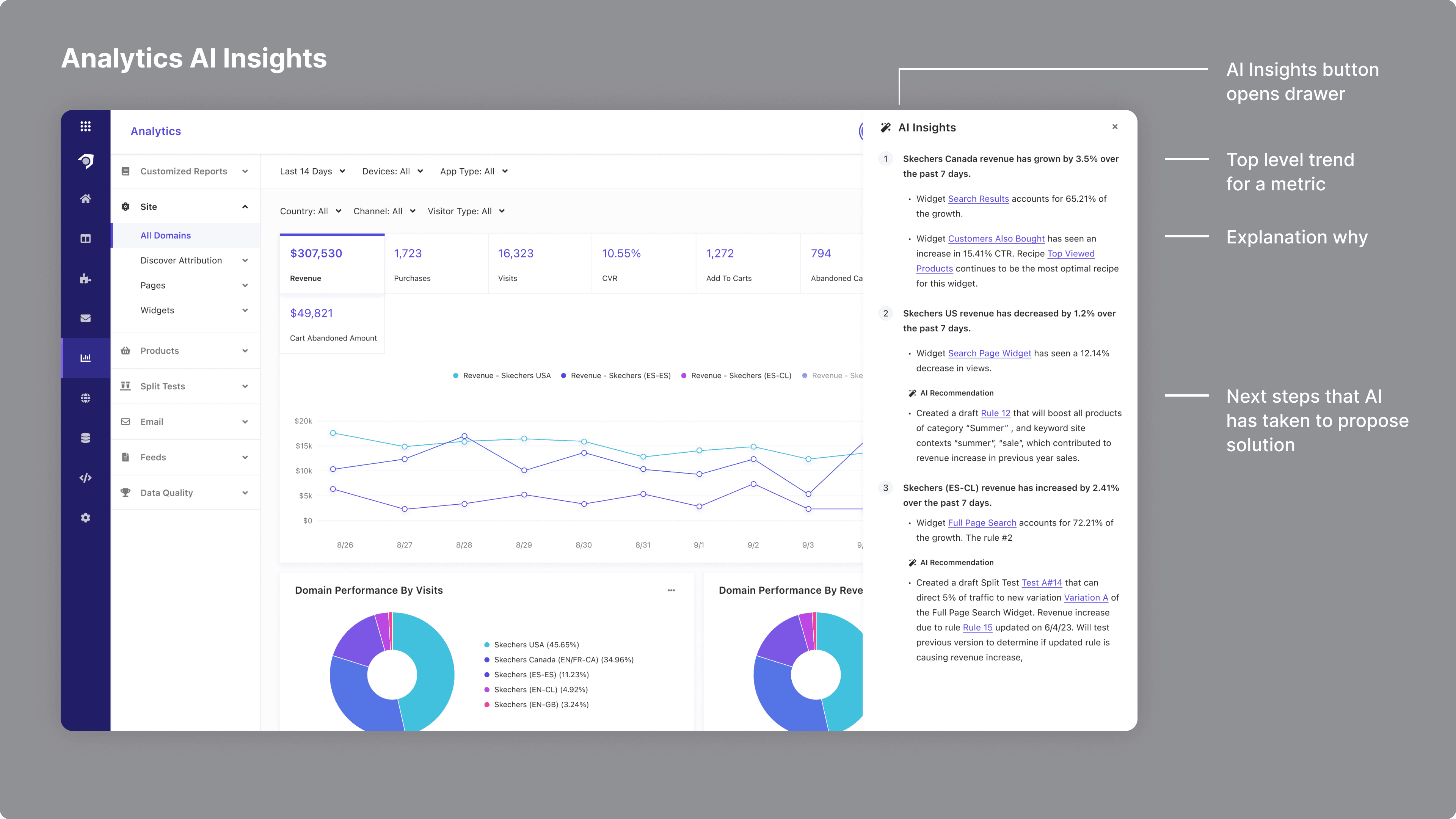
Additionally, we considered how AI could be used to give marketers greater insights. When designing this, I thought about:
What a marketer wants to know at a high level (ex. revenue is going up)
Then they may want to know why
Afterwards, what are the actionable next steps
Although these haven't gone into production, it was a way for us to explore AI capabilities much further.
When designing this, I looked at ChatGPT and Bard for how an AI chat experience looked like. From there, I reimagined how an e-commerce shopping experience could be. Rather than a user clicking away on facets and filters, they could just talk to the AI to find what they are looking for.
Additionally, the AI could not only help a user search for what they are looking for, but remind them of existing orders in progress, or make suggestions based on past orders.
We also started thinking about how AI could give insights. At a high level, it is showing what's happening (ex. revenue going up and down), why it is happening (ex. because of this widget), and what to do about it (it drafts a rule based on historical data that will give better results).
This was an early prototype that just showed text. The ultimate goal of course was to have it be more graphical. So rather than a drawer, this could have opened bigger dialog with sections & charts to explain more.
Results
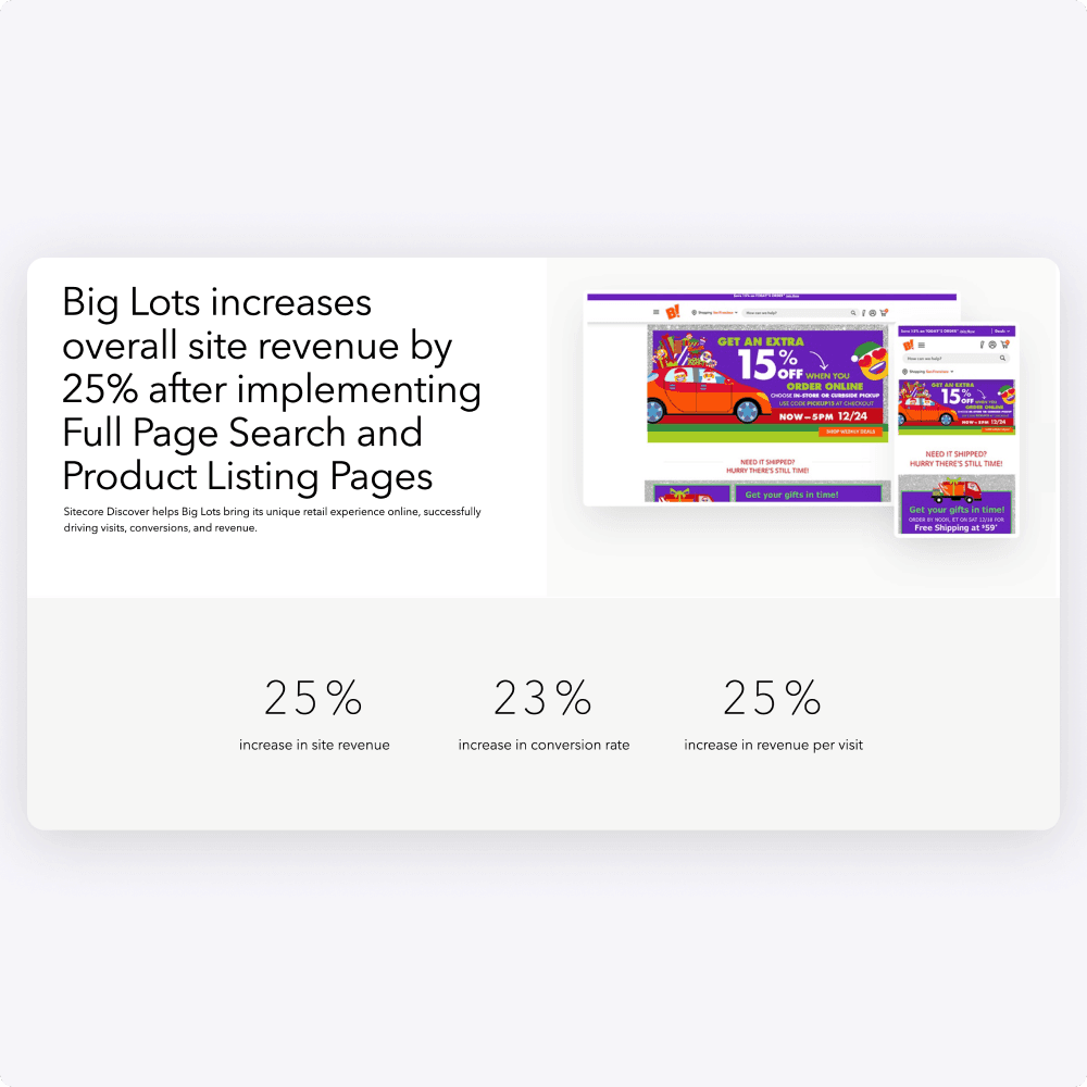
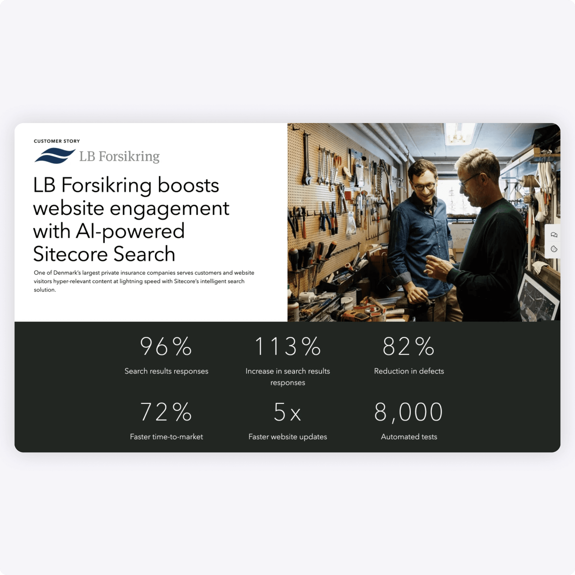
Companies who used Sitecore Search & Discover saw lifts with metrics across the board. We could confirm our results by running A/B tests in the background and our sales department would frequently use these results as case studies.
Sitecore Search continues to grow in sales.
A growing platform in the Sitecore suite of SaaS apps that offers enterprise the website search they need.
